When I first heard about it, I thought it was a rather mathematical approach, especially for an art award. I wondered whether it could possibly be as easy as he suggested to see those emerging topics and so, yesterday, after reading a reference within the ES magazine that reminded me it was that time of the year already, I decided to take on the challenge and see for myself.
In case you wonder, I found one. In fact, I have to admit that I also noticed other trends among the shortlisted images.
Before I go any further, I need to clarify something as I wouldn’t want to be misunderstood. There are some very good photographs both technically sophisticated, spontaneous and charming in the way they reflected an unexpected side of those they capture. To me, however, the selection lacks of surprise.
Art should challenge, but as many of the images that form part of this exhibition are illustrative to interviews in mainstream magazines or photographic reportages, there is a sense of familiarity that detracts from the images.
I think that is probably the reason why the images that were selected for the various prizes won. Because they stand on their own and relate to the other winners in a new way: THE THEME. (Which, to me, was Classical Iconography).
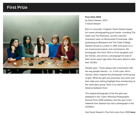
The composition of the First prize, Five girls, clearly borrows elements from the “Last Supper”. There have been many images inspired in “the scene” that illustrates the cliffhanger of the well-known story. The scene pauses time at a key moment and I think, it is because of this that is such a popular source of inspiration. (You can follow this link to see some others)
Although the group is smaller, five rather than 13, the image is a tell of their relationships in a very contemporary context of a caf and a table full of disposable crockery.
The photographer submitted a different image of the same girls (daughter and friends) in 2008, and in looking at that one, you can really tell that the iconographic references are not my imagination. (see here and decide for yourself) The composition and characters were not
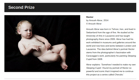
The Second Prize, Hector, is a Cherub (that is the title of the collection it belongs to). From the composition and the way that the finger points to an almost pictoric approach of the tonality, this image is clearly borrowing from the religious iconography (again) that emerged from the 15rh century, where baby like angels took over religious art.
In my opinion, the disappointing part is that, despite the fact that we are quite more aware of the beauty to be found on all types of diversity in 2015, this photo still shows a blond, fair-skinned, boy without adding anything to the original iconography.
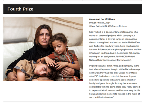
The Fourth Prize, Amira and her Children, is a portrait of a family that fled to safety from Iraq. In a classical triangular composition, it seems inspired by those iconic paintings of the Virgin with two children (Jesus and John the baptist, examples here). I guess that there is a reason why I would see this: A mom, from a nearby region to the original mom, also traveling to safety to protecting her children.
But I find that there is a key difference. Even though the interaction between the children is reminiscent of religious scenes, the mother looks straight at the camera rather than down over them. She is not angry but tired, her gaze strong and determined.
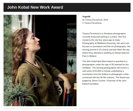
The John Kobal New Work Award, Yngvilg, by Tereza Cervenova has, not a religious reference that I can see, but an iconographic approach one never the less: The same preraphaelite art focus on in the works of Dante Gabriel Rosetti. (see here)
It enhances the beauty of the subject’s femininity, raising it to icon status through a sense of purity and transcendent beauty.
At a first glance, the light, the length of the hair, colours and composition on the image create the illusion of a preraphaelite scene transporting the viewer to a time that has long gone; but when looking at it in detail, one realises this is an image that reflects a more contemporary setting.
An then there is the Third Prize: Nyaueth. A portrait of a beautiful young woman which is haunting and serene at the same time. And which it is, most definitely, the odd one out.
Peter Zelewski has an interesting way to shot portraits. He tends to use the perspective in the background to provide depth and a sense of movement to his portraits; unfortunately this often results in a fashion-magazine-like clean quality that I don’t always like.
Part of a collection called “Beautiful Strangers” (here), the portrait of Nyaueth shows a different type of subject. One that seem to be looking beyond the camera rather than into the camera. It is a portrait of a young girl/ woman, that leaves you with more questions than answers. One of those questions, what is the thread that links her to the other entries?
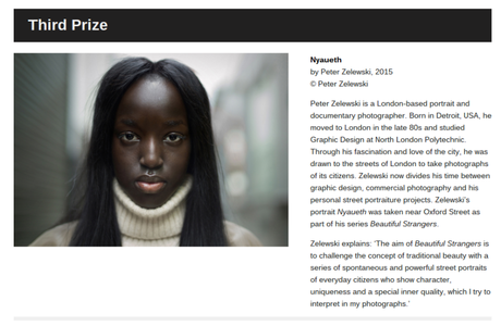
Screen shots from the official website (link here)
Text by Cristina Lanz-Azcarate
Please feel free to use this story for your own personal use, not commercially. All images are property of the author as specified and all rights are reserved. If you wanted to share any of the information provided, post a link to the website but do not extract/copy the information without prior permission
