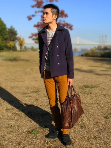
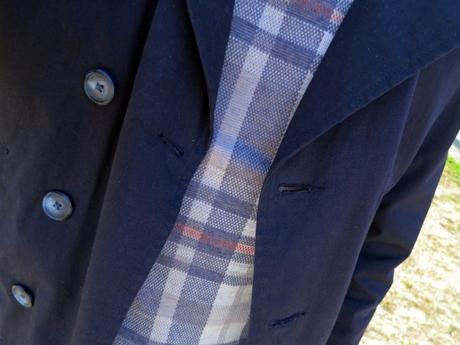
Now that the weather’s getting milder, I’m glad to finally be able to pull out my purchases from my New York trip. Over the summer, I was big on the blue and yellow color combination. In the Fall, I like to go a few shades darker and choose navy and mustard instead. These two colours are are opposites on the color scale and when put together they create a very trendy appeal. This is the first time I’ve worn mustard pants, and I look forward to pairing them with other Fall colours such as burgundy and green in the future.

I’m wearing:
Jacket – Brooklyn Industries
Sweatshirt – Topman
Pants – Uniqlo (similar from Asos)
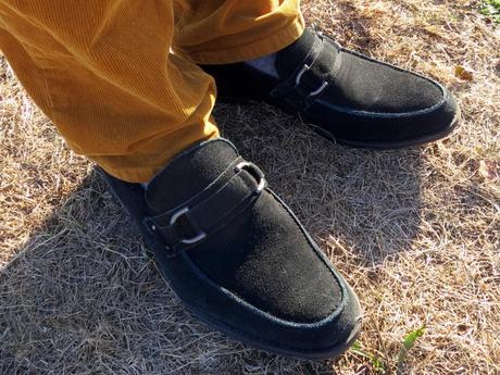
Shoes – Marc Anthony
Bag – Asos


Lately I’ve really been noticing the difference of what a tapered leg opening can do in pants. For the longest time I’ve been buying straight-leg pants, but now I’m sold on slimmer fits since they look less sloppy and can be tucked into boots. I agree that shopping for pants isn’t the most exciting thing, but I must say that owning a decent selection of well-fitting pants is the foundation to any good wardrobe.

Thanks for reading, and please LIKE or comment below to show your support!
Follow me on Facebook, Twitter, or bloglovin’.
