 Over the years I’ve used a simple graphic from the IPCC 2007 Report to explain to people without a strong background in statistics just why average temperature increases can be deceiving. If you’re not well-versed in probability theory (i.e., most people), it’s perhaps understandable why so few of us appear to be up-in-arms about climate change. I posit that if people had a better appreciation of mathematics, there would be far less inertia in dealing with the problem.
Instead of using the same image, I’ve done up a few basic graphs that explain the concept of why average increases in temperature can be deceiving; in other words, I explain why focussing on the ‘average’ projected increases will not enable you to appreciate the most dangerous aspects of a disrupted climate – the frequency of extreme events. Please forgive me if you find this little explainer too basic – if you have a modicum of probability theory tucked away in your educational past, then this will be of little insight. However, you may wish to use these graphs to explain the problem to others who are less up-to-speed than you.
Let’s take, for example, all the maximum daily temperature data from a single location compiled over the last 100 years. We’ll assume for the moment that there has been no upward trend in the data over this time. If you plot the frequency of these temperatures in, say, 2-degree bins over those 100 years, you might get something like this:
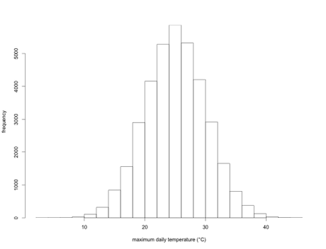
This is simply an illustration, but here the long-term annual average temperature is 25 degrees Celsius, and the standard deviation is 5 degrees. In other words, over those 100 years, the average daily maximum temperature is 25 degrees, but there were a few days when the maximum was < 10 degrees, and a few others where it was > 40 degrees. This could represent a lot of different places in the world.
We can now fit what’s known as a ‘probability density function’ to this histogram to obtain a curve of expected probability of any temperature within that range:
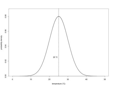
If you’ve got some background in statistics, then you’ll know that this is simply a normal (Gaussian) distribution. With this density function, we can now calculate the probability of any particular day’s maximum temperature being above or below any particular threshold we choose. In the case of the mean (25 degrees), we know that exactly half (p = 0.50) of the days will have a maximum temperature below it, and exactly half above it. In other words, this is simply the area under the density function itself (the total area under the entire curve = 1).
Let’s say we want to calculate the probability that any given day will be 35 degrees or warmer (i.e., we’ll call this a ‘heat wave’). For this, we just calculate the area under the curve to the right of 35 degrees:
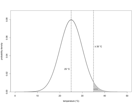
which in this example dataset, p = 0.02. In other words, there’s a 1 in 50 (1 ÷ 50 = 0.02) chance of achieving or exceeding 35 degrees on any given day of the year.
Now, let’s say the variation in temperature over the next 100 years stays the same, but the average maximum daily temperature increases from 25 to 27 degrees. It doesn’t sound like a big deal, does it? Let’s look now at the ‘new’ climate density function overlaid on the old one:
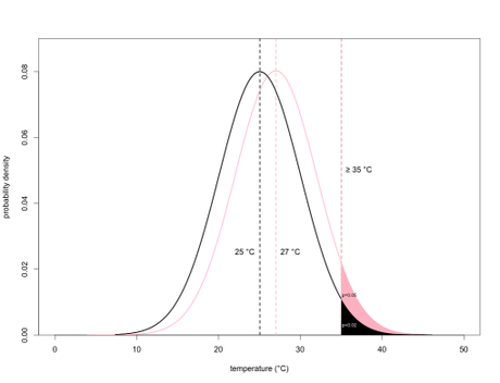
We can see that using the same threshold temperature (35 degrees), the area under the curve in the ‘new’ climate becomes 0.05, which means that there’s now a 1 in 20 chance (1 ÷ 20 = 0.05) of achieving or exceeding 35 degrees. This also means that on average, days reaching 35 degrees or above are now over twice as common than they were previously. Now that ‘modest’ 2-degree average temperature rise doesn’t sound so modest.
Now let’s bump up the new climate’s average by another 2 degrees to 29:
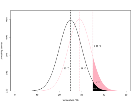
Whoa! Now the area under the curve to the right of 35 degrees is a whopping 0.11, or a 1 in 9 chance of achieving or exceeding 35 degrees. Remember, we’ve gone from a 1 in 50, to a 1 in 9 chance.
Now all of these scenarios assume that the variance (essentially, the ‘fatness’ of the bell curve, known as the ‘kurtosis’ in statistical jargon) remains the same. This is described by the standard deviation, which is 5 degrees in this case. Now let’s assume that the temperature is not only increasing (we’ll use the 2-degree increase again), it’s also becoming more variable. Here, we set the new climate’s standard deviation to 7:
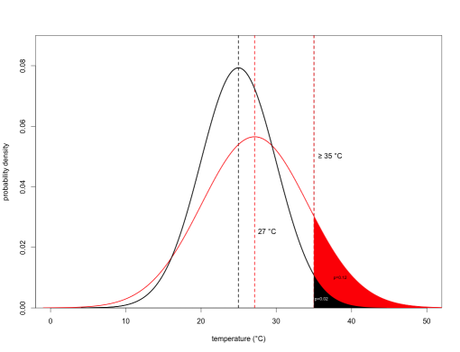
You’ll notice that the curve is a little shorter and fatter than the previous distribution (called ‘platykurtic’), and the huge effect it has on the area under the curve to the right of 35 degrees. Now we’ve gone from a 1 in 50 chance under the ‘old’ climate, to almost a 1 in 8 chance under this new climate. This situation now exceeds the extreme scenario under a 4-degree warming (which if you recall was a 1 in 9 chance of exceeding 35 degrees).
Remember, these are just examples, but they represent very real processes in climatology. Most ecological systems – human society included – do not respond to ‘average’ temperatures (or precipitation, etc.), they instead respond to extremes like heat waves and cold snaps. During heatwaves, older or very young people can succumb and die, and other species are no less resilient (think of how a few hot days can wipe out the plants in your garden). If the heat waves (in this case, defined as days reaching or exceeding 35 degrees, but any definition will do) happen with a probability of 1 in 50, then there’s usually enough respite in between these extremes for individuals to recover. However, if they become so common and sequential that there’s little time for recovery, this is when populations start to suffer and decline.
So remember, don’t focus on averages! It’s the extremes that count.


posted on 18 May at 12:38
Definitely a good/interesting post. blog.frontiergap.com