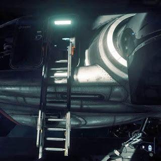
it's a ladder
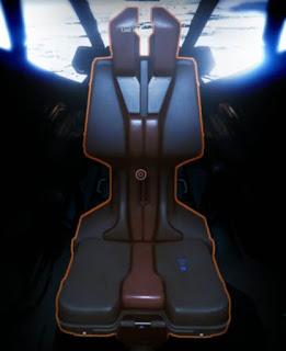
it's a chair
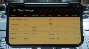
it's a console
OPENING SALVO: Free Look on foot allows player to look around while you are already doing something, this will become relevant when we start to See It, Use It, later on in this blogpost. Free Look while in cockpit or pilot seat is QUANTUM TRAVEL TARGETING because it's the ship's quantum engine capability you're Free Looking with, not your eyes.
Now, back to what normally happens... and I've seen this on countless occassions. Player tries to get into a single-seater ship's cockpit. You've already locomoted on foot up to your ship. You F-click on ship canopy, in case there's some function you can use. You see the cockpit ladder highlight. First thing most players think they have to do is 'activate cockpit ladder' so they can locomote up it. They do so, in their minds they're unlocking the cockpit door and a ladder descends. They (to a man) always Move Towards the ladder ... and are then confused why player doesn't climb up it.
I've seen players, once they're in the medium-sized ship's cockpit area go up to a chair, remember that they have to F-key the fucking chair to activate its natural function. It gains a visual outline showing functionable. And they try to move towards it. Logically, this is the only thing you want to do. Function is stated, "I am a chair," and there's no confusion in the player's head.
A button panel next to an elevator or lift? You're either oriented directly towards it or you Free Look directly at it, close enough to touch it. The button panel highlights.Why shouldn't it. It's its job to know there's a player in front of it or looking directly at it, ready to press its grid of buttons. It's like some sort of game-logical agreement between two sentient beings has taken place.
But Star Citizen wants to offer the befuddled player a tome of F-key click options to read and cogitate and act upon; open canopy, drop ladder, enter cockpit, make coffee, pick up cup, stow weapon, pickup box, place box, use, don't use. Even before you've decided to do anything to the highlighted object.
A ladder is for climbing up. Fast or slow. Or not even climbing up it at all. Maybe just standing there, halfway up, halfway through the next phase of the climb-cycle anim, looking around, maybe shooting from it with one hand, maybe even landing on it from a jump and clinging on... checking out a Spectrum post in one-hand'd MobiGlas (oh, yeah, make MobiGlas activation a wrist roll rather than a two-handed click). You're not supposed to click the CLIMB LADDER button to go up a ladder. It's just another way to locomote from A to B. Once the ladder's available (whether you're at the top or the bottom of it) IT'S OBVIOUS what you wanna do, mount that linear locomotion path, you're not activating a climb ladder cutscene. You're still in full control.
A chair is for sitting on, ffs. In this case, it's the door to the Console 2.0 experience of flying the ship i.e. navigating via the control sticks, buttons and MFDs that command the Flight Experience.
A console, if it highlights, Move Towards it...
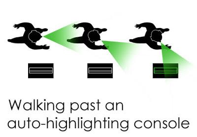
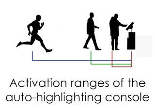
But what if you don't want all the Items 2.0 highlighting all the time? Good question, easy answer, "If you're not looking directly at it with your full intent to inspect for usability and you're not within standing/walking/running range, then it shouldn't highlight." Additionally, if you rotate your character away from or Free Look away from any Item highlighted 2.0 you're stood in front of, it'should de-highlight. If you step away from a Console 2.0 moment, you'll be back in front of the highlighted Item 2.0 object. Turn away from or back out of activation range and it'll de-highlight itself, obviously...
What is wrong with SC's option heavy game interface that player has to do anything other than Move Towards on these highlighted objects? There's nothing special about them, just, "Move Towards means I intend to use its intended function."
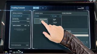
insta-finger
Once you've Move'd Towards a Trading Console, your fingertip's gonna be the mouse pointer, what else do you have to point with? It's swiftly gonna slide efficiently from option to option, the way your brain works. Not slowly with the player having to aim the mouse pointer directly into the option button's activation space. But soft-snapping between the eight options on the above screen; buy, sell, and then the various neighbor buttons. You can always Free Look around while in a Console 2.0 experience, this has shown itself to be especially useful if you're at a buy/sell console in Jump Town; you gotta stay awake, aware, alive.This also works for the Pilot option, too, once you're in the pilot's seat, where the pilot's hand might hover instinctively to an MFD or switch or EXIT button should he Free Look around the cockpit.
Dear makers of Star Citizen, please simplify your god-awful game interface FOR THE BETTERMENT OF THE PROJECT already.

