too many design options
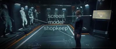
look at this shop screengrab from Cloud Imperium's current pre-alpha of Star Citizen (build 3.4.2) and understand what I mean by Design Redundancy or Duplicate Systems.
There's a similar situation with Thinky vs Manual in game, where you can physically manipulate some aspects of the game (any bespoke hands-on animation situation they choose) and you 'thinky' your way telekinetically through other aspects of the game; ship ramps, buy/sell consoles, ship elevators... it's all broke, weak, timid in real 3D design terms. Human-scaled hands-on design is DESTROYED when you can look up at an elevator node under a five-storey ship and activate it with your mind.
They'll do the same thing with their 'leave it to the player' i.e. fucking keybindings, where you have this awful, complex, layout or sub-game where you try (desperately) to choose a set up that works with the flight/movement model and input device of your choosing. Instead of designing a unified 3D momentum-countering single-hand control system for all modes of locomotion/transport. I mean, you're still moving a single node across terrain or through space. Maybe it's because I come from a console-dev background where you have to make the most of a miniscule input selection. Hint for the PCers: mouse can move across a spherical surface in 2D, if you want a neat solution. K-rist!
So, back to the above image, you bolt through the door looking for armour, which option do you go for; the screen, the model or the shopkeep? Most plump for the self-service screen as it's 'got all the shit on it' and it means by-passing a Humble Retail Helper experience and a buy/try system that's a little bit broke, in so many fundamental ways.
What Design Redundancy or Duplicate Systems actually means is that every implementation remains at tier zero because you don't have the balls to commit to nor the dev-time to complete to the a satisfactory level of polish any one of them. This is an ailment CI has suffered from since day one, sitting on the fence of design decisions, hoping to cater to the masses by offering too many design options and not enough focus'd implementation...
FOOTNOTE: ...until they go ahead and fully commit to a dire design involving a hideous 1990s military vector 2D overlay HUD interface that they need for their one-player game Squadron 42 BECAUSE THAT'S ALL THEY'RE REALLY CONCENTRATING ON at the moment, design-wise production-wise. The fact that it's totally inappropriate for their multi-player sandbox or 'verse i.e. Star Citizen, doesn't seem to phase them too much. Maybe because SC is just 'cream on the vanilla' i.e. nothing more than a ship-sales arena to fund production.

