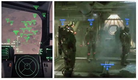
anything like this (hideous 2D info-overlay) flattens the 3D in the game.
It's how the brain works.
It's concentrating so hard on the FOREGROUND text it has no time to register the depth of the 3D imagery.
It's like closing one of your eyes, "Do it," see how it murders 'the illusion' of 3D in your head.
You should need nothing but the information from the three-dimensional World of Items 2.0 and the MFDs in your ship, you have umpteen of them in each ship. Clear the view for the enjoyment of the game. Even the altimeter and speed HUD in the very center of the windshield, the place that you'd want the clearest, you don't need it if you get enough feedback from the basic principles of flight. Just stick it all on an MFD.
Altitude's a classic, "You don't care," what altitude you're at if you have visual sight of the planet you're landing on. Make the 3D work for the player, not against him. Enhance where you have to... Same for ascending i.e. waiting to use Quantum Drive. Show a reducing distance marker on the QT-destination is all this needs, when it arrives at zero you can Quantum Jump.
Focus'd interface design not catch-all interface design.

