ugly unreadable insulting
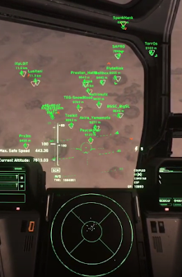
Star Citizen is a pre-alpha multi-player online game in development at Cloud Imperium and as you can see from the image above has a hideous primary-colour 1990s fighter-type HUD or Heads Up Display.
While this might work for the more story-driven single-objective single-player Squadron 42 game CI are co-developing, this kind of basic graphical overlay is UTTERLY UNREADABLE in the multi-player context and totally butchers the three-dimensional beauty of the CI game assets.
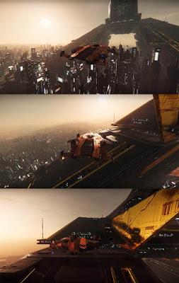
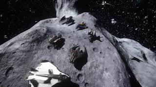
This is a personal campaign to get CI to drop this gaming eyesore and adopt a HUD-less interface... maybe something more like the following images:

using Quantum Drive to TARGET with one button press

removed NO FLY ZONEs

removed all green ship triangles

isn't this better than some terrible text overlay?
Make every Star Citizen asset a foreground asset once again.

