So when I was asked to create a fall decor project for Heidi Swapp's blog, I have to admit that I was less than champing at the bit to get it done.
After a week or so of thinking about it, I came up with an idea I thought was amazing...stupendous...a serious show-stopper.
And it was.
In my mind.
When I actually tried to execute said idea, things turned out the exact opposite of stellar. Darn.
Soooo, I did this instead. And, I have to admit...I'm loving it.
Here's how I started...
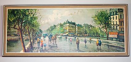
I purchased this piece of art from Goodwill and got it all cleaned up. I had no idea just how dirty a painting could get...ewwww.
Then, after checking online that I hadn't purchased some rare piece of art that would lead me and the rest of my family to complete financial freedom for the next few generations, I painted of the entire thing with white acrylic paint.
The piece is about 3.5'x1.5', so it's not small...it's a pretty great size. I wish that I had taken photos of the following steps, but I didn't. Truth is, I was so excited about getting it done that I didn't stop once I started. But the concept isn't hard...at all.
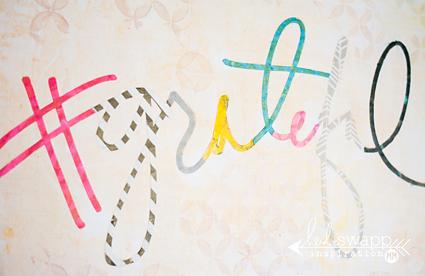
I kept layering on the white paint until the painting underneath was covered (about 3 coats). Then I opened one of Heidi's digital files in Silhouette Studio and sized it to fit the frame. I cut out each letter of the word #grateful using different sheets from both the Sugar Chic & Mixed Company Paper Packs. I also cut out the word "BE" and then played with the words until I liked they way they fit on the canvas. Then I temporarily adhered the words to the canvas with my Bazzill Marathon Runner.
At this point I found that I really didn't like all of the mismatched paper patterns...they were more distracting than cool-looking. So I grabbed some markers and went over the tops of some of the letters. I think this looks waaaay better. And I'm totally digging the non-traditional fall colors I chose. My house is decorated in mainly browns, creams, greys & whites, so these unexpected colors really add to my decor...and they make me happy.
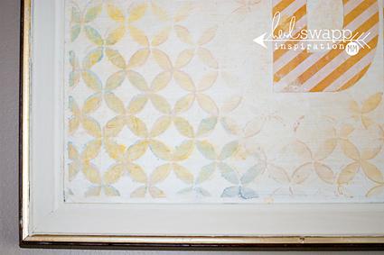
I used my 12x12 stencil and color shine mixed with white acrylic paint to add some depth and dimension to the sides of the piece and around the words. After every layer, I let everything dry and then just kept layering the colors...if I didn't like what I saw, I just added pure white, let it dry and tried again.
Then I sprayed the entire piece with Gold Lamé to really it give it some shine.
When the entire piece dried I went over the top of everything with Mod Podge to seal the piece and permanently adhere the letters.
And here it is...all finished! Yay!
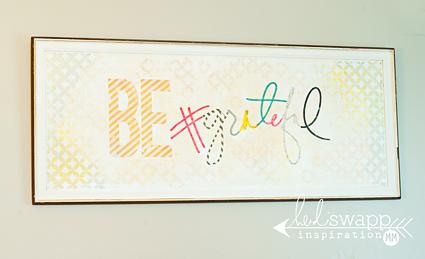
I've hung it in my dining room...and like I said before, I'm loving it. Luh-ving.
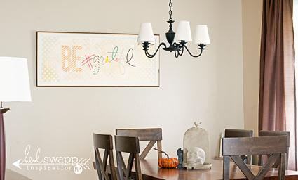
And because the colors aren't completely specifically fall, I can leave it up for all long as I'd like!
Supplies: Mixed Company 12x12 Paper Pad, Sugar Chic 12x12 Paper Pad, 12x12 Circle Lattice Stencil, Color Shine Coral, Color Shine Tinsel, Color Shine Navy, Color Shine Gold Lamé, Color Shine Mustard. All the items used for this project can be found at Michaels craft stores.
