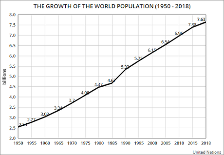

I found these charts interesting, and thought you might also. The top chart, using information from the United Nations - Population Division, shows the growth of the world's population from 1950 through 2018. In that time period, the population has tripled -- from 2.54 billion in 1950 to 7.63 billion in 2018.
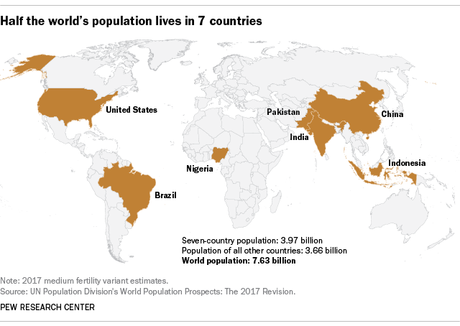
The second chart is from the Pew Research Center. It shows that over half of the world's population (about 52%) lives in just 7 countries -- China, India, Indonesia, Pakistan, Brazil, Nigeria, and the United States.

