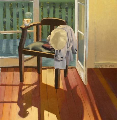
Three (oil on linen) © Samantha Groenestyn
I’m thinking a little more, as I’m painting, back in Brisbane, of shadows and the way they cradle and nudge the light. Not just as blank shapes, jagged voids piercing a picture, but as quiet and thoughtful terrain in their own right, and as the unshakeable support for the regions washed in light.
Nelson (p. 159) questions the modernist preference for light. ‘Things which stand out are privileged over conditions which recede,’ he writes, ‘but upon which the outstanding paradoxically depends. Shadow is relegated to the background, as though it were not integral to the image.’ He calls this modernist bias ‘photocentricity’ (p. 159), considering it the symbol of our current artistic malaise; a retina-burning dependence on flood-lit, full-chroma colours ignoring the gentle nuances of recesses folding away from the gaze, the hushed down-planes and the subdued forms shying away from the light. The quiet mystery of the dark side of the moon. Our pictures are flatter, brighter, and possibly rely more often on crisp linework to divide form from form, with shadows seeming heavy and mood-killing; overly dramatic. Modern comics, drawn on digital tablets and coloured boldly. Modern illustrations, wispy and watercoloured. The modern aesthetic is as light-obsessed as a moth.
The great eighteenth-century Western project wears the title baldly and proudly: the enlightenment extolls ‘light as intelligence and shadow as ignorance,’ (Nelson, p. 161). Shadows are dubious, guileful and deceptive. We want back-lit, fluorescent, LED brilliance, lighting our paths and shining the way forward.
In physics, one can create light by constructing electric currents and attaching filaments and such, and, in a more abstract sense, one can fill a space with light. But it is nonsensical to talk of filling a space with dark—shadow is the natural default which science allows us to manipulate. Painting equalises this bias—the painter creates shadows in just the same way as she creates light. This is the sort of super power you want to make good use of.

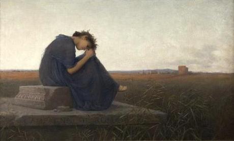
Campagna di Roma. Grabmal der Caecilia Metella, 1894. (c) Rudolf Bacher; Belvedere Wien.
In the Lower Belvedere I found myself mesmerised by the subdued, neutral colours of Rudolf Bacher’s Campagna di Roma – Grabmal der Caecilia Metella. The girl is described with delicate modelling, her skin soft and pink, her blue dress airy in the breeze, but she rests completely in shade. Her understated colours are set starkly against the bright void of sky, the light, for once, supporting the shadow. Again, Bacher’s Redeemed, seemingly softly lit, but defiantly in shadow as evinced by the brilliant shape on the wall cast by light pouring through the window. I’ve wanted to toy with these ideas, accepting that though light is ever present, it might not reveal the truth, and it certainly doesn’t hold the secrets.
Nelson, Robert. 2010. The visual language of painting: An aesthetic analysis of representational technique. Australian Scholarly Publishing: Melbourne.

