Politics Magazine

Seven Charts That Should Shame All Americans

Posted on the 18 May 2018 by Jobsanger
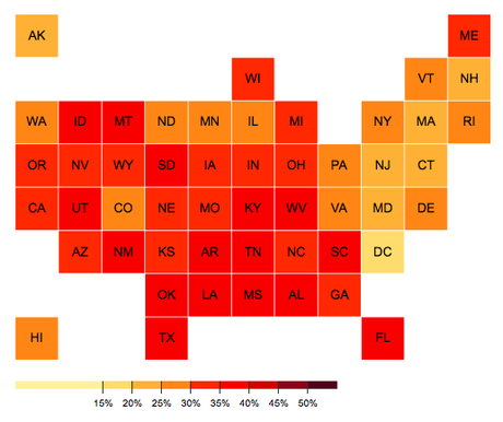
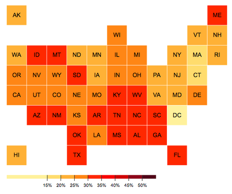
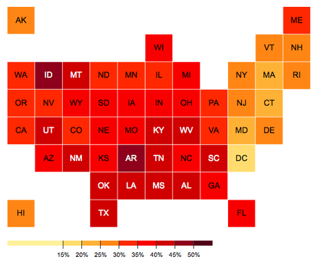
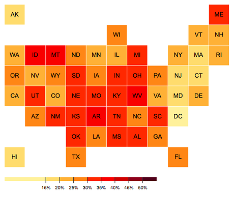
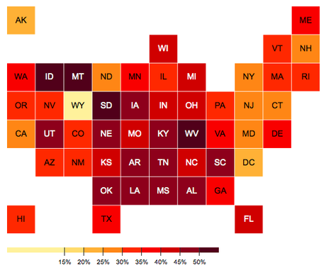
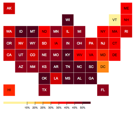
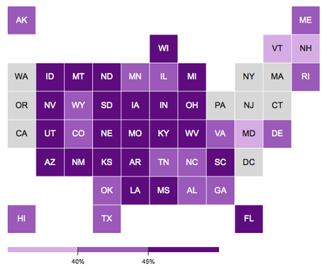
The charts below are from Oxfam America. They show the number of Americans living in or near poverty, even though they are working at a full-time job. You can go to the Oxfam website to see the interaction charts, showing the exact figures for each state. On the charts below, the darker colors represent a higher percentage. These charts show the percentages working for less than $12 an hour (a poverty wage), and the percentage without any paid sick leave.
According to Oxfam America:

The federal minimum wage has been stuck at $7.25 an hour for seven years. This is a poverty wage, and has an effect on wages for millions of jobs. Overall, 58.3 million workers (43.7 percent) earn under $15 an hour; 41.7 million (31.3 percent) earn under $12 an hour.

Percentage Making Less Than $12 An Hour
Seven Charts That Should Shame All Americans
Percentage Of Men Making Under $12 An Hour
Seven Charts That Should Shame All Americans
Percentage Of Women Making Less Than $12 An Hour
Seven Charts That Should Shame All Americans
Percentage Of Whites Making Less Than $12 An Hour
Seven Charts That Should Shame All Americans
Percentage Of Blacks Making Less Than $12 An Hour
Seven Charts That Should Shame All Americans
Percentage Of Hispanics Making Less Than $12 An Hour
Seven Charts That Should Shame All Americans
Percentage Of Workers Without Any Paid Sick Leave
Seven Charts That Should Shame All Americans

Back to Featured Articles on Logo Paperblog