In praise of simplicity
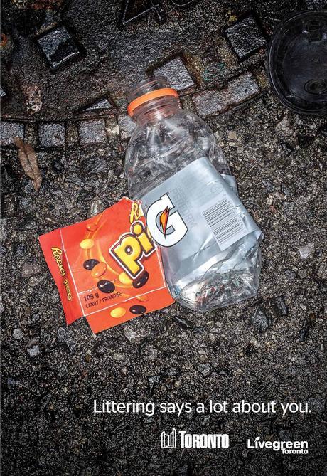
Regular readers here will know that I am a big fan of simplicity and elegance when it comes to communication. Often verbal communicators (such as preachers) multiply words whilst dividing clarity. This is one of the reasons I always encourage them to look at the creative output of other communicators, especially those in non-religious contexts. Yesterday, I came across the Livegreen campaign to keep Toronto tidy. Their poster campaign is made up of high resolution images of …rubbish. Each photograph puts together two pieces of litter in such a way as to ‘say’ something about the person who dropped it. The adds are simple, poignant, and memorable.

Image from Livegreen. CLICK for full size
Meanwhile, the IKEA advert below rehearses an old cliche about how we all need to get back to the good old book. The book in question is, of course, their catalog. However, they do it all with such elegance, and the presenter narrates it with such puppy-dog enthusiasm, that it is hard not to smile, don’t you think?
