With my recipes page, you have always had a very limited view of my posted recipes. To see everything I had posted, you needed to search through the archives or keep linking through 'older posts'.
These new dynamic templates showcase your blog and posts in some clever ways. The reader can choose which design to view the blog in, such as the magazine view, currently on my recipes blog. What do you think? It's more functional, right? Is it more helpful to you in locating/viewing recipes?

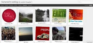
Blogger's "snapshot" template
I like this magazine style, and the classic, but the snapshot view is fun too. I've applied this snapshot view to my Cooking With Dreena blog (if you're not familiar with this blog it has cookbook recipe edits, pantry lists, some cooking tips, etc). There aren't as many posts on this blog, but you get the idea. (But, you should be able to switch back and forth and view the different styles from the toolbar at the top - can you?)So, do you like this new format for my recipes page?
(And, I'm back with a giveaway next post!)
