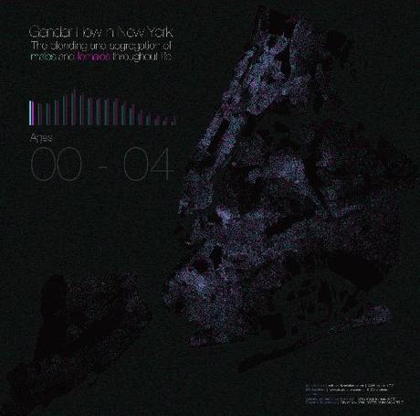
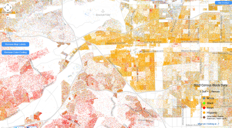
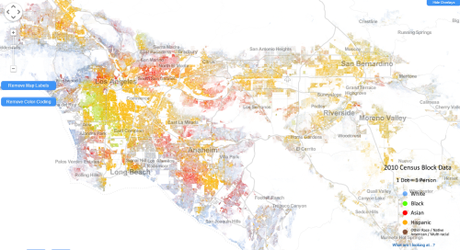
Two examples of dot density maps, which are primarily used to visualize demographic space.
At UXBlog: The Dispersion of Life and Gender in New York City
“Now it gets interesting. We are in the age-span where teens/young adults can choose where to live. And they choose paths that are not gender-neutral. Immediately we see clusters of females and, to a lesser extent, clusters of males. What’s the deal? College. And prisons.”
Also notice the disappearance of NYC males at the outer edge of life: women outnumber men 2-to-1.

The Racial Dot Map is equally interesting. 1 dot = 1 person, coded for reported race or ethnicity. It is the most detailed visualization of U.S. racial data ever compiled. Here’s a screenshot of my Heimat, California’s Inland Empire, the urban and suburban sprawl between Los Angeles and Riverside:

Asians crowd into upper middle class enclaves in the hills. That’s a stereotype in the area: if the town ends in “hills” or “heights,” it’s an Asian town. The stereotype is generally true.
While most of America flushes blue (white), most of the L.A. Southland flushes yellow (Hispanic).

Rich whites crowd along the coasts. Further inland, the black/Hispanic borderland of South Los Angeles is the site of often violent turf warfare between black and Mexican gangs. Both of my parents grew up in South Los Angeles, in Lynwood, between South Gate and Compton. My father attended Compton College; his grandfather owned a gas station in Compton. It would be fascinating to see a diachronic dot density map of this area. The direction and intensity of white flight and black replacement, followed by the direction and intensity of white and black displacement by Hispanics after the 1970s.
Any demographic discussion that does not make reference to these dot density maps is inadequate. They are, in the words of the UXBlog, the most “truthful” maps for visualizing social data. 1 dot = 1 data point.
Of course, the maps, as presented, still have limitations. Big ones. For example, in the racial map above, the ethnic classifications come from U.S. Census data, which deploy the misleading term “Hispanic,” a catch-all word invented in 1970 by D.C. Anglos who didn’t know the difference between Ibizans, mestizos, and Amerinds but realized they couldn’t keep calling them all “white.” In reality, some Hispanic dots have predominantly European ancestry and look like John Travolta while others have predominantly Amerind ancestry. Most are mestizo (60% European and 40% Amerind, on average, for Mexicans). Depending on ZIP code, 40-70% of California Hispanics check “white” on the racial portion of the Census form. The map could be improved by turning Hispanic yellow into at least 2 shades—one for mestizos and Ibizans, the other for individuals who primarily identify as Amerinds.
However, this limitation is a limitation of data-collection, not a limitation inherent in dot density maps. The maps can handle complications. Can the data collectors?
