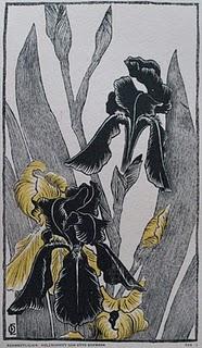
 Otto Eckmann, SchwertlilienColour woodcut, 1895
In many ways, the career of Otto Eckmann can be seen as pivotal in the democratization of art. This is true both in the way he blurred the distinction between fine and decorative arts, and in the way he renounced oil painting, which was geared to an art market of the rich and powerful, for popular and commercial art forms that reached as wide an audience as possible.
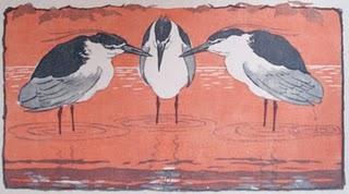
 Otto Eckmann, NachtreiherColour woodcut, 1896
The extent to which craft decisions influenced artistic outcomes in his work can be seen in my two colour woodblock prints. Both were published by Pan, and both were printed by Gieseke und Devrient in Leipzig. Although both are intended to be independent graphic images, I could easily imagine either of them being put to commercial use: Schwertlilien as a repeat image on a textile, for instance, or Nachtreiher as a motif on ceramics. And in each case decisions about processes and materials have decisively influenced the aesthetics of the final print. Schwertlilien (Irises), with its sharp outlines and bold contrasts between the black and yellow of the flowers, the grey of their leaves, and the uninked background, has been printed on cream wove paper. The creaminess softens the image and prevents it from being stark and challenging, while the robust thickness and open texture of the paper give an organic solidity to the print. By contrast, the ethereal Nachtreiher (Night herons), is printed on delicate, wafer-thin china paper, which is then floated onto a wove backing sheet. The resulting print has a dreamlike quality, as if the herons are conferring on some matter of mystical importance. This is quite at odds with the immediate physicality of the irises, which feel as if you could reach out and pluck them from the page.

