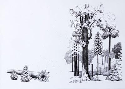
Black plate illustration for pages 6-7 The Biggest Living Thing (Carolrhoda, 1983) Pencil drawing by Caroline Arnold
Today's children’s books are printed with beautiful full color illustrations created with a vast array of artistic techniques—painting, drawing, collage, photography, mixed-media--basically anything that can be digitally color scanned. Those scans are then used to make the printing plates for the book. Typically there are four plates: black, cyan, magenta, yellow. (These are the same colors in the ink cartridges of your home printer.) On the printed page the colors merge to create a full range of hues.
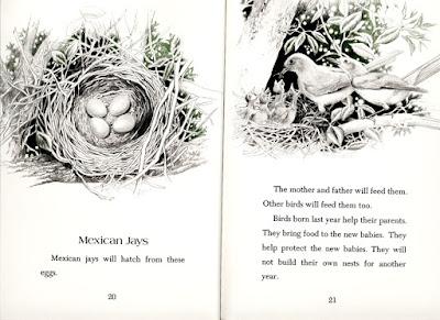
Pages 20-21 of my book Five Nests (E.P. Dutton, 1980). Illustration by Ruth Sanderson.
But in 1980, when I first started publishing books for children, many were illustrated with black-and-white art, especially if they were nonfiction books, like mine. Digital scanning had not yet been invented and the cost of separating colors photographically to make each of the colored printing plates was so high that only the most established artists worked in full color. Many books were printed with black plus in some cases one or two colors. Five Nests, illustrated by Ruth Sanderson, was my first published book.The art was black, plus one color--green.
For most children’s books in those days, the artist was required to make a separate drawing for each printed color. Thus the art was “pre-separated” not needing expensive photographic separation. It was a technical process, converting the intensity of each color to shades of gray and then calculating how the colors would appear when overlapped on the printed page.
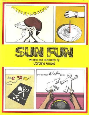
Cover of Sun Fun, an activity book.
My first opportunity to illustrate one of my books was Sun Fun (Franklin Watts, 1982) a book of simple projects about the sun and solar energy. It was a two color book. Obviously, I chose yellow for one of the colors. The other color I chose was red. As they overlapped in the printing I could achieve a range of colors from pink and orange to brown and gray.
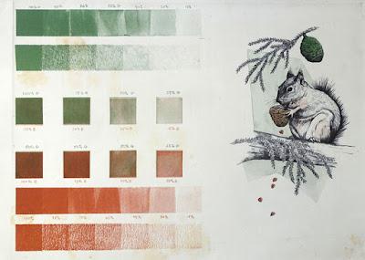
Proof sheet for page 39. Squirrels help spread Sequoia seeds.
The second book I illustrated was my book about giant sequoia trees, The Biggest Living Thing (Carolrhoda, 1983.) This also was a two color book. I chose brown and green.
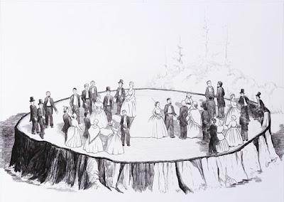
Black pencil drawing for pages 23-24. Space at top is left open for text. This Sequoia stump was so big it could be used as a dance floor.
The primary illustrations for the book were done in black pencil. Then working on a light table I created the pages for the two colors being careful to line up the registration marks to make sure that they would be in the correct places when the pages were printed.
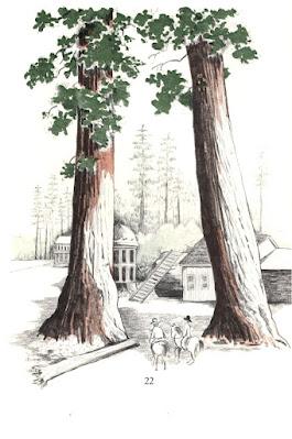
Page 22. Two color art. Black plus green and brown.
The Biggest Living Thing was a 48 page book. I began by doing the black-and-white drawings—24 double-page spreads. With the additional drawings for the two colors I did a total of 72 drawings plus a full color painting for the jacket. It was a lot of work--for not a lot of money. After finishing the project I decided to focus my energy on writing books rather than illustrating them.
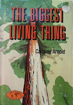
Jacket of The Biggest Living Thing. Watercolor painting.
Twenty years later the world had changed. Digital separation made it possible to illustrate without pre-separating. I began to illustrate again, this time using a cut-paper collage technique. But that is another story.
Note: The original art for The Biggest Living Thing is archived in the Kerlan Collection at the University of Minnesota.
