I am proud to have Philippe Apleoig as my Parisian of the Month. Philippe is one of the greatest graphic designers of his generation, working for very prestigious clients including Yves St. Laurent, Pierre Berge Foundation, Hermes, Musée d'Orsay, and Theatre du Chatelet. Don't miss the wonderful retrospective of his work at Musée des Arts Décoratifs.
Where were you born and where did you grow up?
I was born in Paris in November 1962. My parents moved to Vitry-sur-Seine, a working class suburb in the south of Paris, when I was two years old. They ran a small store where they sold and repaired electrical equipment and appliances, such as televisions, radios, and refrigerators. We lived in very modest conditions. I grew up there until we moved to Choisy-le-Roi. When I was 15 years old, my literature teacher suggested that my parents send me to a high school in Paris, where I would have better learning opportunities. However, it was in Vitry-sur-Seine when I was still a child that my parents signed me up for drawing and modern dance classes at the local art academy. The drawing and painting teacher showed the class a series of art books from the public library, and it was through reproductions in those books that I discovered Corot, Picasso, Ingres, and Van Gogh. It was also in Vitry-sur-Seine that I discovered American contemporary dance. I will never forget seeing Martha Graham, Alwin Nikolais, and Merce Cunningham perform for the first time. I was fascinated by this magical, avant-garde world.
At what age did you discover you were attracted to graphic design and when did you know you wanted to pursue it as a career?
I was only 20 years old in the summer of 1983 when I arrived at Total Design in Amsterdam. I had taken two years of art classes previously. During my studies at the École supérieure des arts appliqués Duperré, one of our teachers, the eminent calligrapher Roger Druet taught us calligraphy and introduced us to typography. It was absolutely not what I was dreaming of. I wanted to paint and to become a choreographer, but I was a dedicated student and I was openminded about learning something new. I wanted to absorb knowledge that would drive me somewhere, professionally speaking. I was afraid that becoming a painter would not be possible due to my family’s financial situation. I knew that I had to learn a skill to earn my way and to become independent.
It was Mr. Druet who encouraged me to contact Total Design, which I did, and the studio accepted me as an intern. When I arrived in Amsterdam I was a virgin in terms of graphic design—my ignorance was huge. I was impressed by the rigorous work ethic at Total Design, and I was thrilled to work on a number of art catalogues as well as a promotional poster and brochures for the Boymans-van Beuningen Museum of Rotterdam. I was fascinated by Total Design’s radical modernism—in some ways, it reminded me of my passion for modern dance. I was extremely drawn to abstraction as well. I visited the Stedelijk Museum often, where I discovered Mondrian and Malevich.
I returned to Paris, finished my Bachelor of Arts degree and signed up for a Master’s degree at the École nationale supérieure des Arts Décoratifs (Ensad). At that time, typography was not a fashionable subject. This was especially true in France, where the trend focused on the Polish school of posters and the Grapus group, whose members used handwritten text, symbols, and mixed painting and photography. Many of the students were attracted to this rejection of the Swiss international style—it was considered old-fashioned. I didn’t know how to position myself in this context; I was still taking dance classes and painting and drawing. I spent a lot of time in the theater, where I discovered the work of Pina Bausch and the Wuppertal Dance Theater, which touched me profoundly.
To pay for my living expenses and schooling I did illustrations in gouache and ink for various magazines. As I was looking for another small job, I came upon an opportunity with the Cité des Sciences et de l'Industrie, a new museum which had not yet opened. It was located in northeast Paris within the Parc de la Villette and was being built to promote scientific and technical culture for a broad public. After I showed the Cité des Sciences interviewing team my final Total Design internship report, they informed me that Total Design had just won the competition to design their signage. I wrote a letter to TD immediately, letting them know that I wanted to return for a second internship. They remembered and appreciated my enthusiasm for their approach, so welcomed me back, two years later. It was during this second internship, in the summer of 1985, that I committed to becoming a graphic designer.
Before returning to the Netherlands, though, I had responded to an ad posted in Ensad’s student services office. The Musée d’Orsay, which was under construction, was looking for an in-house graphic designer. I applied, and after flying round-trip to Paris from Amsterdam to interview, was asked by the museum director to join the Orsay team. That was in September 1985. Though I began my career as a professional designer rather quickly, I was aware that I still had a great deal more more to learn!

Ontwerp : Total Design
⁃ Design by Frans Lieshout (born in 1956)
⁃ Catalogue cover for the exhibition
⁃ 20 years Total Design, 1985

⁃ Poster for the Musée d'Orsay, Paris
⁃ 1987
Early in your career you went to work in Los Angeles. Can you tell us about that experience and how you liked the American landscape and culture? Did it influence your work?
The first time I encountered April Greiman’s work was in a book I discovered in the Total Design library. The title was “Posters by Members of the Alliance Graphique Internationale 1960-1985,” edited by Rudolph de Harak. I was stunned to see a poster designed by April, titled “Your Turn, My Turn” (1983), which had a strong aesthetic and free approach that were so different from the other works. The composition was comprised of a a sophisticated collage of images, abstract shapes, and typographical elements that seemed to be in motion. It was very colorful and conceived to be viewed using 3D glasses. April’s graphic language seemed so fresh to me, and so unexpected that I wanted to know who she was. It drew me to the United States for the very first time.
I traveled to Los Angeles in 1986, just after the Musée d’Orsay opened to the public. I will never forget entering April’s studio for the first time. I felt as if I had walked into one of her posters. The interior design was in total harmony with what I knew of her work; it felt as if everything was floating in space, with bizarre angles and shapes, unbelievable touches of color, fabulous light. Later I asked her if she would take me on as an intern ; I wanted to learn from her. I was impressed by her background—she had studied in Switzerland with Armin Hofmann and Wolfgang Weingart. April was very comfortable with typography ; she played with it and made it look very free, very inventive. I wanted to follow her in that direction.
However, what I didn’t know when April welcomed me into her studio at the end of 1987 was that she would introduce me to the computer and to new technology applied to graphic design. That was a big jump and way beyond where everyone else was at that time. I was completely destabilized until, slowly, I caught up with this new way of working. April influenced me in other ways as well, ways that I didn’t recognize at first. She drew from other cultures for inspiration: for instance, the arts and crafts of Mexico, Japan, and China. April showed me how to combine the formative principles of typography with elements borrowed from world cultures. In addition, her passion for nature and the landscape surrounding Los Angeles was contagious. She taught me how to perceive light and to be sensitive to the natural harmony of rocks and plants. In many regards, April helped me to discover America : its incredible mosaic of people and its monumental, seemingly untouched, landscapes. In retrospect, I think for me that American culture shed light on the interface between humanity and technology. It was later, after I had spent more time in New York, living there, being confronted with the city’s relentless energy, that I discovered how comfortable New York felt to me—it became a second home, one I felt a natural part of.

Comme un coursier indompté
⁃ Slipcase for the Centre national des arts plastiques
⁃ 1989

Bilan et perspectives '89
⁃ les arts plastiques
⁃ Press release for the Ministère de la Culture et de la Communication
⁃ 1989
What are some of your design influences?
Wim Crouwel and the Total Design team, and April Greiman, of course. I want to mention Wolfgang Weingart as well, as I was an admirer of his posters.

Vormgevers
⁃ Poster designed by Wim Crouwel (born in 1928)
⁃ 1968

Poster for the exhibition Wim Crouwel : A Graphic Odyssey
⁃ held at the Design Museum, London.
⁃ Philippe Apeloig was asked to design a poster
⁃ based on the same grid as Wim Crouwel's poster Vorm Gevers
⁃ 2011
Much of your work is in the arts arena including museums and art institutions. Were these areas you naturally gravitated to or did the commissions just come to you?
From childhood through my teenage years, I liked to visit museums. Looking at paintings has a magnetic effect on me. However, I cannot say that it was natural for me to work for museums, even though my first job was at the Musée d’Orsay. I was not born in a family that naturally – or I might say, culturally – made contact with the art scene. I found my way alone, driven by teachers and by random encounters throughout my formative years. The initiation into working for art institutions was rather brutal, because it happened at a very young age. But when I grew to appreciate my good fortune in landing the job at the Musée d’Orsay, I jumped into it—I wanted to be adopted by that world. I had to do two things to excel in it: I had to learn discipline and to constantly refresh my gaze. Working as a designer for museums and art institutions has not only opened my eyes but has allowed me to address the human condition—fragility, passion, conflict, joy, sorrow, peace. I try to shape these complex, abstract, and immaterial concepts into graphic form using subtlety, above all.

Louvre, Dix ans de la pyramide, Saison 1998-99
Poster celebating 10 years of the Louvre pyramid 1998

⁃ Poster for the Petit Palais, Paris
⁃ 2010
You have also worked with many luxury fashion brands. How does working with fashion clients differ from art and cultural institutions?
There is no difference. The same design requirements apply.

⁃ Poster for Hermès Jumping International
⁃ 2013
It must be thrilling to have been invited by the Musée de Decoratifs to exhibit your work. How did the opportunity come about and please tell us about the show.
The idea for the exhibition was initiated by the book. It took more than five years for Tino Grass, a young German designer, to collect my archives, to classify them, and then to make a selection of the work for the book.
I remember being contacted by Tino in 2007 while he was a student at the Fachhochschule in Düsseldorf. He was working on a book project dedicated to typographic designers that was later published under the title Schriftgestalten by the Swiss publisher Niggli. Tino included my work and a text that he wrote which was initially part of an interview with other designers, including Hans Rudolf Bosshard, Luc(as) de Groot, Hans-Jürg Hunziker, Uwe Loesch, Fred Smeijers, and Kurt Weidemann. When he finished this book, I invited him to come to Paris to work on a book with me.
Tino began by classifying my archives. He looked at all of the extant material and together we selected what would be included in the book. Then we approached publishers. Niggli was interested in publishing it in German; we did not immediately find either a French or English publisher. In 2011, I was working on both the signage and a catalogue for an exhibition at The Musée des Arts Décoratifs in Paris when I was approached by the museum director, Béatrice Salmon. She told me that she was very interested in publishing the book, but wanted an accompanying exhibition. Neither I nor Tino nor the others working in my studio—Yannick James and Anna Brugger—had planned to organize an exhibition, but that is how it happened. Anna helped Tino design the book and assemble all the elements –the high-resolution images and edited texts –while Yannick became the curator of the exhibition in our studio. We knew that it would mean a huge amount of work for our very small team, but we managed it from A to Z.
All of us were driven by the desire to make the exhibition pedagogical, that is, to show the design process. Tino advised us to reserve one room for showing book design, while Yannick created another space for showing logos. The logos were shown on screens, as animations. Twelve logos were singled out and presented on larger screens; these illustrated the design progression, step by step, from the beginning sketches to the final version. Yet another room was dedicated to sketches. At the entrance to that room we placed the following text, which I wrote:
“When I take on a job, I don’t immediately know what I shall do. I do my utmost to focus my thoughts, but my attention wanders aimlessly at first: I let things float by me – images, objects, things I’ve read, sounds – I’m active by being receptive. I never have a preconceived idea which would only require me to invent a visual to translate it. I’m not illustrating.
I’m receptive, welcoming things, and this phase helps me push away a sort of insecurity and keeps worry at bay. When I realize that the proposed project is no longer foreign to me and that I have started to appropriate it, my disquiet starts to be productive. Sketches begin to pile up, I change things, everything moves. I have to work with constraints, for example the number of letters in a word or title.
I work with the luck of the draw, like in gambling. The letter arrangements that I try out, the ones that impose themselves, end up taking the right form, the correct form in my eyes. That’s when I fix it, immobilize it, and the searching stops, at the pivotal point, supported by what becomes a mass of preparatory sketches. That’s when I can go and show it to the client, justifying it if necessary.”


Typorama, Graphic work of Philippe Apeloig
Edited by Tino Grass
Essays by Alice Morgaine and Ellen Lupton
Project texts in english by Ann Holcomb, based on original concepts by Philippe Apeloig
Project texts in french edited and corrected by Michel Wlassikoff
Design: Tino Grass with the participation of Anna Brugger for Studio Apeloig
Cover: Philippe Apeloig
French version: Éditions Les Arts Décoratifs
English version: Thames & Hudson


Hall way presenting ten fonts edited by the suiss type Fondery Nouvelle Noire.
www.nouvellenoire.ch

In the studio
Sketches' room, revealing the design process behind some of the posters.
If you could have dinner with someone from history, who would be and what would you serve them?
Johannes Vermeer, Caravaggio, Baruch Spinoza, Franz Kafka, Juan Miro, Federico Fellini, and Simone de Beauvoir, and so many more. I would pay no attention to the food served, but I would swallow their words. I would ask them to help me to understand their vision of the world and how to create, to be free, and not be afraid of how time flies, and how best to use one’ brief life.
Who in the design world do you admire?
Cassandre, the Stenberg brothers, Wim Crouwel, Paul Rand, Wolfgang Weingart, and April Greiman.
What arrondissement do you live in and what do you like best about it?
I live in the 9th arrondissement of Paris in the Drouot Quarter, a kind of financial district where there are also many auction houses and antique shops. I miss nature, though; there are almost no trees. However, I really like the Haussmann style of the architecture. Most of the facades are restored and cleaned up. The buildings house offices for the headquarters of banks and insurance companies. Even if the neighborhood no longer has the artistic flavor that it used to have during the 19th century, it is still the Paris of Balzac.
What do you prefer about Paris?
“La Liberté” (as in Paul Eluard’s 1942 Resistance poem: “j’écris ton nom, liberté”).
Typorama, Exhibition
Till March 30th, 2014
Curated by :
Amélie Gastaut, Curator of the Advertising Department
Yannick James, for the Studio Philippe Apeloig
Musée des Arts décoratifs
107, rue de Rivoli, 75001 Paris
www.lesartsdecoratifs.fr
Open Tuesday to Sunday 11AM to 6PM,Thursday till 9PM
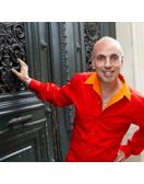
Top photo of Philippe Apeloig © Carlos Freire, 2013
All photos of exibition and book © Prisca Martaguet

I am happy to announce the launch of Eye Prefer Paris Cooking Classes. Come take an ethnic culinary journey with me and chef and caterer Charlotte Puckette, co-author of the bestseller The Ethnic Paris Cookbook (with Olivia Kiang-Snaije). First we will shop at a Paris green-market for the freshest ingredients and then return to Charlotte's professional kitchen near the Eiffel Tower to cook a three-course lunch. After, we will indulge in the delicious feast we prepared along with hand-selected wines.
Cost: 185 euros per person (about $240)
Time: 9:30AM- 2PM (approximately 4 1/2 hours)
Location: We will meet by a metro station close to the market
Class days: Tuesday,Wednesday, Thursday,Friday, Saturday, and Sunday
Minimum of 2 students, maximum 6 students.
Click here to sign up for the next class or for more info.

I am pleased as punch to announce the launch of Eye Prefer Paris Tours, which are 3-hour walking tours I will personally be leading. The Eye Prefer Paris Tour includes many of the places I have written about such as small museums & galleries, restaurants, cafes & food markets, secret addresses, fashion & home boutiques, parks, and much more.
Tours cost 210 euros for up to 3 people, and 70 euros for each additional person. I look forward to meeting you on my tours and it will be my pleasure and delight to show you my insiders Paris.
Check it out at www.eyepreferparistours.com
Click here to watch a video of our famous Marais tour