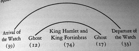
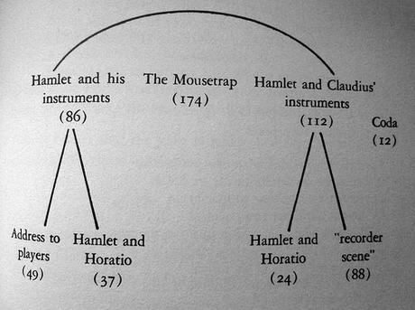
This is about an incidental remark in the Preface, something of an apology (p. viii):
A critic attempting to talk concretely about Shakespearean structure has two choices. He can create an artificial language of his own, which has the advantage of precision; or he can make do with whatever words seem most useful at each stage in the argument, which has the advantage of comprehensibility. In general, I have chosen the latter course.Here’s two of those offending diagrams, from the Hamlet chapter, pages 97 and 103 respectively; you can see the line counts in parentheses:
The little charts and diagrams may initially give a false impression. I included these charts only reluctantly, deciding that, inelegant as they are, they provide an economical way of making certain matters clear. The numbers, usually line totals, sprinkled throughout may also give a false impression of exactness. I indicate line totals only to give a rough idea of the general proportions of a particular scene or segment.


What’s the fuss about? And there aren’t many of them. These are simple diagrams and, yes, without them, Rose’s accounts would be more difficult to understand. Indeed, without them, a reader would be tempted to sketch their own diagrams on convenient scraps of paper.
If figure Rose’s misgivings about the number are about humanistic ideology, we don’t do numbers. His willies about the diagrams may be that as well, but I think there’s something more there. The diagrams themselves are problematic simply because they ARE diagrams. They intrude too deeply into the inner workings of the humanistic mind. It’s like throwing a spanner into a machine; it gums-up the works.
It’s one thing to have pictures in an illustrated edition of, say, Hamlet, pictures depicting a scene in the play. That’s fine, for it’s consistent with the narrative flow. And it’s fine to have illustrations in, say, an article about the Elizabethan theatre, where you need to depict the stage layout or the relationship between the stage and the seating. Such illustrations are consistent with the ongoing flow of thought.
Those diagrams, however regrettably necessary, are different. It’s not that they’re inconsistent with the flow of thought. They’re not. They’re essential to it. But they indicate that this kind of thinking is not quite kosher. Why not? How do these simple diagrams intrude on the humanistic mind, while more elaborate images of the type mentioned in the previous paragraph, while those images are fine?
I think it’s because the humanistic mind has somehow become fundamentally discursive–see my post, Humanistic Thought as Prose-Centric Thought. Illustrations are not problematic, because they depict whatever it is you’re thinking about. Rose’s diagrams, simple as they are, are different. Yes, they depict structure in Shakespeare’s plays, but it’s structure that is not apprehended visually. What you see on the page is one word after another, page after page. You never see scenes juxtaposed. What you see on the stage is talk after talk, action after action, but you don’t see a tableau of three or five scenes arrayed as in a multi-panel altarpiece. No, Rose’s diagrams aren’t images you think about, they’re images you are to think with, and that’s the problem. That’s what makes them intrusive.
Just why this is so, is not at all clear to me. But I’d bet it has to do with the brain. The cerebral cortex consists of some 100s of loosely distinct functional areas, each specialized for a different mental operation. I’d warrant that thinking with a diagram calls on a configuration of these functional areas that’s not normally part of the configuration used in humanistic thought. This is a matter of behavioral mode, as I’ve discussed it here and there. And that’s beyond the scope of this little note.

