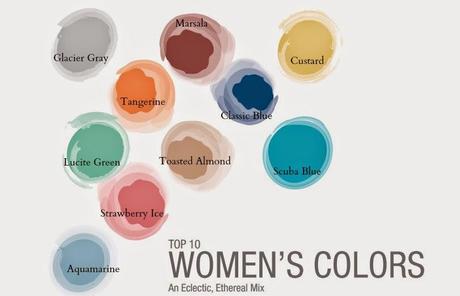

* Marsala - Sensual and bold, delicious Marsala is a daringly inviting tone that nurtures; exuding confidence and stability like the fortified wine that gives Marsala its name, this robust shade incorporates warmth and richness, while its grounding red-brown roots point to a sophisticated, natural earthiness.* Glacier Gray - Nature’s most perfect neutral, Glacier Gray is a shade that is timeless. Quietly assuring and peacefully relaxing. Glacier Gray is an unobtrusive gray that contrasts and enhances; bouncing off other shades without taking away from them. It slips into the background allowing other colors to take center stage.
* Custard - A delicious and delectable yellow.Sweet and sunny, Custard is a cheering tone that brings thoughts of pleasant relaxation. Engaging with its soft and mellow warmth and full of good feelings.* Tangerine - Spontaneous and gregarious, Tangerine is a juicy orange shade that is energizing, yet not jarring to the eye. Versatile Tangerine is striking enough to stand on its own. Good natured and friendly, but with a tangy edge, this fun-loving color invites a smile.* Strawberry Ice - A suggestive of a cooling and refreshing delicacy, yet its warmth is quite appealing. Subtle and charming makes it an ideal shade for Spring/Summer 2015. Both tasty and tasteful, Strawberry Ice is a confection color that evokes a feeling of being “in the pink,” emitting a flattering and healthy glow.* Toasted Almond - A sun-tanned neutral offers comforting warmth and is indicative of a spontaneous spring, summer feeling. Timeless and versatile, Toasted Almond is an organic shade that speaks to authenticity and all that is natural.* Classic Blue - Reliable and thoughtful, inspires calm, confidence and harmony. A shade that is strong and reliable. Just as with the sea, because of its waterborne qualities. It is perceived as thoughtful and introspective.* Lucite Green - Generally not thought of as a fashion color, though it does come back from time to time. A soothing green shade whose time has really come again. Fresh and clarifying, cool and refreshing, light in weight and also in tone. With its minty glow.Lucite Green seems almost transparent.* Scuba Blue - An invigorating turquoise, conveys a sense of carefree playfulness. Even though a cool shade, the vibrancy of Scuba Blue adds a splash of excitement to the pallette. It offers a feeling of escape as it is reminiscent of a tropical ocean. This stirring and energizing shade takes us off to an exotic paradise that is pleasant and inviting, even if only a fantasy.* Aquamarine - An airy blue with a dreamy feel. Cool and calming, ethereal Aquamarine is a shade with a wet and watery feel. Open and expansive, this restful blue also acts as a stress reducer.

