Pantone’s Going Green for 2017!
Pantone has released their fabled Colour of the Year for 2017 and it’s greener than a green thing that’s covered in green.
The Kings of Colour state that ‘Greenery’ is “symbolic of new beginnings”, evoking the first days of spring “when nature’s greens revive, restore and renew” – and for once, I love it.
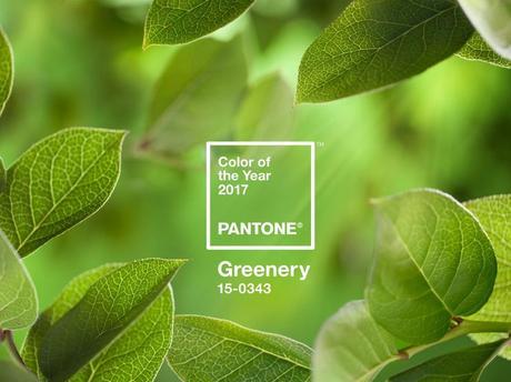
There aren’t many things that fire the synapses quite like the first shoots of spring, I’m sure you’ll agree.
You’ll know the feeling all too well if you walk your dog in the woods or out in the fields – seeing the season’s change from long nights to the longer days, flowers ‘springing’ up here and there – it certainly fills me with a sense of well-being that few other things are capable of.
With Greenery, Pantone is attempting to bring the great and green outdoors into our everyday lives.
Why Does Pantone Choose A Colour?
Since the turn of the century, Pantone has chosen a color of the year that’s supposed to reflect the current ‘cultural climate’.
Last year (as I discussed in this blog) they opted to go for two separate colours – Rose Quartz and Serenity – that reflected a societal change and the acceptance of “gender equality and fluidity”.
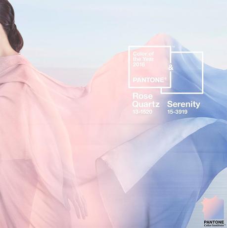
If I’m honest, I actually dismissed both colours at the time as being a little too babyish for my tastes and the reasoning behind Pantone’s choice was a little far-fetched in my humble opinion.
So with this year’s choice, what does Pantone say Greenery represents in modern society, and am I actually going to get on board with the concept?
What Does Pantone Say About Greenery?
Leatrice Eiseman, Executive Director of the Pantone Color Institute says of 2017’s choice: “Greenery bursts forth in 2017 to provide us with the reassurance we yearn for amid a tumultuous social and political environment.”
I can only assume, in the final few words of that statement, she’s alluding to the fact that the Americans have put the human equivalent of Kermit the Frog in the White House for the next four years (at least).

Which is ironic really, considering that Kermit is the greenest of the green frogs that most of us will have ever seen and he is a surefire bet to always bring calmness and reassurance to any situation.
But far from being a socio-political color choice, Greenery is also about our basic human need to be at one with nature.
This is a point reinforced by Leatrice Eiseman who added that “Greenery symbolises the reconnection we seek with nature, one another and a larger purpose.”
And if I am honest I can totally see where she’s coming from.
A Basic Need For Nature
Pantone is right to say that we ‘need’ to have a little natural color in our lives.
This is the exact reason that we have ‘green spaces’ in towns and cities.
Why New York has Central Park, why the city of London is pock-marked with green recreational spaces and why every town has a park and every village has a green.
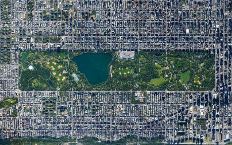
As Pantone say: “Green is nature’s neutral” and the more we humans are surrounded by the electronic world and everything in it, the more we need natural surroundings to balance it out.
And with this growing desire to reconnect with the natural world, Greenery not only represents nature but the freedom associated with it too.
It’s a reinvigorating color. One that elicits a feeling of rebirth, reawakening and revival.
In fact, Forbes saw it the same way, saying that Greenery calls to mind the ‘re-‘ words: “refresh, revive, restore, renew, replenish, regenerate, rejuvenate, reinvigorate, re-oxygenate.”
How To Use Greenery In Your Home
There are loads of accessories and furnishings that you can incorporate into your home decor that feature Greenery – I’ve even had a few myself down the years.
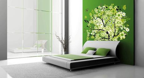
From wall decals that have green birds and plant life, to full feature walls that embrace the natural ethos, adding green shouldn’t be a problem.
But what about things to go with it?
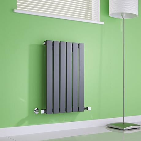
Of course, this is Best Heating, so I am obviously talking about radiators and heated towel rails – and you’d be surprised by how well white, black and anthracite radiators actually go with green.
This, for example, is from the Milano Alpha range and (I think) it showcases wonderfully just how complementary the two colours are.
But it’s not just the designer radiators that go well with the old greenery, the HTRs do a pretty fine job of stepping up to the plate too.
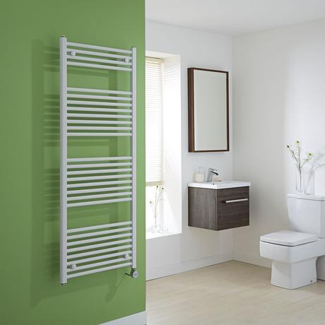
Green is often a very popular color for the bathroom or the ensuite, due to its calming effect and ability to relax us more than almost any color – Houzz did a great article on when to use green, check it out here.
But the Milano Calder range of Heated Towel Rails is a great way to add a sleek designer feel to a green space in your home.
I’m sure you’ll agree with me when I say that Pantone have made a great choice for 2017. It’s better than the baby blue and pink of 2016 and is definitely a color I can get on board with.
Now if only I can convince my missus to go back to all the green accessories we had before we recently moved.
If only…
How Will You Use Greenery?
I’d love to know what you think of this years Pantone Colour of the Year.
How would you use it in your home?
Is it a bathroom, sitting room or kitchen colour?
Do you even like it, or is it a little too green for your tastes?

Let me know in the comments below.
Stay safe & happy heating!

