As we step into 2022 with renewed vigour and hope, it is that time of the year when we welcome new trends and embrace new beginnings. It is also the time for the Pantone color of the year. Reflecting the global mood and expectations from the new year, Pantone this time has gone all out and created a brand-new colour, Very Peri which has been designated as the color of 2022. PANTONE 17-3938 Very Peri as described by the company is “the happiest and warmest of all the blue hues and introduces an empowering mix of newness”.
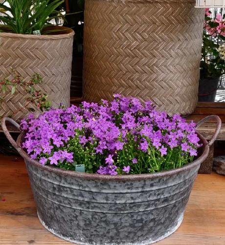
Hope and Buoyancy
A symbol of transition, high spiritedness and joy, Very Peri has been described by Pantone as “a dynamic periwinkle blue hue with a vivifying violet red undertone that blends the faithfulness and constancy of blue with the energy and excitement of red”. . A perfect synergy of two diametrically different shades, Very Peri is a color that sparks both curiosity and creativity which is ideal for the transformative times we live in and navigate the phygital world. A millennial tone that is completely refreshing, Very peri inspires innovation and brings in an element of novelty.
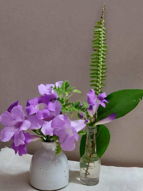
Element of playful freshness
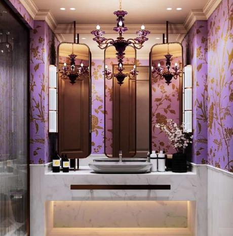
When it comes to home décor, Very Peri is the perfect hue to add in a pop of color to an otherwise neutral space or muted color palette. An ideal way to add an element of surprise it is a great idea to introduce it on an accent wall or as a statement color in the foyer area or hallway. “A Very Peri painted wall would make for quite an eclectic backdrop for a family room, it can be paired with furniture in neutral shades with cream and ivory accents to create an effortlessly modern look. For the bold hearted ones, a dramatic entrance foyer in Very Peri can be an interesting option as it is a color which when well-lit can brighten a space and when dimly lit can add drama to the setting” says Sanjana Lunia, founder Eris Home. A unique shade that looks purple in a bright setting and a deep blue in a dim space, Very Peri is a color that adds invigorating as well as serene vibes.
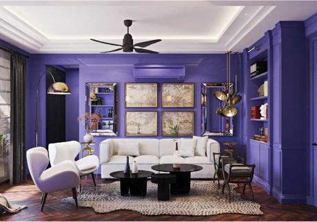
Ideas aplenty
Given that this color can be both raw and luxurious makes it extremely versatile and a treat to home décor enthusiasts. From furnishings, artefacts, art work to even fresh flowers, the color has the ability to enliven the space almost effortlessly and in a jiffy. For your living area, consider throws or plush cushion covers or even rugs dipped in Very Peri while combining it with whites, gray or even taupe for an elegant look and understated luxury. A wonderful color for furnishings, it works well on velvets and/or silks as the sheen on these fabrics go very well with the shade. For the bedrooms, you can opt for pillow cases or a textured head board in this shade to add a contrast against white, cream or ivory sheets. Table linen in Very Peri has its own charm too.
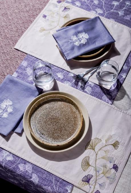
Dos and don’ts
- Very Peri is best when paired with neutrals and white.
- Add a pattern or two in order to tone down the color.
- Follow the 80:20 rule, wherein 80 is a neutral shade and 20 is Very Peri.
- Lighting is key to accentuate or tone down the look of the space when using it on a wall.
- Limit the use of the color to one statement piece per space
An elaborate version of this article was originally published in Zee Zest.
