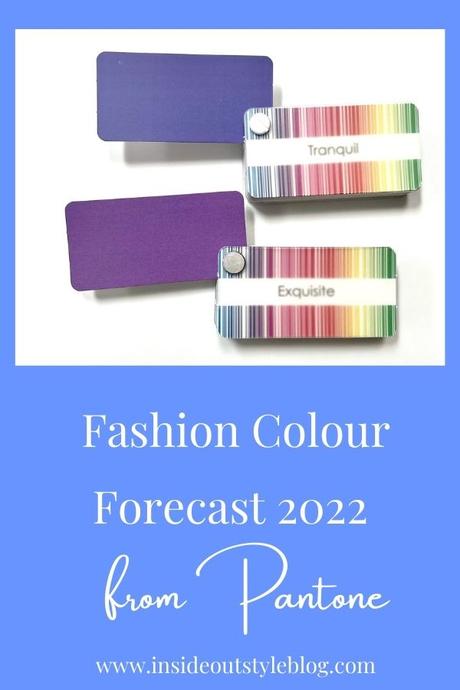


Each season, Pantone puts together a forecast of what they see as upcoming fashion color trends based on catwalks and interior design and the general mood of the times. They also put out a forecast for a color of the year as well and have just released their 2022 color of the year which they are calling Very Peri (as in a very periwinkle blue). It’s a big change from this year’s colours (Ultimate Grey and Illuminating Yellow) and they describe it as a color that encourages creativity and personal inventiveness.
Pantone Very Peri – Colour of 2022

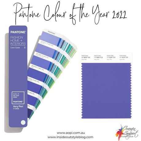
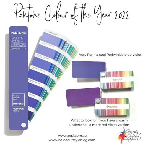
When I look at this color I see it as a cooler blue-violet color and so will sit well in all the cool palettes. It’s fairly medium in value (value just means how light or dark a color is) and so will cross over many of the cooler color palettes easily. You can see with the color palette that it sits in the middle of the value scale – neither very dark or very light).
That said, I’m sure we’ll also see warmer more red-violet versions of this color in stores along with darker and lighter ones too (as is always the case with color trend forecasts vs reality of life). Below I’ve selected a warmer version of Very Peri that works for those with a warm undertone – you can see it has a more red undertone rather than the bluer undertone of Very Peri.
It’s a gorgeous violet shade of blue and will team gorgeously with a mint green called Cascade, see the London Fashion Forecast, as well as the lemon yellow called Popcorn) along with the cool teal green which they call Harbor Blue from the New York Fashion Forecast below.
Pantone Spring Summer 2022 – London Fashion Colour Forecast
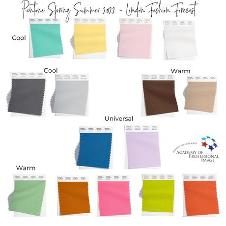
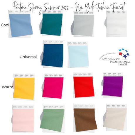
Also recently noted are the color trends from the fashion catwalks of London (above and New York) below.
I’ve split these into cool, warm and some universal colours and neutrals so you can more quickly identify the colours that are more likely to work for you and your palette.
Pantone Spring Summer 2022 – New York Fashion Colour Forecast
You’ll notice that the neutral selections between London and New York are fairly similar – a white and a cool gray along with a warm brown.
Colour Forecast Comparisons
Here I’ve popped some comparisons between the colours that are more similar from both London and New York Fashion Forecasts together so you can see them in relation to each other (it’s the easiest way to identify color properties.
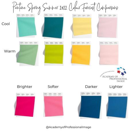
You can see both warm and cool greens, as well as warm and cool yellows, will be available. The darker blues are both warmer (which means they can be worn by everyone) and there are some very bright colours along with some softer versions.
Notice the pinks how the London Potpourri Pink version is cooler and the New York Gossamer Pink is warmer – can you see that hint of yellow in it that makes it warm, not cool? Bubblegum pink is also warmer so be careful when purchasing hotter and brighter pinks that the one you choose looks like the pinks in your color palette swatch so you are getting your most flattering pink shades.
Find Your Version of these Pantone Colours
Use your color palette to find your version of the Pantone Spring/Summer 2022 colours and the Colour of the Year Very Peri.
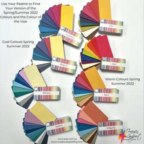
Here I’ve chosen the most similar versions of the Pantone fashion forecast colours in a variety of warm and cool color palettes – why don’t you do the same? Grab your swatch and compare them to the images above of the Pantone color forecast colours, look for your version so that when you’re in-store and on the lookout, you know what you’re looking for – which will work for you and which to completely avoid. Your version may be lighter, darker, brighter or smokier, depending on your palette, but there will be versions of some of the colours available to you, and there is always a variety of expressions of these colours in clothing.
Don’t have a palette? If you’d like your individualised palette marked with your signature colours, you can get this with an online personal color analysis (or as an addition to my 7 Steps to Style program where you’ll discover your ideal color direction, undertone, value and intensity).
