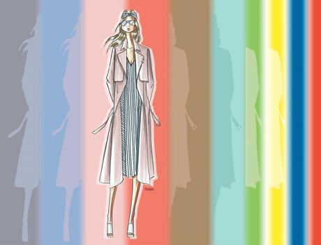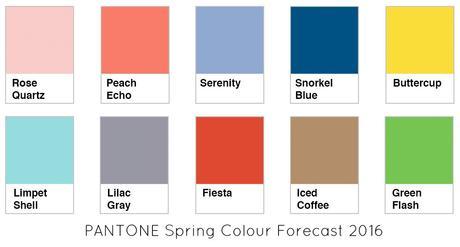
It's Spring here in Melbourne (and all the Southern Hemisphere) and Pantone has released it's forecast for Spring 2016 (Northern Hemisphere).

These colours echo many of the colours from the previous colour forecast for Autumn/Winter 2015 and Spring 2015, but are just a lighter or slightly brighter version.
Universal Colours
Warm Colours
Cool Colours
We've already been seeing a lot of Iced Coffee camel and rose beige shades, with the rise of the popularity of rose gold.
Snorkel Blue is another warm undertoned navy which is brilliant for everyone. It's a hair enhancer for brunettes. It's an eye enhancer for most blue eyes and is a great colour for the office as it's neutral enough to wear and wear with so many other colours.
It works well with almost all colours (which is why you can wear it as a neutral). It's what I'd call one of the Marine or Junior Navy shades of blue as it has a slight green element to the blue which warms it up. As you can see it pairs perfectly with turquoise accessories.
I was in the shops the other day and have already noticed quite a bit of Buttercup around in Oxford and Country Road and Carla Zampatti.


