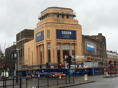
The info boards around the hoardings show that they are reinstating much of the original Art Deco color sceme and re-opening the restaurant area on the frst floor behind the big tall windows.
That's great.
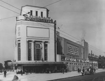
I was hoping that free-standing letters on the exterior as per when it was a Gaumont cinema (see below). Or some big neon letters would be nice.
But recently the new street-facing signage was revealed:

Odeon Holloway Road, N7, January 2020
Oh how disappointing. An opportunity missed. How is this Art Deco style?!Odeon's designers have made use of the space that was originally intended to advertise the films or events that were on.
OK, that's fine, but they have lazily inserted a bland blue panel with their brand lock-up slapped in the middle, restricted in size by its height. Yet there appears to have been no thought applied to how the available space can best be used and how the signage can fit within that space. This lazy approach is sure to be happening on their other sites too.
I have been working on signage projects for years and, if this was the panel was the only option, then it could have looked so much better. I'd have made the ODEON letters almost twice the side and then slipped in LUXE* underneath with rules either side rather than above and below.
These days we have laser cutting and digital technology, LCD screens/lighting and moving graphics, so couldn't something more evocative have been installed?
Anyway, below is a pic of how the cinema looked back in the year it opened.
And lots more pics here:

1938
*I assume this means luxury and in those big sofa-style chairs with receptacles for drinks etc. Call me old-fashioned but prefer I like to sit properly on seats/chairs. I find the new seating uncomfortable.