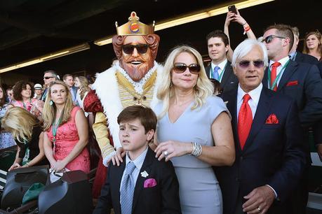
 I frickin’ love the King appearing without explanation in places rich people are, so that people will start conversations on social media. I just wish they could be that nuanced and crafty in their other non-traditional efforts over there at BK.
Here are nine recent attempts by nine different restaurants to engage in the kind of advertising encouraged by this, the digital age—not a comprehensive list, and not a final word in the discussion. Just nine examples, and one good thing and one bad thing about each one.
Before we jump in, these are the nine tactics:
1. A blog
2. A killer app that, if you eat enough of the product, might actually eventually kill you.
3. Notched-up Twitter engagement
4. Online content meant to be entertaining
5. Online content that manages to be entertaining against all odds
6. A game!
7. Clever inventions whose existence is brought to our attention because they’re so interesting they “go viral”
8. Online content the brand did not create nor approve but allowed or encouraged anyway because the name is spelled right
9. Metaphorical bowl of soup thrown at wall
Some of these I’ve written individual blog entries about. But they’re still an interesting array, and perhaps a resource for you as you tap your forehead trying to force yourself to think of a way to promote your restaurant besides TV, billboards, radio, print, coupons, and the other usual suspects.
Let’s go. Number one…
1. A blog
WHAT RESTAURANT: Chick-fil-A
WHAT IS IT: A blog that makes a fan feel connected to Chick-fil-A beyond just visiting the brick-n-mortar, serving up stories of people who work there—including posts like this detailing one employee’s beliefs about the famously great C-f-A service.
WHAT IT LOOKS LIKE: It looks like a blog. It has different stories, and as of today it’s being kept up-to-date (always important and a danger when blogging, to have big lapses between posts—BELIEVE ME I KNOW). There’s a variety of stuff offered. Here’s a fun video interview with the guy who supplies the cows they use in ads.
ONE GOOD THING: It’s unpretentiously professional-looking, very personal and earnest—and since a large part of the restaurant’s appeal is its family atmosphere, this adds to the sense of a community.
ONE BAD THING: It’s hard to find, and who’s looking for it? Hard to picture lots of people having enough time to hunt it down, or even to be aware of it.
2. A killer app that, if you eat enough of the product, might actually eventually kill you.
WHAT RESTAURANT: Taco Bell
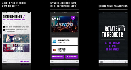
WHAT IS IT: A really thorough, branded way to interact with a youthful brand on the device that youths are typically looking at instead of doing whatever they’re ostensibly supposed to be doing.
WHAT IT LOOKS LIKE:
ONE GOOD THING:
It sets the bar for a useful, good-looking, well-thought-through, functional app that stays true to the brand. Easy to use, even fun to use.
ONE BAD THING:
Everyone else knows what to do now that Taco Bell showed them.
3. Notched-up Twitter engagement
WHAT RESTAURANT: Domino’s
WHAT IS IT: A whimsical way to order Domino’s through Twitter which is more about how whimsical Domino’s is (read: youthful and self-aware and of-the-moment) than a way to actually order pizza, despite people willfully pretending not to understand it.
WHAT IT LOOKS LIKE:
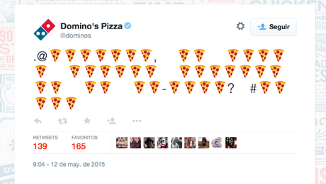
ONE GOOD THING: This makes Domino’s looks like it will try anything—and guess what, that’s a major plank of their “honest” brand position: constant reinvention to prevent becoming the butt-of-the-joke pizza pie everyone compares to cardboard.
ONE BAD THING: It’s easily misunderstood and a little obscure if you’re not paying a lot of attention. It could make them look like they’re trying too hard. But again, “trying too hard is better than not trying” is a major plank of their “honest” position.
4. Online content meant to be entertaining
WHAT RESTAURANT: Friday’s
WHAT IS IT: Cheap-looking online content that appears in your paid search areas of certain sites if, like me, you visit a lot of restaurant sites.
WHAT IT LOOKS LIKE:
ONE GOOD THING: Their search media people have located me, and the spots are visible. And lots of people enjoy this promo.
ONE BAD THING: They’re just not very interesting. They’re clearly ads, they’re clearly thrown together on a tight budget, they’re clearly jumping on the “goofy mascot” bandwagon which was revived with wonderful Jimmy Dean breakfast ads years ago and won’t stop, so they look “me too” and “seen it” and they don’t reward attention. If I’m predisposed to be excited about the return of their successful promo, then okay, I might give them a look. But they’re derivative, which adds to the already derivative feel of the pubby chain.
5. Online content that manages to be entertaining against all odds
WHAT RESTAURANT: KFC
WHAT IS IT: A microsite with the History of the Colonel, for all the Millennials who thought he was a cartoon character invented for the chain like Ronald McDonald or something
WHAT IT LOOKS LIKE:
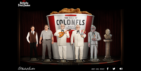
ONE GOOD THING: They really run the risk with this campaign of the younger demo they want not realizing the Colonel is real: part of their heritage and founder of the company. Knowing that makes the advertising more interesting. If you don’t realize the Colonel is a historical figure, you don’t get full enjoyment. And this dang web thing is a hoot to play with. It “moves” well, and it’s interesting, and it’s entertaining. A lot of work obviously went into it, and it feels like actual entertainment as much as advertising.
ONE BAD THING: It’s a KFC microsite. Will anyone really invest time? How indolent is our nation?
6. A game!
WHAT RESTAURANT: Chipotle
WHAT IS IT: It’s presented as a game themed around food additives. They challenge you to guess which additives are in their food vs. other common foods. They send you a coupon when you’re done.
WHAT IT LOOKS LIKE:
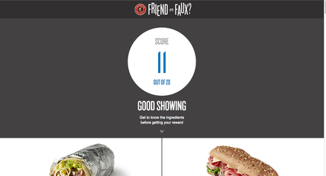
ONE GOOD THING: It’s strategic. It’s a “sticky,” involving way to communicate significant product benefits. It’s in brand. I should like it. I should be a big proponent of it.
ONE BAD THING: It’s didactic. It’s preachy. Preachiness and fun rarely go hand in hand (as opposed to preachiness and emotion, like that one spot with Willie Nelson singing Coldplay) and if you’re going to portray something as a game, even “The Game of …Fakery,” which sounds fun, then it’s a huge let-down. It’s a framing problem. The promise is fun, the payoff is not. This thing is kind of like an interactive exhibit you’d see at the state fair where you touch a button to try and match the leaf to the type of tree it comes from—it smells like a scholastic lesson in sheep’s clothing. Only for true believers and coupon monsters.
7. Clever inventions whose existence is brought to our attention because they’re so interesting they “go viral”
WHAT RESTAURANT: Pizza Hut
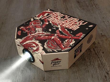
WHAT IS IT: A Pizza Hut box that projects movies that somehow involves your iPhone. Pizza and a movie!
WHAT IT LOOKS LIKE:
Here’s a video:
ONE GOOD THING: Cool as shit. Gets batted around the internet a little bit by sites like Business Insider or Adweek or whoever, making Pizza Hut seem like it’s trying to be relevant.
ONE BAD THING: Seems not real. Seems not necessary, and maybe in the end kind of impractical and goofy. Seems like a clever designer working at a Hong Kong ad agency said “what if” and did this but it never got real traction from Pizza Hut. Seems like Pizza Hut is too big a ship to turn toward this innovator direction. In the end, it’s just nifty and doesn’t really seem like Pizza Hut is taking this kind of brand position seriously. Also: probably only gets on the radar of a small percentage of people. Most people have probably never heard of it. I’d wager.
8. Online content the brand did not create nor approve but allowed or encouraged anyway because the name is spelled right
WHAT RESTAURANT: Olive Garden
WHAT IS IT: Numerous occasions where Olive Garden was provocative (probably on purpose), started something then relinquished control, or allowed someone to take their brand and play with it.
WHAT IT LOOKS LIKE:
ONE GOOD THING: Well, they’re obviously trying to change. It shows an open-mindedness and apparent embrace of the new paradigm of brands setting a tone and a standing for something, then relinquishing control.
ONE BAD THING: They haven’t figured out what’s truly next for them. They’re just all over the board.
9. Metaphorical bowl of soup thrown at wall
WHAT RESTAURANT: Burger King
WHAT IS IT: Speaking of which, BK has been all over the board. They’re hip, they’re square, they’re everywhere.
WHAT IT LOOKS LIKE: It’s a chicken choosing which locations to revive chicken fries—except it’s not. It’s Satisfries—except it’s not. It’s Subservient Chicken’s return, except it doesn’t have ANYthing to do with the original idea, which was quite strategic around the concept of “Have it Your Way.” And the King just, like, shows up in places where American Royalty would be—and relies on social media (and regular media, for that matter) to spread the word.
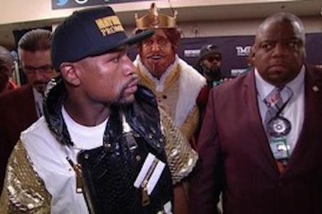
ONE GOOD THING: The King subtly turning up where royalty sits? Great. Smart. Seems like they’re a jump ahead of me (as a consumer) and it’s restrained and mysterious and I like it. Makes the brand feel tuned in and relevant. Makes the brand feel like a player.
ONE BAD THING: All that other stuff just seems like it’s not committed. The overall effect is of a company struggling to understand their own identity, their own place in the QSR landscape. They started the “Lucy the Chicken Chooses” thing (see link above) and abandoned it. They ditched “Satisfries,” whose name I mocked but at least the product fit the equation of “fun + making-women-feel-welcome-since-they-felt-unwelcome-during-the-original-reign-of-the-creepy-King.” The Subservient Chicken redemption thing seems both too insider and too random—it doesn’t make sense, like the earlier incarnation did. Overall, BK just seems to be trying anything and everything, both in traditional and non-traditional advertising, and to someone paying attention they seem like they don’t know who they want to be.
Anything spark an idea for your restaurant brand, there? You know, I don’t usually beg for comments, but I’d love to know if you got an idea for a digital thing from reading this. In the comments. NOTE: If nobody leaves me a comment within a reasonable amount of time I’m going to delete this potentially pitiful plea.
