
It's time friends. It took 9 months of coordination, planning, excessive emailing and general indecisiveness to get to this point, but I'm thrilled to unveil an updated blog design.
Two years ago I began this blog as a means to share my love of food with a broader audience. Though I put many hours of work into the concept behind the site, the choice of the original design took several minutes.
I'd hired someone on Elance for some assistance, and he offered a solution to my nagging design issues: buy a pre-made theme from Themeforest.
It was a perfect plug & play solution. I was drawn to the colors and movement of the original site; even without content, it seemed active. Which was perfect for someone who wanted to look established but hadn't yet written a single post.
I had one other suggestion for my friend the programmer: find a theme that hides the photography.
Hide it ....Bury it....Make it invisible.
About a year later, I added some advertisements to the space. Feeling like I needed to justify the time that I spent working on the site with a little income, I succumbed to the BlogHer partner program. It wasn't a decision that I took lightly, but in the end, I felt that it was necessary. It's one thing to work on a passion project in your free time; it's quite another when you have to hire a babysitter to help with backup childcare because your passion project has swallowed every available hour in your day.
So let's cut to the chase: the site layout wasn't working for me anymore. While writing has always been my favorite part of publishing a blog, it wasn't until recently that the photography become equally important. It was a steeper learning curve, but I've grown immensely. I've learned to use my manual DSLR, taught myself the basics of Photoshop, taken classes in lighting and composition.
After all of that work, Lord knows I should have a place to showcase those photos.
Translation: minimize the clutter, get rid of the {unnecessary} bells and whistles, but continue to make the site searchable and easy to navigate.
Change is hard to process. I know that some of you will miss the vibrant orange header, the image of the kids. Those little image snippets that showed every blog post that I wrote since the beginning of time.
In some ways I will too.
But the kids are now years older than they were in the original header. And they'll still be in every other blog post. With pores on full display given the new, larger, image size. How delightful!
Plus, you'll have convenient navigation for all things NYC, all things travel, and all things cocktail. You'll have direct and easy access to all of the CSA posts that I labored over last summer. You'll see touches of hand-drawn illustration in the icons that now serve as category headings. And, wait for it....you'll see all picky eater fruit and vegetable challenge posts in one place.
Remember those posts? Some of you may have noticed that they stopped somewhat abruptly, and for that, I apologize. It was during the course of the design process that I decided to have all of the picky eater posts be accessible from a single page. And the number that I wanted to shoot for - 100 new foods - was slightly less than two years worth of posts. As such, I felt comfortable skipping one week...which led to another....then another again...you know where this is going. Momentum is critical and I learned a vital lesson about blogging - don't. ever. stop.
I do plan to make up the remainder of the picky eater posts to get to an even 100. It's a great number, an admirable number, and it took a lot of work - both mine and the kids' - to get there.
And I may continue to tinker with the site a little here and there to make things just right. But what you today see is 99% complete. If we've done our job - that would be me, but more important, my lovely web designers Wooden Spoons Kitchen and my talented illustrator Maggie Prendergast - the site should come across as minimal, grown-up, content-focused and playful all at the same time.
Overall, the redesign was a fun, creative exercise...an excuse to carry a sketchpad and doodle ideas. Most important, it was a forced slim down for someone who leans toward the overdesigned. But like planning a wedding or having a baby, you look back at the effort in hindsight and thank the mighty heavens that it's over.
I need a cocktail.
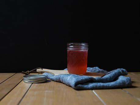
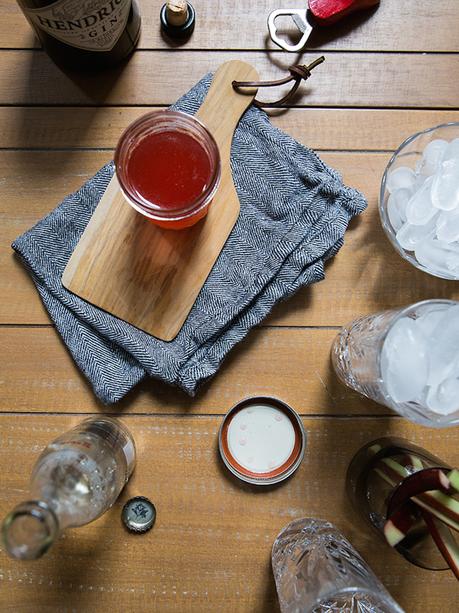
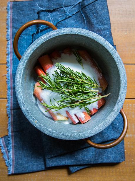
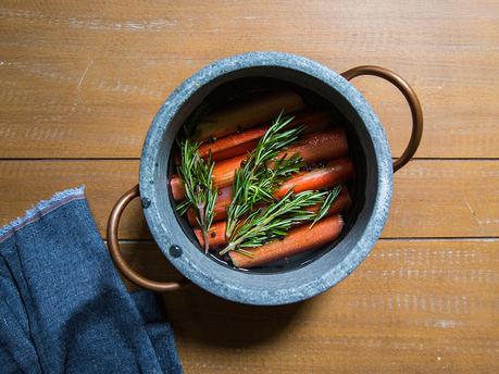
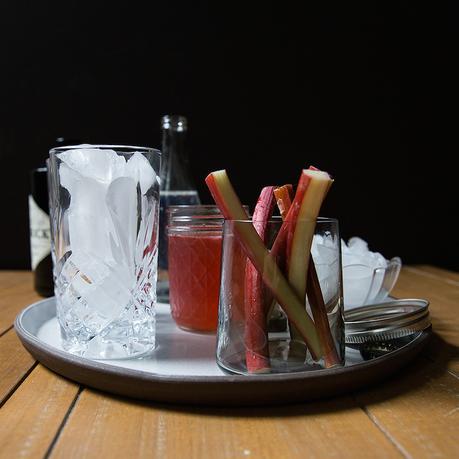
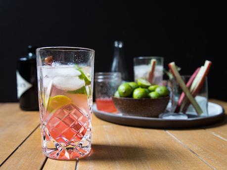
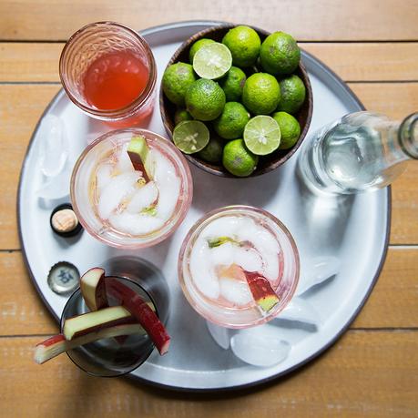
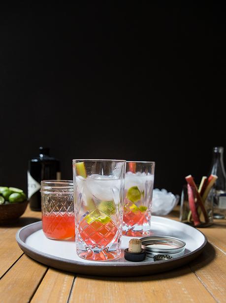
Thankfully I made myself two of these rhubarb key lime gin & tonics.
So onwards, upwards, let's see where we can take this...

