This article was originally posted on Boagworld by Paul Boag.
For many of us, newsletter signup is a key metric we track. After all, if we can get people to signup for our newsletter then we can keep our brand in their mind. That means they will think of us when they come to buy.
But getting people to subscribe can be tough. We get desperate and before long we are pushing annoying subscribe popup overlays at every user who visits our site. And it works! Our subscription rate goes up and we feel justified. But what we do not see is the cost. The users swearing at their screens as they close yet another annoying ad. Just look at the exit rates. For every user who signs up you are driving many more away.
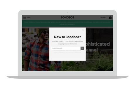 We feel justified in using newsletter signup overlays because they work.
Newsletter signup overlays are the lazy way to convert users. By screaming in their faces you are sure to get some people’s attention. But like the religious fanatic shouting on the street corner, you are alienating far more people than you are winning over. You need a more subtle approach.
Newsletter signup overlays are the lazy way to convert users.
Tweet this
This was exactly the conundrum faced by Colin Gray. He is the expert behind the amazing podcasting resource at thepodcasthost.com. I have been working with Colin for a while and one of the areas we came to discuss was newsletter signups.
He is a smart guy and knew that newsletter signup overlays annoyed users. But he knew that they can be effective. His current newsletter signup box at the end of his articles was having some impact, but he wasn’t satisfied.
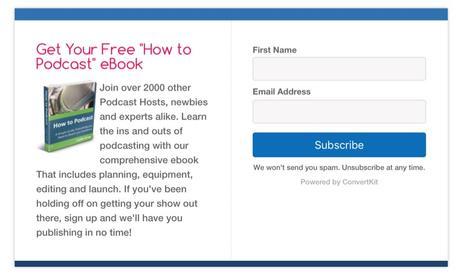 Colin had created a strong newsletter signup call to action. But he wasn’t satisfied.
What follows is the advice I gave him and a breakdown of the proposed changes I recommend he makes. At the time of writing he is yet to put in place these changes. But when he does, I am confident it will make a big difference in his conversion rate and that they would on your site too. What I can guarantee is that they will be less annoying than slapping a newsletter signup overlay on your site.
Focus on benefits
First, it is not enough to ask somebody to signup to your newsletter. You need to answer the question why. What will they get out of it? What benefit does your newsletter provide?
Colin has attempted to address this by incentivising people with a free ebook. This is a great idea. But the result is that most people are signing up for the ebook and not the newsletter. In fact the call to action makes it look like the newsletter has no value in its own right and Colin has to bribe people to agree to receive it. No doubt this leads to a lot of people unsubscribing as soon as they get the ebook. That or consigning those emails to the SPAM folder.
We have to make it clear that the newsletter has real value in its own right. That it is just as informative as the ebook.
Both the newsletter and ebook provide the same benefit. They teach you to become a better podcaster. So I have focused the headline on this.
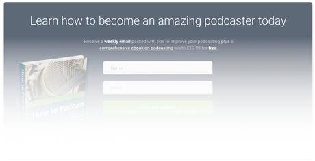 Focus your headline towards the benefits of your newsletter
Be clear what people will get
The call to action on Colin’s site is so focused on the ebook that you might not realize you are subscribing to a newsletter. The only clue is that you are clicking a subscribe button.
There is no information on what is going to happen once people have subscribed other than they are going to get an ebook. What emails will they receive? How often? What will they include?
If you want people to subscribe to your newsletter you need to be clear about what that means. How often can people expect to receive emails from you? What will those emails contain?
I rewrote the copy to focus on what the user would get if they signed up.
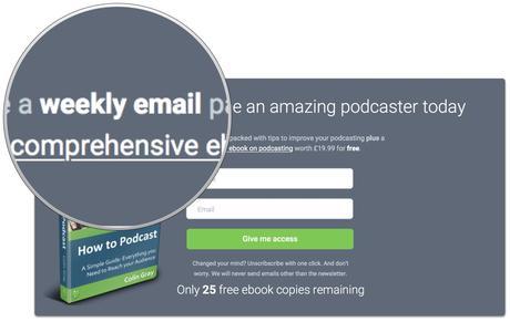 Be clear about what the user will receive.
Objection handling
Next, I shifted my attention to addressing the concerns users might have.
People hate unsolicited email. They want to know exactly what they are going to get and be sure they can unsubscribe if they don’t like what they receive.
Colin is on top of this. He has already said that he won’t send SPAM and that the user can unsubscribe at anytime. I just added a bit of clarity. After all, what does Colin mean by SPAM? I also emphasize just how easy it is to unsubscribe. I wanted the user to be in no doubt.
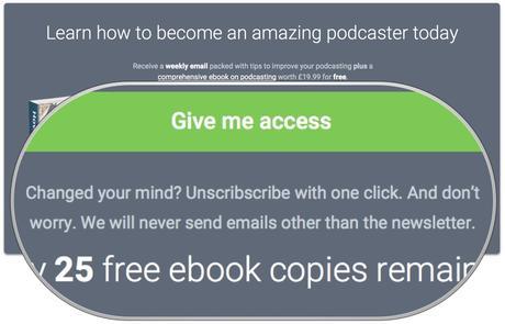 Clearly address the concerns users might have about subscribing.
Create a sense of urgency
But removing reasons not to subscribe and highlighting the benefits is not enough. We want people to subscribe now. The last thing we want is for people to get distracted and not take action. It is necessary to create a sense of urgency.
Colin’s ebook gives us a means to do that. It is something that we know from past experience people want. All we need to do was give them the sense that if they failed to act soon they might not get it.
To achieve this I recommended limiting the number of free copies he gave away. Once those copies were gone people will have missed out. Colin could always offer another incentive in its place. But showing a count down of available copies would encourage people to act.
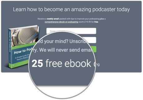 Use scarcity to encourage people to act now.
Create value
Of course you can only create a sense of urgency and scarcity if people want what you have to offer. We didn’t want to get distracted promoting the value of the book as Colin had done in the past. We needed a shorthand way of creating value in people’s minds.
I achieved this by showing that Colin was selling the book for £19.99 on Amazon. This helped frame the ebook in people’s minds. Now if they signup for the newsletter they get something worth almost £20.
This idea of creating value is so important and something that you need to find a way of doing with your own newsletter. Will your newsletter help save people time or money? Can you give something away with the newsletter that has monetary value?
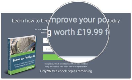 People know their contact information has value. To get people to subscribe you need to offer them value in return.
Make sure people see your newsletter signup
Our new newsletter signup was working much better. But that only had value if people saw it. There are lots of ways of making a call to action more noticeable from the use of whitespace to animation.
But in the case of Colin’s site I recommended two changes. First, I suggested a dark background to make the call to action stand out from the surrounding content. The rest of Colin’s site used a light background so doing that would draw the eye.
Second I recommended changing position. Currently Colin’s calls to action are only at the end of his posts. This makes sense to some degree. After all people will want to know Colin creates great content before they signup. But, many people don’t make it to the end of an article.
Because of this I suggested Colin embed the newsletter signup a third of the way down an article. This gave people the chance to see if the content was to their liking, while at the same time catching people before they left.
 Getting the position right for your newsletter signup will make a huge difference in conversion.
Overlays have their place
As you can see, popup overlays are not the only way of improving your conversion rate. Don’t misunderstand me, I am not saying that all overlays are bad. For example, both this site and Colin’s make selective use of ‘exit intent’ calls to action. If we think somebody is about to leave the site we might display a newsletter signup overlay.
But, this is only on exit and only on selective pages. For example I only use them on blog posts that get a lot of search engine traffic. That way I avoid annoying regular readers. But I still have a chance to reach out to those first time visitors. People who may never return because they were just searching for a specific piece of information.
Don’t check your feeds as much as you should? Signup to my bi-weekly newsletter instead.
Original SEO Content by SEOAndy @ Newsletter Signup: How to get subscribers without being annoying

