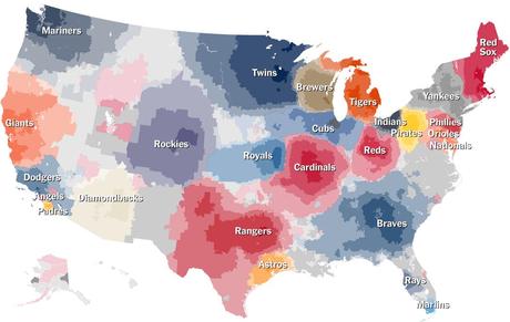
Feeding my seemingly growing obsession with baseball fan maps, the New York Times published this interactive map a couple days ago — again, based on Facebook data — that allows us to to zoom in on which team fans root for, down to the zip code. For example, I can tell you that my hometown contains 69% Royals fans, and my current neighborhood comprises 49% Royals fans. After the Royals, 12% of my current neighbors root for the St. Louis Cardinals, while 7% pull for the Boston Red Sox (…really?). Things get especially interested along both coastlines, where a greater saturation of teams results in a greater conflict of loyalties.
In addition to the large, nationwide map, the Times generated fourteen smaller maps, highlighting baseball’s biggest rivalries. If you would like to read the article and explore the interactive map, just click on the image below, and it will direct you to the site. Enjoy!

Click on the map to link to the article


