I seem to end up frequently explaining to students and colleagues that it’s a good idea to spend a good deal of time to make your scientific figures the most informative and attractive possible.

Japanese man spending weekend morning painting in his bedroom at home
" data-image-title="Japanese man spending weekend morning painting in his bedroom at home" data-orig-file="https://coreybradshaw.files.wordpress.com/2022/07/creating.jpg" data-image-description="" data-image-meta="{"aperture":"0","credit":"Getty Images","camera":"","caption":"Japanese man spending weekend morning painting in his bedroom at home","created_timestamp":"0","copyright":"","focal_length":"0","iso":"0","shutter_speed":"0","title":"Japanese man spending weekend morning painting in his bedroom at home","orientation":"1"}" width="301" data-medium-file="https://coreybradshaw.files.wordpress.com/2022/07/creating.jpg?w=300" data-permalink="https://conservationbytes.com/2022/07/27/never-underestimate-the-importance-of-a-good-figure/japanese-man-spending-weekend-morning-painting-in-his-bedroom-at-home/" alt="" height="200" srcset="https://coreybradshaw.files.wordpress.com/2022/07/creating.jpg?w=301 301w, https://coreybradshaw.files.wordpress.com/2022/07/creating.jpg?w=150 150w, https://coreybradshaw.files.wordpress.com/2022/07/creating.jpg 509w" class="wp-image-212703" data-large-file="https://coreybradshaw.files.wordpress.com/2022/07/creating.jpg?w=509" />But it’s a fine balance between overly flashy and downright boring. Needless to say, empirical accuracy is paramount.
But why should you care, as long as the necessary information is transferred to the reader? The most important answer to that question is that you are trying to catch the attention of editors, reviewers, and readers alike in a highly competitive sea of information. Sure, if the work is good and the paper well-written, you’ll still garner a readership; however, if you give your readers a bit of visual pleasure in the process, they’re much more likely to (a) remember and (b) cite your paper.
I try to ask myself the following when creating a figure — without unnecessary bells and whistles, would I present this figure in a presentation to a group of colleagues? Would I present it to an audience of non-experts? Would I want this figure to appear in a news article about my work? Of course, all of these venues require differing degrees of accuracy, complexity, and aesthetics, but a good figure should ideally serve to educate across very different audiences simultaneously.
A sub-question worth asking here is whether you think a colleague would use your figure in one of their presentations. Think of the last time you made a presentation and found that perfect figure that brilliantly portrays the point you are trying to get across. That’s the kind of figure you should strive to make in your own research papers.
I therefore tend to spend quite a bit of time crafting my figures, and after years of making mistakes and getting a few things right, and retrospectively discovering which figures appear to garner more attention than others, I can offer some basic advice about the DOs and DON’Ts of figure making. Throughout the following section I provide some examples from my own papers that I think demonstrate some of the concepts.
tables vs. graphs — The very first question you should ask yourself is whether you can turn that boring and ugly table into a graph of some sort. Do you really need that table? Can you not just translate the cell entries into a bar/column/xy plot? If you can, you should. When a table cannot easily be translated into a figure, most of the time it probably belongs in the Supplementary Information anyway.
white space — White space is one of those aspects that you do not necessarily realize is the reason you don’t like the look of a particular graph. If your axis scales are such that most of the data appear at one extreme, if your panels have huge gaps between them (see next entry), or there is just a big hole somewhere in the figure, you need to rethink the configuration of the information. You can do various things to remove white space, including moving components closer together, or adding icons (see below), changing axis scales (see also below). A nice, tight (but not too cluttered) figure is much more visually appealing than one where big white holes distract your attention.
panels — If your figures look cluttered at one extreme, or a bit naked at the other, it’s time to consider multi-panel plots. Such plots allow you to put a lot of information in a single figure, provided you don’t try to swamp your reader with everything and the kitchen sink in one go. Some tips for good multi-panel figures include: avoiding panel titles (see more below; panel letters or numbers of sufficient size usually, but not always suffice), standardising panel size, avoiding repetition of axis labels and titles among panels (see more below), and standardised axis scales (where possible).
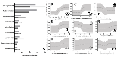
titles — Figure or panel titles are usually unnecessary and distracting, but you’ll want to include an easy way to identify what different symbols/lines/colours indicate via a legend, and of course, a detailed follow-up explanation in the caption. Simple letters, numbers, or symbols for sub-components generally do the trick and avoid cluttering the figure with too much annotation.
captions — Speaking of captions, the age-old recommendation that a figure should be stand-alone really comes into play when crafting a figure. Can casual observer skimming through your paper understand the meaning based on the figure and caption together, or are they required to read the entire text to get it? If the latter, your figure is not stand-alone and should be fleshed out a little more.
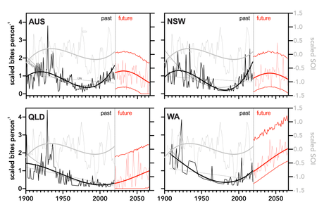
abbreviations — apart from panel indicators, I tend not to use abbreviations/acronyms/initialisms in my graphs for the simple reason that it’s not immediate apparent what they mean. I loathe these forms in pretty much all scientific work anyway, so I also advise keeping them out of your figures (my Australian state abbreviations shown below notwithstanding ;-) ).
avoid repeating labels — As mentioned above, avoid repeating labels and titles among axes that are the same in (usually) multi-panel plots. If the axis scale is the same across, say, the rows of panels, then all you need is the title and labels on the first panel on the left, with all subsequent panels merely repeating the axis ticks. The same applies in the x axis for columns of panels. Not only does this simplify the design, it also saves a huge amount of white space.
to log or not log — Often, a nice logarithmic (or other) transformation of an axis can tighten up the display and render a wonky distribution more visually appealing. It can also get rid of unnecessary white space. However, be aware that any transformation changes the graph’s interpretation, so that you should be very clear what the trend signifies.
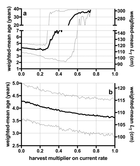
axis segments — In reference to transformations, if you are concerned about misleading interpretation, or a transformation fails to solve the white-space problem, a segmented axis can produce a much more appealing figure. Say 90% of your data fall between 1 and 10, but you have a few data in the 100s or 1000s. Breaking the axis up so that most of it refers to the 1:10 range, with a little dedicated to the extreme values, can really help interpretation.
uncertainty — Do your trend lines have any associated uncertainty (e.g., standard deviations/errors)? Do your bars have measurement error? If you have ANY associated data errors, don’t just show the central tendency. Add all uncertainty in the form of error bars, shaded uncertainty regions, etc.
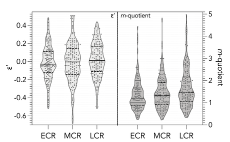
data distributions — Many journals these days require you to display all the data uncertainty in a plot, such that bar graphs with little T error bars are no longer acceptable. Great ways to display the data distribution is through things like boxplots, but even better are violin plots now increasing in popularity. If I have a distribution, I now usually include a all the jittered data on top of the violin plot itself.
to 3D or not 3D — You’ve seen it on the telly thousands of times before: a bar graph with a mysterious third dimension showing ‘columns’ instead of bars. Don’t do this. Unless you have a third dimension in your data, don’t make one up. Three-dimensional graphs might look appealing, but they are usually empirically misleading.
color — In the not-too-distant past, color was generally frowned upon for scientific papers, mainly due to the cost of reproducing color images in print. These days that limitation is less and less applicable, because most publication is now online, and color costs no more than greyscale/black-and-white figures. That said, don’t go crazy with colours. Many of us are rather color blind, and fortunately, many colourblind-friendly color schemes are now available on most graphing applications. The other reason too many colours can be distracting is that they do not conform to any empirical symbolisation. In other words, do your different colours indicate some element of the data (categorisation, origin, etc.)? If not, keep them to a minimum. Just in case someone needs to print still these days, also think about whether all the information will be retained in your color figure should someone need to produce it in greyscale. If that proves challenging, rethink your color scheme.
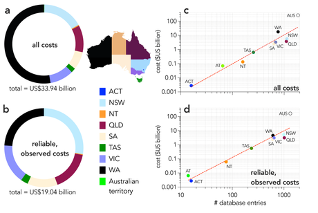
borders — Generally I try to keep borders as simple as possible. There is no need for an entire box in a bivariate plot, but a map often has ‘boundary’ effects (e.g., the sudden disappearance of a coastline), which can be solved elegantly with a simple line border. Too many borders makes a figure look bulky and blocky. Too few can lead to misinterpretation of elements aren’t easily separated upon first glance.
font — Often journals require any number/word fonts in the graph to be consistent with the font of the main text. If so, you should follow their convention. If not, then a simple, appealing, yet non-flashy font should be used for all figure elements (axis titles, legends, axis labels, etc., etc.). Do not mix and match fonts on the same figure.
are the data continuous? — I often see graphs where single values (e.g., frequencies, discrete temporal values, etc.) are joined by some sort of line, implying that you have data between the discrete values. If you don’t, don’t try to imply a continuous distribution between the adjacent categories. Choose a format that displays the data most accurately. Along these same lines, great, bloody high bars from zero to the value at hand tend to condense all the information into one extreme of the graph. Here, a point is much more suitable.
unnecessary capitalisation — I see this a lot. Axis labels, axis titles, panel titles, etc. with capitalised first words. It doesn’t help that most applications automatically capitalise the first word in a text box. Ask yourself whether it is a proper noun; if not, don’t capitalise. Most labels are not the first word of sentences, so standardise and keep your capitalisation only for the words requiring it.
icons/images — I mentioned above that icons can sometimes that gaping white-space issue. A cleverly placed icon or simplified image of the subject at hand can often accompany a formidable graph and make it pleasing to peruse and reproduce. Again, use with moderation, and try to make sure your icons are high-resolution (otherwise, they tend to look amateur).
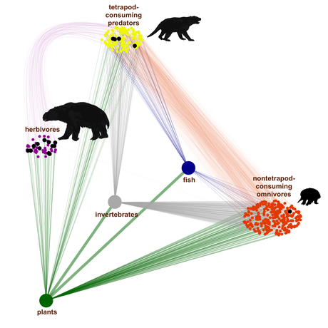
shading — Do you have icons, arrows, etc. that seem just a little too boring? Often a very subtle shadow can provide a little perspective. But like the 3D issue, avoid inferring an empirical dimension. Another powerful use of shading (drop shadows, glows, etc.) is to help differentiate text from background detail.
backgrounds — It is sometimes tempting to include a background color or even an image behind your graph. This can be a powerfully aesthetic detail if done subtly, but really distracting if done without care.
use multiple applications — I have yet to find the ‘perfect’ graphing application, so I tend to use many at the same time to produce the best-quality figures. The generic R plotting facilities are crap, although ggplot makes figures a lot more aesthetically pleasing (but requires a lot more coding know-how). Excel is loathesome for figures. I often use R to produce the summary information, then import the data into a dedicated graphing application (e.g., GraphPad Prism, etc.), which I can then import into a GIS application if I need to combine things with maps. Or, I can produce subplots in one application and aggregate them in Powerpoint, or some such. The key here is to be flexible, and make sure the final output can be exported at high resolution (vector or at least 600 dpi).

