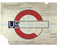
Johnston's final design
Across the fast-expanding network there was a mix of signage in all shapes and sizes. There were discs, banners, lozenges and diamonds, all implementing different styles and typefaces. The whole thing needed to be brought together as a brand.In 1916 the job was given to Edward Johnston, a relatively unknown calligrapher who appears to have been a quiet camera-shy man who kept his ideas to himself and just got on with the job at hand. But Johnston kept no preliminary sketches and so no-one really knows how his mind was working or what inspired the final design which was finalised and on dislpay in 1919. It's often been said that he based his final design on the 1908 "roundels" can still be found on station platforms such as Covent Garden and Caledonian Rd.
I have a theory about this but it's a bit "chicken or egg"; which came first?
A thought has been bubbling in my head for years but I have only just been motivated to check it through properly this week, as shown here, following a conversation at the museum depot at the weekend.
Here goes...
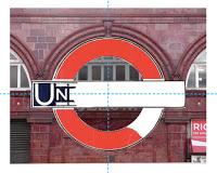
I believe the simple logo shapes were already staring Johnston in the face every time he looked at one of the arched modular sections on Leslie Green’s ox-blood tube station buildings.
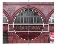
I have used Holloway tube station here to illustrate my point.
First I drew a circle within the window arch.
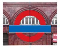
I then drew a rectangle over the tiled area below the window where the station name appears, making the height of it the same as the section between the top and bottom lips, and its width to be up to the edges of the windows at either side.
And then I coloured it up in red and blue. Looking good.
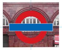
As you can see, the blue rectangle was sitting too low, so I just shunted it up to align vertically as well as horizontally. Looking better.
And then I checked it against Johnston’s “Proportions of Standard Bullseye Design” which I blasted in Photoshop so I could see what I was doing and….
… drum roll please… it’s the same!
And I hadn’t even measured that blue rectangle!
The logo's proportions have changed a bit over the decades. I checked some subsequent logos and placed them onto Holloway station (not shown here) and they too fit. Perhaps this is what Johnston had in mind all along?
Or is it the other way around?
It occurs to me that Leslie Green might have had the idea for this shape when he was designing the stations. Hence the early solid red disc roundels on his platforms.
What do you think?
Another thought...
OK so, Edward Johnston (1872-1944) and Leslie Green (1875-1908) weren't actually employed by Frank Pick at the same time, but they were almost the same age and might have known each other. Consider that both were relative unknowns before Pick gave them their commissions. Perhaps they had discussed these logo ideas before Green died, incidentally, the same year that the disc roundels appeared.
Hmmm...
Ponder ponder...
