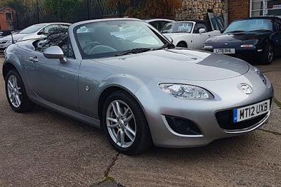
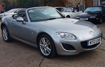
The third gen were objectively good cars which looked fine from most angles, but the headlights are too small, too high up and too close together, especially if viewed from the front, and the front wheel arches are much too conspicuous.
This is easily fixed with Excel and iPhoto.
BEFORE (image from MX5 City, o/t, I have ordered a couple of used parts from them, excellent service)

AFTER

This makes it look a bit S2000-ish, but that car had its own (unfixable IMHO) styling issues which are avoided here.
The curve of the front bumper could do with flattening off a bit so that it doesn't protrude so much, but I think that's a pedestrian safety thing, plus I can't fix that with Excel and iPhoto.
