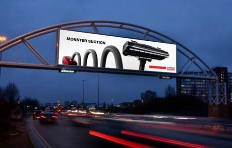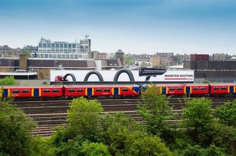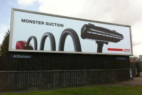
Miele vacuums are known for their massive power, so what better way to communicate that than to use a massive medium, a billboard. Using only two words and a logo, this ad really sticks to simplicity and just lets the product do the… sucking. Kudos to the agency, The Brand Nursery, for not running amok with boring details and bullet points which ironically would have made this ad really suck. Instead, The Media Shop, Posterscope and JC Decaux worked together to pin-point several great out-of-home locations for the monster take-over.
Dominic Worsley, marketing director for Miele, commented:
We are extremely proud of our vacuum cleaners, which continually come top in reviews and decided it was time to get the message out about how incredibly powerful they are. We hope this imaginative and eye-catching campaign will put Miele vacuum cleaners at the forefront of the consumer’s mind, helping to drive them into store.
As much as I love this ad and truly appreciate the simplicity and reference to the Loch Ness monster, I can’t help but think there’s a missed opportunity here. The first time you see Miele’s monster vacuum, I’m sure it’s very impressive. However, the second time you see it… are you still going to be as impressed? What if the monster was actually sucking/eating it’s surroundings… if there was a train car with people trying to escape, sucked into its mouth? In the end, this is still a very solid ad and I’m proud to have it on a billboard.


