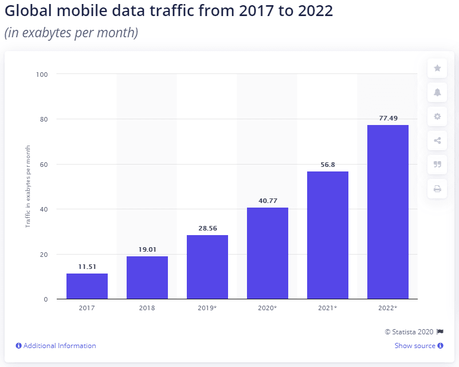
The world isn’t new to the mobile-first approach. Call it convenience or anything else — people are consuming content on their mobile phones more than their desktops and this will only increase in the near future. According to Statista, at least 50% of global online traffic is driven by mobile users.

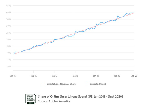
We were going through Adobe Retail Shopping Insights (2020) and found out that more than 42% of consumers have done their holiday shopping via smartphones. What’s interesting to note is that, despite working from home, Adobe projected that the average spend on smartphones was around $28B, and this was in the USA alone.
Let’s take a look at the following graph that depicts the smartphone revenue trend. Yes, with more people buying smartphones, the demand for offering better experiences gets higher.

In India, the number of users consuming content via smartphones is exponentially higher. According to Statcounter, mobile users stand at 76.98%, leaving desktop users behind at 22.48%. That sort of explains why most of us have adopted the mobile-first approach for crafting mobile-friendly user experiences.
But with the growing smartphone user base, two things are a given: one — There will be more people who will want to access your website via mobile, ensuring great quality and usability for your websites for mobile and testing them well will become very important. So, in this post, we’ll talk about mobile web testing, why it’s important, and its best approaches.
What Is Mobile Web Testing?
Mobile web testing is a form of test that’s performed to check if websites or web apps perform uniformly across various browsers and screen resolutions. This testing can also be called mobile web responsiveness testing.
Why Should We Perform Mobile Web Testing?
Our users consume content on different devices and different browsers. What this means is, most of them have different screen resolutions, and our products and websites have to be optimised to function across these various devices too. If the websites or web apps are not responsive, users may not return to the sites. Here are some reasons why mobile web testing is important:
For A Better Search Result Ranking: Google ranks websites based on how mobile-friendly they are. If the sites are mobile-friendly, they’ll also show up in the search results, thereby increasing our site’s discoverability factor. A simple way to find out if our website or a piece of code is mobile-friendly is to take up Google’s Mobile-Friendly Test.

For Device Compatibility: We’ve already discussed that our users browse on different devices, and these devices come with different screen resolutions. A wise thing to do is to understand what sort of devices our users have so we can prioritize web development and testing for those particular devices.
According to Statcounter, only 8.88% of users have devices with a screen resolution of 1920×1080 and at least 13.81% of users have 360×640. For a better picture, let’s take a look at the following graph.

To ensure our websites run uniformly across all screen resolutions, we’ve got to perform mobile web testing.
For An Enhanced Performance Speed: If the page load time is long, a user tends to lose interest in accessing the website or web app again. With mobile web testing, we can check and rectify our page load time, and also see if our site’s performance speed is consistent across various browsers. We can also gather page’s speed from Google’s PageSpeed Insights.
For A Better Design: Aesthetics matter and for mobile responsive websites to retain and attract users, our websites should also have a great design. Outdated browsers may not always support niche design features and to ensure our features work the way they’re intended to, we have to perform mobile web testing.
How To Better Plan Our Tests?
Now that we’ve established the importance of mobile web tests, here are a few things to consider for planning our tests better.
Is My Site Functional?
For our sites to function uniformly across all devices and browsers, we have to set certain checkpoints that include
- Are all the links opening up?
- Is the navigation functioning the way it’s intended to, across different screen resolutions and browsers?
- Are forms and interactive elements working?
- Are all elements and images optimized for different browsers and screen resolutions and are they functioning as intended?
Testsigma recommends UI testing for checking the site’s functionality as we’ll have the flexibility to check how different elements are behaving on the UI, also because a mobile website’s functions are mostly UI driven.
Executing these tests on various devices helps ensure that these functions are compatible across various devices and browsers even before including them in the website/web app.
Signup to make your website mobile web friendly, easily
You can check how to get started with mobile web testing with Testsigma here.
Is My Site Offering Uniform Visual Experience
Checkpoints for ensuring our sites are offering uniform visual experience:
- Is the site’s visual experience uniform across devices with various screen resolutions?
- Is the site performing consistently across different mobile viewports? Our mobile viewports are generally smaller than the screen-resolution and hence it’s important for our site to be visually uniform across both smaller and bigger viewports. Besides, that’s the only way to achieve mobile responsive websites.
Take a look at ViewPorter’s report on viewport dimensions for different devices. This could come in handy while performing a test.
We recommend UI testing or User Interface testing for validating the visual elements on the site. With this test, we can find out whether the visual elements meet the performance and functionality expectations.
Apart from checking if the visual elements are working correctly, this test is also helpful in finding how the website handles any user actions. You can also check out our article on how to automate mobile UI testing.
Is My Site’s Performance Speed Good Enough?
Users trust sites that load faster and to ensure speed, we have to set these checkpoints:
- Is our site’s load time uniform across a range of devices? For instance, if our site takes three seconds to load on Chrome, is it consuming the same amount of time on Safari too?
- Is our site’s navigation performing the way it’s intended to, across various browsers? We’ve got to check how long it takes for our users to complete a purchase or to interact with various elements on our site, and if that’s uniform across various browsers.
Honestly, there’s nothing better than automation testing on a real device to understand how our site is performing across various devices. Since, the performance of a site is also subject to network connectivity, low battery, memory consumption, start-up time etc., we’ll understand how these factors can affect the speed.
Mobile Web Testing: 3 Approaches That Will Make Your Life Easy
What are the best approaches for mobile web testing? — a million-dollar question that, fortunately, has quite straightforward answers. As we’ve already discussed what factors to consider for mobile web testing, let’s discuss the three best approaches for making our lives easier.
Cross-Browser Compatibility Testing: A cross-browser compatibility test is performed to check if our website or web app performs as intended, no matter which browser or device our users have. During a cross-browser compatibility test, we follow certain practices like validating our site’s HTML/CSS code, plugging in CSS resets, making use of vendor prefixes, checking how mobile-friendly our website is, and maintaining separate stylesheets for different browsers, etc.
It’s important to note that our users consume content on different browsers, and not all browsers support the features we design. If we take a look at the following graph by Statcounter, we’ll notice the market share of different browser versions.

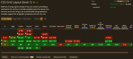
We can see it for ourselves — the range of web browsing habits is vast, and our website has to be developed in a way that it’s compatible across various browsers. For that reason, cross-browser compatibility testing is done. One of the best practices while performing this test is to find out if the features we’ve designed are supported by various browsers. We can use Can I Use? to check if features like fetch, CSS grids are supported by various browsers.

In case the features aren’t fully supported, we might have to introduce polyfills to ensure the running of essential features. We also recommend going through our exhaustive guide for cross-browser testing.
Test On Real Devices: A few may argue that testing on emulators/simulators is cost-effective and less time-consuming but any developer worth his salt will prefer testing on real devices. We’ve already mentioned how factors like network connectivity, battery consumption, memory consumption, pixel densities, etc. can directly affect the performance of our website or web app. We cannot fetch accurate results if our product is tested on emulators, and by testing on real devices, we can truly test how our end-users interact with our site.
But this may be limiting in terms of speed, and so that brings us to.
Automation Tools: Automation tools can cut down our efforts, cost, and time by several manifolds. But not just that, the accuracy of our tests is higher when we automate them. Apart from offering a better test coverage, automation is less time-consuming too.
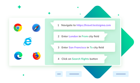
Testsigma’s automation tool supports both cross-browser testing and has a pool of thousands of real devices for you to perform tests on. What gives you a competitive edge over other automation tools is we’ve got over 2,000 devices that run on various (and even outdated) versions of OS, with various browsers.
Our cross-browser automation testing tool supports parallel execution and makes use of separate cloud environments for both cross-browser and cross-device testing.

It can be seamlessly integrated with CI/CD, project management tools, and communication mediums like email, Slack, etc. We send out comprehensive reports and maintain a log of all the bugs via screenshots and records so you can collaborate with your teams and work on fixing bugs together.
We’re not joking but it’s really that simple to perform mobile web testing using our tool! If you’re a mobile-first business looking to attract more users, let’s chat. Alternatively, if you’re looking at automating mobile app tests, check out our tool here. We’ve got a free 30-day product trial.

