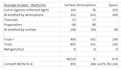
Their 'energy budget' was the topic of my two previous posts. If you summarise it, you get the following table:

That is the average for any 24-hour period in total. Problems arise if you try to dis-aggregate it into 'day' and 'night' (see previous post).
1. I think they didn't understand latent heat of evaporation (they show that the surface gives 80 W/m2 to the atmosphere) and the heat/potential energy transfers (they refer to this as 'thermals' and show that the surface gives 17 W/m2 to the troposphere).
Latent heat and potential energy can't be expressed in W/m2, they are expressed in Joules! They can't be measured with a thermometer! Some heat at the surface is converted to other forms of stored energy entirely. So while the surface is using up some its W/m2, those W/m2 are not being added to the troposphere, and so drop out of the equation. When water condenses or there is a down draft (to match a rising thermal elsewhere), the energy is converted back to Wm/2. There is no one-way transfer from surface to atmosphere, the W/m2 disappear from the surface and re-appear at the surface when and where the condensation and down drafts happen.
Like trees - they capture a lot of light and some heat from the sun and convert it to stored energy i.e. chemical energy. You can convert this back to a lot of heat and some light by burning it.
2. It is rather worrying that they show more than half of the radiation from the atmosphere coming back to the surface. If you start with a random photon somewhere in the troposphere moving in a random direction, you know that there are slightly more molecules per unit volume beneath it than above it. Therefore - you would reasonably assume - it is ever so slightly more likely that it will be bounced upwards by a molecule below it than being bounced downwards by a molecule above it.
Analogy - in the pub, people crowd round the bar. You are standing quietly drinking your pint. If you move away from anybody who jostles you, you will end up at the other side of the room. IPCC's logic is, you would end up in the middle of the crowd at the bar.
So they show an ugly gray band of 'greenhouse gases' at cloud level bouncing 90% of the radiation from the surface straight back down again; and according to them, over 60% of the radiation emitted by the troposphere goes down and less than 40% goes out to space. I'm pretty sure that 'greenhouse gases' can't and don't change the overall direction of travel of photons, or even that they slow down their progress any more that N2 or O2 molecules do.
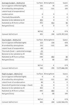
3. But never mind, I'm assuming that enough of their numbers are honestly and accurately measured or calculated for my version to be plausible - at least on their terms. I have used their figures as far as possible, but I had to change thermals from 17 W/m2 to 31 W/m2.
If the table looks a bit blurry, click it to see it clearly.

