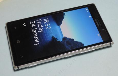
Microsoft (aka Nokia) Lumia 925
As you can see from the post title, I’m reviewing here both the Microsoft Lumia 925 along with its operating system, Windows Phone 8; the reason being that it’s often hard for me to tell where one ends and the other begins; where lie the borders between hardware, firmware and software; most of all taking into account that the three of them are created by the same MS Corporation. So, which of Microsoft’s companies gets the credit or the blame for a certain feature or lack thereof?
Also I must say that I’m new to Windows Phone, which is an OS I would’ve never gone for if it weren’t because Microsoft’s Nokias are the only phones (that I know of) shipping what I most value above all other features: free offline maps (HERE maps). Lastly, it’s to be noted that here I’m mostly comparing the Lumia 925 with my other two phones: a Nokia C7 (Symbian Belle OS) and a LG Optimus black (Google’s Android OS).
Look and feel
If you ever come to read this post, then by now you’ve likely read a bunch of professional reviews about the Lumia 925, with great pictures and descriptions, so I won’t digress much in this section. Physically, it’s one of the sexiest handsets I’ve ever hold and beheld, a pleasure to have in your hand, feels very light while not fragile (though somewhat slippery), has a nice form factor (a bit too wide for single-handed use) and is slim as can be. Its design is simple and elegant, an aluminum frame holding together the display and the plastic back cover (pity it’s not also aluminum, but I don’t mind to pay that price for the sake of lightness). The three discrete physical buttons are placed on the right side (the volume rocker would be handier if placed on the left, I believe). On the lower part of the display there are the three haptic buttons that Microsoft imposes on any manufacturer wanting WP to run on a cellular. On the back sits the mandatory camera lens (a very good quality Carl Zeiss) and the flash leds, plus a speaker.
Usability. The WP8 OS.
So far, so great. Issues show up when you stop staring at the device and start using it. Just to pick the first one you come across, let’s mention that it’s not possible to switch straight from standby to wake up mode, the same way you do with any iPhone, Symbian, Blackberry or Android. Even if you don’t set a PIN or key for safe-locking, on WP8 two steps need to be taken: first we have to get past the standby screen (they call it glance), either by pushing the power button or by double-tapping the display, and second we slide up the lock screen; only then we’re presented with the tiled, Win_8/ WP8′s iconic home screen.. (It’s pretty obvious where Microsoft is leading us.)
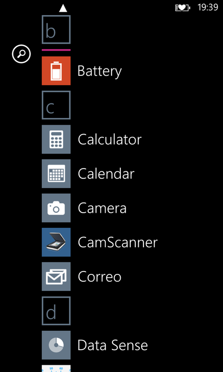
Applications list layout
Unlike other OSes, WP8 offers only one home screen where to pin our favorite apps’ tiles (each providing three different sizes for three different kinds of “live” information) in a vertically scrollable matrix. This screen is always accessible by pressing the central haptic button (the one with the Win 8 logo on it). Sliding this matrix to the left takes us to the applications screen: a very unwieldy one-colum, big-font-sized (not resizable) list of all our apps arranged by name that seems specially designed for wasting display room as well as, lacking a scrollbar, for making app search noticeably cumbersome: in the same screenshot where any other smartphone holds twenty apps, WP8 barely can show eight or ten.
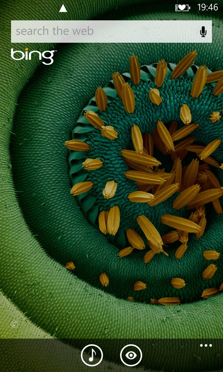
Search ‘feature’
The right haptic button is arguably one of WP8′s most inconvenient features: not only tends to stand always in the middle of every thumb movement we make, thus often being hit by accident, but also serves to the only purpose of marketing Microsoft’s Bing search engine: it brings forward a redundant IE10 browser, somewhat featured with two buttons for music recognizing and QR code reading. Worst of all, you can’t remap haptic buttons, nor cancel them, so as to -at least- not hit search all the time. But this is obviously made on purpose. Sorry to say, I find this is almost a swindle: a total waste of a precious haptic button, blatantly serving Microsoft’s own profit instead of the buyer’s use.
Finally the left haptic button, return, being most used is the hardest to tap single-handed. Unles you’re long fingered, you’ll need to tap it with your left thumb, or really stretch your right one… only for chance hitting search once more. For the rest, return works very much like a browser’s left arrow: it takes us to wherever we were before, and often it’s the only way for collapsing the popup keyboard.
All three haptic buttons have a vibrate feedback that can’t be turned off, which is a power waste for a device so short of battery life. Why not make it an option?
Now: so far, so bad.
Another down side about WP8 OS (though they sell it as the eighth wonder) is the severe development and use restrictions imposed on us, most of all when it comes to filesystem access, which is close to null. Microsoft is paranoid about this, and their staff have done a hard job here, even hackers at xda-developers being at a loss. There’s almost no way of file exploring except for three MTP-accessible folders. This is a big issue for anyone willing to have a minimum control over which files they’re storing in their device, and takes up a lot of the Lumia 925′s very scant storage room.
Say, for instance, you download a file for which there’s no associated app in your phone. Well, you won’t ever find that file, nor be able to use, transfer or delete it, even if you later install the appropriate app. You’ll have to download the file again. For the same reason, filesystem cleaning tasks can’t be performed, which leads to a ceaseless increase on the garbage we usually collect through normal web browsing, quickly shrinking the already scarce storage. In my unit, after one month use, the so called other (aka dump) category in the filesystem rounds up to 800 MB. There are a couple apps in the Market to help delete this garbage, but they use shoddy and slow indirect means.
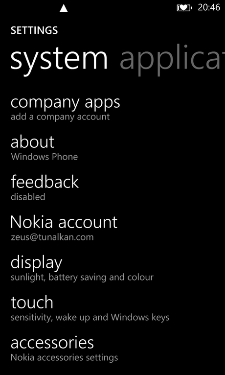
Settings layout
One more WP8 issue is the phone settings: instead of a hierarchy with ten or fifteen main categories holding subcategories–as Androids or Symbians have–we get here a settings scroll list with 54 categories (!!), divided in two groups: system and applications, with elements sorted out without any criteria whatsoever, logical or alphabetical. So, if you want to make sure you don’t miss the setting you’re scanning for, you need to slowly scroll through this long list; which happens to be extremely inconvenient, and ends up being annoying.
For example: a category named store is counter-intuitively listed under applications, whereas under system there is an apparently similar category named storage check, and yet another one called phone storage. The same goes for wallet, phone or background tasks: who on earth would expect to find them under applications? Inversely, email accounts, internet sharing, kids corner or even company apps, don’t go under applicatoins, but are listed under system. Sorry, Microsoft guys: what the hell?
As you can see, WP8 is no short of ‘misdesigns’ and missing basic features. Here are some others.
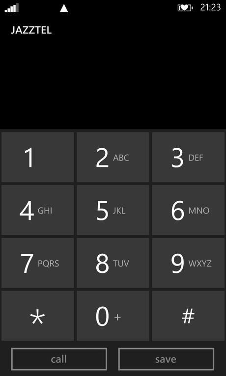
WP8′s keypad
There is, for instance, an odd lack of a direct key to the dial pad. While in every other phone on the planet you can acces the dial pad with one single press or tap, on WP8 you need at least two: first hit the phone tile, and then the keypad option. To make things worse, the T9 keypad lacks a transliterate feature; i.e., it can’t be used to dial a contact’s name by clicking on the letters: they’re there, but good for nothing. Fortunately there’s a free app (Phone dialer) offering transliterate. Thanks to DreamTeam Mobile for this.
Or what to say about one of the most arguable points in WP8?: its preventing any app (or shortcut) from directly changing the phone settings. Apps are only allowed to provide us a link to a given setting, thus being required two taps where other OSes need just one, which is yet another bothersome behaviour. WP8 devs say this is purposely devised on account of– the shooing and always vague–security reasons; but until someone tells me a real solid argument to buy those reasons, I’ll keep thinking it’s but Microsoft’s bullshit; sorry.
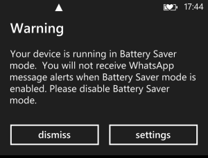
No notifications when in eco-mode
What else? Oh!, yes. Except for calls and SMSs, you don’t get background notifications in battery saving mode, which is close to unacceptable for apps like Skype or Whatsapp, for example. You can’t stay socially connected and preserve power at the same time, which is an extraordinary inconsistence: if you are socially connected, you’ll soon run out of battery and can’t stay socially connected any longer; but if you preserve the battery power in order to stay socially connected, then you can’t be socially connected. To top the bill, for viewing the apps’ notifications in battery saving mode you have to: first wake up the phone, second unlock the screen, and third bring forward the app. Too cumbersome.
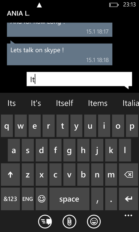
Keyboard in predictive text mode leaves 25% screen to the app.
To be done with this section, let me talk about -perhaps- one of the worst flaws in WP8: the virtual keyboard. I’ve never had to deal with anything the like: drawn after the maximal-minimalistic kind of style with which Microsft designers seem to think they’ve re-invented the hot water, WP8′s oversized and simplistic keyboard is both unpractical for typing on, and obstructing when it comes to deal with the app running behind. To name three of its main issues:
1.- it lacks some basic signs (a one-tap question mark, for instance),
2.- its lower row is totally misplaced to the right, to the point that, in the Spanish layout, letter B sits almost underneath letter J (for anyone used to blind typing, WP8′s keyboard typing experience is odd: keys to be pressed with our left thumb are noticeably closer to the right one),
3.- in predictive text mode, an unnecessary stripe, way too wide, is added on top of the upper row for showing the suggestions, leaving barely one fourth of the screen to the app.
It’s my belief that when something is not polished, not perfected, all efforts to improve it are welcome; but smartphone virtual keyboards have already been brought to perfection by iOS and Android designers, and hardly anything else can be done to make them better; therefore, any step in the line of bringing to humankind a new way of typing is plain extravagant to say the least; outlandish to be more precise. The wheel can not be reinvented, Microsoft: WP8′s keyboard does not contribute with anything to the typing experience while certainly detracts usability.
One good thing can be said about this keyboard, though: predictive text works like a charm. Most of the time, except for fuck and some other inspiring words, it gives me the right suggestions (which, I admit, doesn’t tell much about my English vocabulary span).
Enough. As a last word here, suffice to notice that I haven’t even started talking about the apps themselves, most of them lacking features present in other OSes’ counterparts. Perhaps the most relevant of these applications is Skype, with which you can’t send SMSs. Funny enough, Skype belongs to Microsoft Corporation.
Usability. The device.
First let me talk about what, in my regard, is one of the two best sides of this handset: the display. Simply superb: resolution, color density, responsiveness, brightness, reflections… Any aspect of the screen is great, even compared to the Nokia C7 or the LG OB, both being good contenders. The other strong point in the Lumia 925 is the camera, which is surprisingly good for a mobile, being able to take pictures sometimes even better than a “real” camera. The 925′s lens, along with Lumia’s five photo applications, let you profit its possibilities to the max. Where I don’t see the point, though, is in Nokia’s four camera apps (besides the WP8 default), which turn to be redundant and confusing. I wish there was just one app (the default, tweaked to offer all the added features of the rest), because oftentimes I lose a good shot just because I’m thinking which of the five apps should I open in that moment.
Lumia 925′s call quality is–in my experience–acceptably good, compared to both the Nokia C7 or the LG Optimus Black. Voice through the earpiece sounds clean, undistorted and crisp, without background white noise. But that’s as good as it gets, because this Lumia has TWO HUGE FLAWS: 2G data transmission and storage memory, both unforgivable in a flagship device.
Whatever its origin–hardware or software–the poor creature can’t establish a 2G connection even in normal (2-3 bars) signal conditions. In the same spot where both my C7 and OB take ten seconds to synchronize mail or chats, the Lumia 925 is a helpless failure, taking sometimes up to three minutes to connect (!!), only to finally give up unsucceded. Here, this handset scores an absolute zero. No problem with 3G, however. But 2G saves power and is definitely more appropriate for voice calls. And what if we’re somewhere out of 3G signal? I’m afraid that Microsoft’s Nokia division has done a very poor job there, mostly taking into account that this is supposed to be a flagship phone: it oughtn’t have any problems working with data over GPRS, even when signal is poor. At least, not where an outdated Android Froyo or a relegated Symbian Belle do the same job flawlessly. Hence, trying to chat, download a text message, connect to the Market or search on Bing over 2G is a frustrating experience.
As to the storage, the phone has a chip with just 16,000,000 bytes (which is only 15.2 GB, not 16 GB as the marketing goes) for containing the operating system itself (which can eat up to 2,6 GB!), plus the apps, plus our country’s maps, as the very essentials; hence, if we consider the 8.7 Mp camera, there’s definitely a severe shortage of storage room for our pictures and multimedia content. And, as I don’t see any reason for not shipping 32 GB (only some branded models do) or at least a microSD expansion slot, I strongly believe that this is done deliberately to force us to use SkyDrive. Actually, it’s no little coincidence that, along with the small storage, comes an aggressive marketing campaign for promoting Skydrive. Microsoft doesn’t want us to store our data and information on the phone, but on their servers, wherefrom they can collect it for being sold to the best bidder. So, have this in mind when you buy a Lumia 925: you’ll be contributing to the success of the data business and, in a way, to people’s control.
Another important weak point in this phone is the battery life: deplorable; utterly disappointing when it comes to practical use. I know that other reviews say the opposite, but… if you want my advice, don’t pay attention to those reviews. Sure, if you put the handset to sleep and in eco-mode mode, it can last well over two weeks untouched; but nobody buys this phone for not using it. Likewise, if we only use it for calls over 2G, battery life is also acceptable: we can get three or four days without a recharge; but then again, after spending 350 € in a piece of hardware like this, a Lumia 925 buyer is looking for much more than just a reasonable talk time: he’ll want to chat, browse the web, use VOIP, videoconference, listen to music, play videos, take photos, check email, use HERE maps, etc. But then, unfortunately, a fully charged battery won’t make it till the end of the day without a recharge. See this screenshot here?:
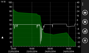
Battery drain
Notice the huge drop between 4 and 6 pm? That’s two hours of Whatsapp chat, draining around 45% of the power. This means only four hours of chatting over 2G will give you a dead phone… supposing it was fully charged. Besides, the processor gets noticeably hot. I don’t know if this is a Whatsapp or a Lumia issue, but I don’t care much: whoever the fault, it’s unacceptable. On my C7 I can chat twice or thrice that time until I run out of power. Other web apps don’t drain the Lumia’s battery so quickly but, in general, with any kind of internet/navigation use, this cell phone’s won’t render more than five hours of intense use. Doing exactly the same things with my other Nokia I get almost three day’s use, and two days with the LG Optimus Black.
* * *
And that’s all, folks! Here you have your Microsoft Lumia 925. I’ve left behind in this review some typical aspects like multimedia capabilities, camera details, web browsing experience or extended information about calls. This is intentional: there are dozens of professional reviews that will give you extense and, as far as I’ve read, quite reliable information regarding those features. My main point here was to talk about those sides most other reviews never mention.
I can’t really see what kind of customers is Microsoft targetting with WP8 phones. Buying a new smartphone for losing features seems to me utterly absurd. Perhaps it’s a matter of fashion, but I don’t get it. Actually, many WP8 buyers comment online that they were just bored of Android and wanted to try something different. Well, I reckon you need to be ample on money for that. From my point of view, the only one good reason for purchasing a Microsoft Nokia is HERE maps. True, some things are really cool about the 925: Glance is cool; the stability of WP8 is cool (yet, sometimes it freezes for half a minute), but only at the cost of forbidding the apps to do many things they can do in other environments not less stable.
Conclusion: If you don’t want to get frustrated, don’t buy a Lumia 925 and, if possible, don’t buy a Windows Phone 8 at all.
Please feel free to comment anything. I’m open to all opinions if they’re expressed with respect to the author of this post. On my side, I can only say one last significant word: my MS Lumia 925 is for sale./em

