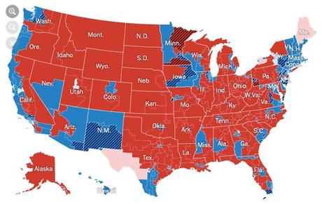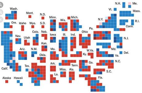

The maps above are from The New York Times. Both show the results of the 2018 congressional elections. But they are also a prime example of how a map can hide as much truth as it reveals.
The top map has an enormous amount of red on it. It gives the impression that most Americans are conservative (and that somehow the Democrats must have connived to win in 2018).
That is simply not true. The second map breaks the country down into congressional districts (roughly equal). Note there is much more blue on this map, because Americans voted to give Democrats a significant majority of those individual congressional districts.
The truth is that most Americans are not conservatives. And in 2018, they showed a definite preference for Democrats.

