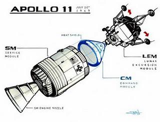
 How a simple line drawing can become a great illustration like this one made by Jason White?
One of most interesting tutorials made by designer Jason White in his latest book "Old School Wiscom" is dedicated to the importance of a good line drawing.
This tutorial is all about it!
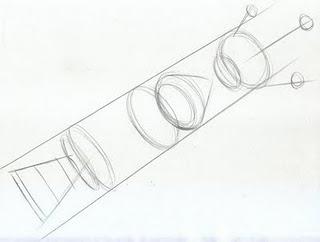
"If all the lines in a drawing are the same thickness, the drawing comes across as primitive and static. This drawing of the Apollo 11 modules is intended to illustrate the benefits of using different line weights in a drawing."
In other words we cannot pretend that it is enough to draw lines to make a shape in good perspective to obtain a good drawing and illustration...we do not have to forget that our drawing is always in perspective and to give that effect of depth we need to change the thickness of some lines according to the technical drawing rules. So the thicker lines are the border objects (basic shapes) ones and the lighter ones are the inner lines (like cut lines and graphic lines). In this tutorial it is very clear how and where to variate lines, so I suggest you to go check all images step by step of this excellent tutorial to understand and learn...start doing the same from today to your sketch technique to improve it and bring it to a professional level.
Click: Jason White's linedrawing tutorial.

