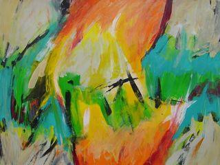
I didn't begin this painting with a plan in mind, but it ended up having a landscape feel to it, though not one with a typical horizon. I began painting with emerald green and teal blue, using a brush and blending them as I painted.
I painted a bright yellow above and below the green in the center of the image. Then I added cadmium orange above and below the yellow, and used a pale peach to blend the colors together.
The acrylic paint dries fast on this paper, but I worked quickly to blend colors together. In the unpainted areas of the four corners, I used unbleached titantium, parchment, and titanium white, blending them as I worked. I also added the parchment and white into the center section.
In the final steps, I used darker colors as accents--first a cadmium red deep, and then mars black, applying them with a thinner brush for more control.


