Paintings by Mark Grotjahn at LACMA
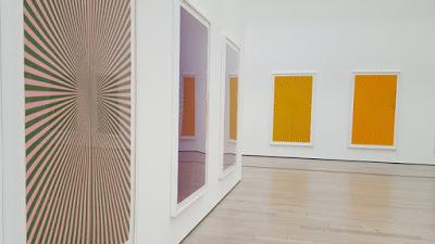
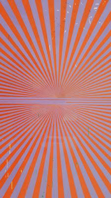
An interesting contrast to the David Hockney portraits at the Broad Contemporary Art Museum at LACMA is the exhibit in the adjacent gallery of “butterfly” or starburst compositions by Mark Grotjahn. (The actual name of the show is 50 Kitchens–see below.) The colorful paintings, all the same size and with a similar design, are mounted on stark white walls–as opposed to the pomegranate red walls of the Hockney show. Each of the Grotjahn paintings explores a different combination of colors. And when you get close you can see speckles of other colors peeking through.
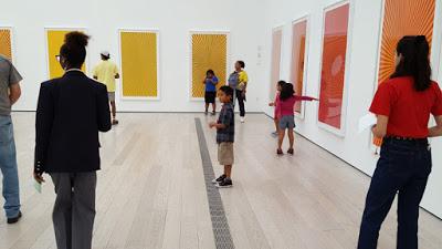
Choosing favorite colors
On the Sunday afternoon that I visited, two groups of kids were doing activities related to the paintings. After choosing the paintings with their favorite colors, they gathered on the floor with paper, rulers and colored pencils to create their own butterfly designs. As you look at each painting the two halves are mirrors of each other, just like a pair of butterfly wings! It looked like a fun project–for kids or adults!
This painting is symmetrical on the horizontal axis; others are on the vertical axis.
The exhibit ends August 19, 2018.
Los Angeles-based artist Mark Grotjahn (b. 1968) has made “Butterfly” compositions since 2002, and the latest to come out of his studio is 50 Kitchens (2013–18), exhibited here for the first time. Conceived as one work, 50 Kitchens takes its inspiration from a single composition (in black and cream-colored pencil) that Grotjahn made to meet the dimensional specifications of a wall in his kitchen. The more than 50 subsequent chromatic drawings explore pairs of radiating colors (like Tuscan Red and Chartreuse, or Grass Green and Canary Yellow) and together create a prismatic display. The works allude to artists interested in color, light, and optics, such as Wassily Kandinsky and the Op art painters of the 1960s, and also incorporate residual traces of earlier drawings that have been seamlessly integrated into the new works.
