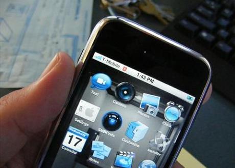
 More and more, people are using their smartphones to access the internet. Photo credit: Robert Anthony Provost
A recent Ofcom report has found that two fifths of UK adults now own and use a smartphone to access the internet. That’s hardly surprising given how popular mobile devices have become, but what is surprising is that organisations have been somewhat slow to adapt to the smartphone’s rising popularity.
When first developed, websites were oriented toward desktop and laptop users and assumed that consumers had large screens and technology such as Flash to navigate through content. Fast forward to the present and such conventional websites are likely to put off customers who are using a handheld device to look for information and/or to buy goods and services from your organisation.
Some businesses have tried to address the exponential growth of handheld devices by building separate websites which are optimised for mobile and can run alongside their desktop sites. This fragmented approach means that there is more than one website to develop and maintain and this can prove rather expensive. Furthermore, with the advent of tablet devices there are even more screen sizes to consider. Thankfully an approach for websites called ‘responsive design’ offers a solution that’s much easier to manage and is more cost effective.
Responsive web design displays the same content as a ‘conventional’ website but uses layouts suited to a device’s width. Whether a customer views the site on a smartphone, a tablet or a conventional PC screen, the website adjusts the layout accordingly, giving a consistent look and feel no matter what the device. Yes, it actually is a one size fits all approach that works! Customers who use a plethora of devices and browsers will access a single source of content – your website – which is laid out to make it easy to read and navigate with a minimum of resizing, panning and scrolling.
It’s time to think of handheld devices first because ultimately, it is how most of your consumers will be accessing your website. Most of us are all too aware of how frustrating it can be to view a ‘conventional’ website over a mobile phone. If a website is either taking too long to load or appears too cumbersome to navigate, remember that a competitor’s website is only a couple of clicks away. A customer spurned is a customer lost.

