A Really User-Friendly Website
Whether your business is based online, with no kind of real-world outlet, or a brick and mortar store or business is your primary source of income, with an online presence to support it and help it to grow, your website is a crucial element to your business.
Even the smallest of businesses today have a website and a social media presence.

Your Website As A Tool
Your website is a fantastic tool . It can help you to attract new customers and give you a way to reach a much wider audience. A website can give you an easy way to communicate with your customers and a fast way to provide them with any information that they need.
It gives you a place to engage with your audience and a chance to grow loyal relationships, as well as somewhere to give them extra information and support.
On the other hand, it also offers your customers an easy way to reach you, to ask questions and to provide honest reviews and feedback. Your website has many benefits, to both your business and your customers, and it's easy to see why so many brands are investing so much time and money in theirs.
But, it's only a useful tool if it's used well. You might think that your website is easy to navigate, loads quickly, makes sense and gives your customers what they need, quickly and without confusion. But, you spend a lot of time on it, and it's really not you that it needs to impress.
A good website needs to be user-friendly, easy to navigate and exceptionally simple. The layout needs to make sense, essential information needs to be easy to find, and if you sell online, the process should be straightforward and fast.
Take a second to look at your website as someone who has never been on it before, is it really user-friendly, or have you just gotten used to it?
Is Your Website Accessible?
Firstly, ask yourself if your site is accessible to everyone. Do you have up to date translations installed? Is your font easy to read? Do your photographs and graphics have descriptive and helpful alt text?
Do your videos include audio description services ? Is it keyboard accessible, or are there areas that require a mouse to view?
Consider getting a focus group to spend some time on your site and offer your feedback. They might spot things that you don't.
Does It Work Well on All Screens?
Not everyone viewing your website will be doing it on a desktop computer. In fact, most of them probably won't be. You might find that the majority of your viewers are on tablets, smartphones and other devices .
But, chances are you work on it on a desktop or laptop with a large screen. What you see, isn't necessarily the same as everyone else.
Take the time to check your site on different screen sizes, to make sure that it looks the same, all of the pictures and graphics fit, and the headings still make sense. I'm always checking my mobile device when I publish a new post and poke around a few pages while I'm there. 🙂
Is Your User-Friendly Website Fast?
Modern websites are huge. Yours probably has videos, photos, and plugins taking up space. This can make things slow. But, most users will click away if a site doesn't load within a few seconds, as we've become so used to instantly internet access.

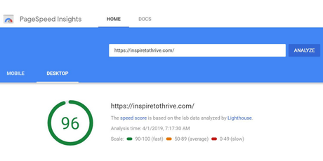
If your site is slow, consider optimizing images, hosting videos on YouTube and embedding them, and other website speeding up techniques. If you are unsure, go to Google page speed test page.
Of course you can (and should) check the mobile speed too which mine now needs improving. It's being worked on by Mayura. 🙂 Sometimes plugins come and go, so be sure to monitor those too for your website.
Does the Navigation Make Sense on Your Really User-Friendly Website?
For your site to be easy to navigate it needs to have basic things like an easy to find menu and a search bar. But, beyond this, ask yourself if it makes sense.
Do your categories and menu items make sense? If you came on looking for specific information, could you find it easily?
How is Readability?
Many website owners are guilty of focusing so much on and keywords that their text is hard to read, and sounds unnatural when read out loud.

Make sure it's easy to read with headings, small paragraphs, and good writing, and SEO should follow. Break up large chunks of text with bullet points, pictures, and graphics, and make sure you proofread everything at least twice, with one real through out loud to get a better idea of how it sounds.
Does Your Website Work?
Have you ever tried to make a transaction on your website? Have you tested your links, your email sign up form and your social media buttons?
The best way to make sure things work is to check them for yourself. Do this regularly, don't just assume that because it worked when you installed it, it always will.
How often do you test for website usability yourself? Do you have someone to monitor your website for usability?
I'd love to know more in the comments below on how you are making your website more user friendly!


