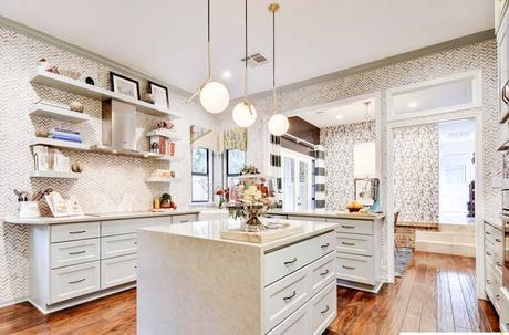
 I do really like the chevron wallpaper, I'm just not sure if I like them throughout the whole kitchen.
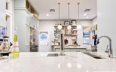 The kitchen is the work of Lieve Saether, Owner at Turnstyle Design LLC. The kitchen is her own.
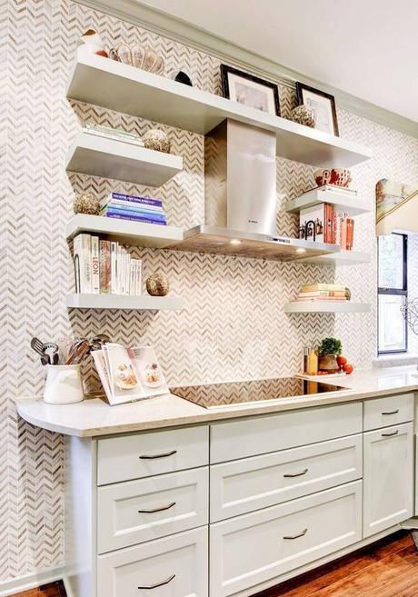 Open shelves in the kitchen are a popular way to add more kitchen storage
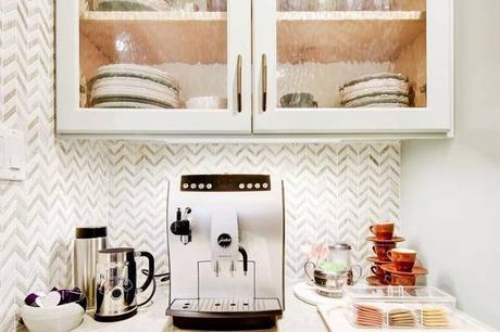
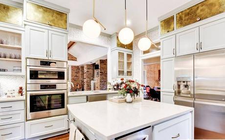 I am not a big fan of the brass-looking top cabinets. I do really like the soft greenish white on the other cabinets.
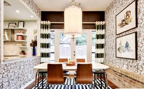
Saether's strong suit is unexpected mixes of pattern, color, and texture. She says the key is not too take them too seriously and follow your own creative intuition.
Below are some "before"shots so you can really appreciate the transformation.
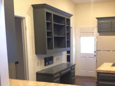
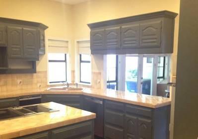
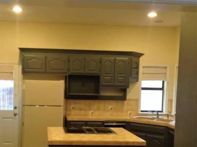
What do you think? For me, I do think the kitchen is really beautiful, and I would definitely say "wow" upon entering, but there is a bit too much going on for me. I like more minimalist kitchens.
Read the whole story and see all the pictures from the source.
