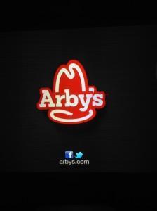
Friend of the blog and professional designer Uriaha was watching some TV the other night (and yes, of course, apparently there was at least one other screen operating in his lap or the coffee table in front of him). He caught this on his iPad and sent it to me in an email entitled “Yet another new logo” with the text of the message reading “It’s not even on their site yet:”

My friend is very quick with his iPad camera.
If this a new logo, that makes two new logos in about a year.
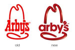
Check out this blog reviewing their last change. All that blog writing, now, gone to waste if they’re airing a redesign of the redesign. The following is a screen grab of the two logos as shown on the Design Shack site last October:

From a nice review on DesignShack by Joshua Johnson a little over a year ago. Compare this “new” hat’s lowercase “a,” lack of friendly little curve on the tail of the “y,” and weird apostrophe to the hat Uriaha caught on his iPad. Oh, and the shiny three dimensionalness. I’m sure a pro designer would spot a thousand other differences.
I always assumed the name of the restaurant was a phonetic spelling of “R B” which stood for “roast beef;” but another friend of mine used to claim that “Arby’s“ stood for “America’s Roast Beef, Yes Sir!” Turns out we’re both wrong.
But I might start pretending, based on my friend’s belief, that the name is an acronym for “America’s Re-designing-est Brand, Yes Sir!”
