User Experience also known as UX has been an integral part of design both in web design as well as mobile app design. Traditionally web design has always been the focus for business growth and innovation; however, the latest statistics show that there has been a big shift towards mobile app designs. By 2020, mobile apps are forecast to generate around 189 billion dollars in revenue through app stores and in-app advertising. According to statistics, 197 billion apps were downloaded in 2017. It is no longer enough just to create a mobile app, instead mobile app developers and graphic designers need to work together and use the latest tools and resources to create a seamless yet intuitive user experience. By providing a personal and relevant experience to the user, mobile app creators can ensure that the user would continue to use the mobile app. User experience concepts are carefully designed to increase pleasure and usability to the consumers. The entire interaction process with the mobile app must include aspects of branding, design, usability, functionality, and ease of use.
One of the best way to improve user experience for any mobile app is to implement innovative navigation. Different mobile application can present different challenges; however, most can be improved through navigation design. Here are 3 innovative mobile app navigation trends for better user experience that will enable you to tackle any usability problems with your mobile app design.
1) Side Navigation

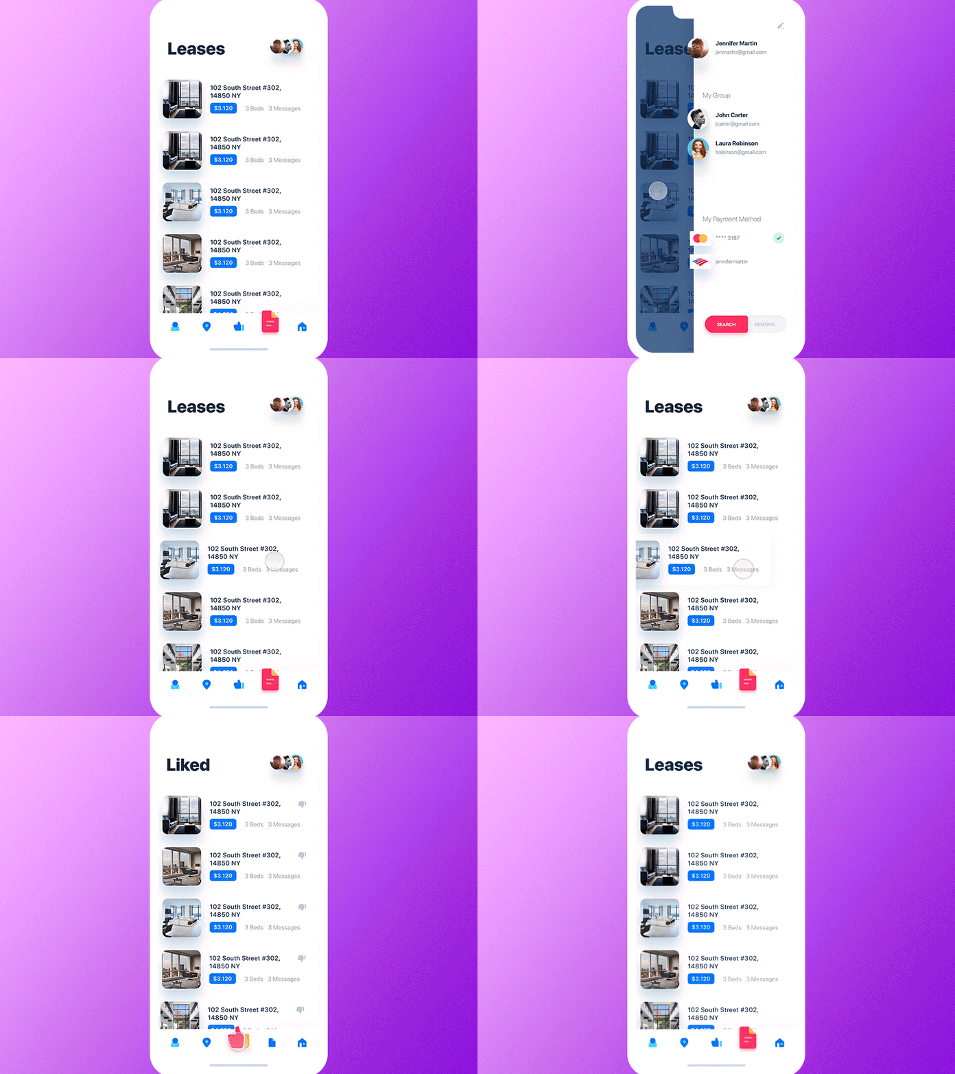
Side Navigation is part of an evolution that is popping up everywhere in mobile app design. The hamburger menu or triple bar menu is often displayed as ☰. The design is often located at the top left or right hand corner and provides a shortcut to various menu items. This navigation option is very population amongst mobile app designs because it allows users to have a full view of the app without having to deal with cluttered menu items. Mobile app design need to be user friendly as 75% of internet usage worldwide originates from mobile devices.
2) Bottom Navigation

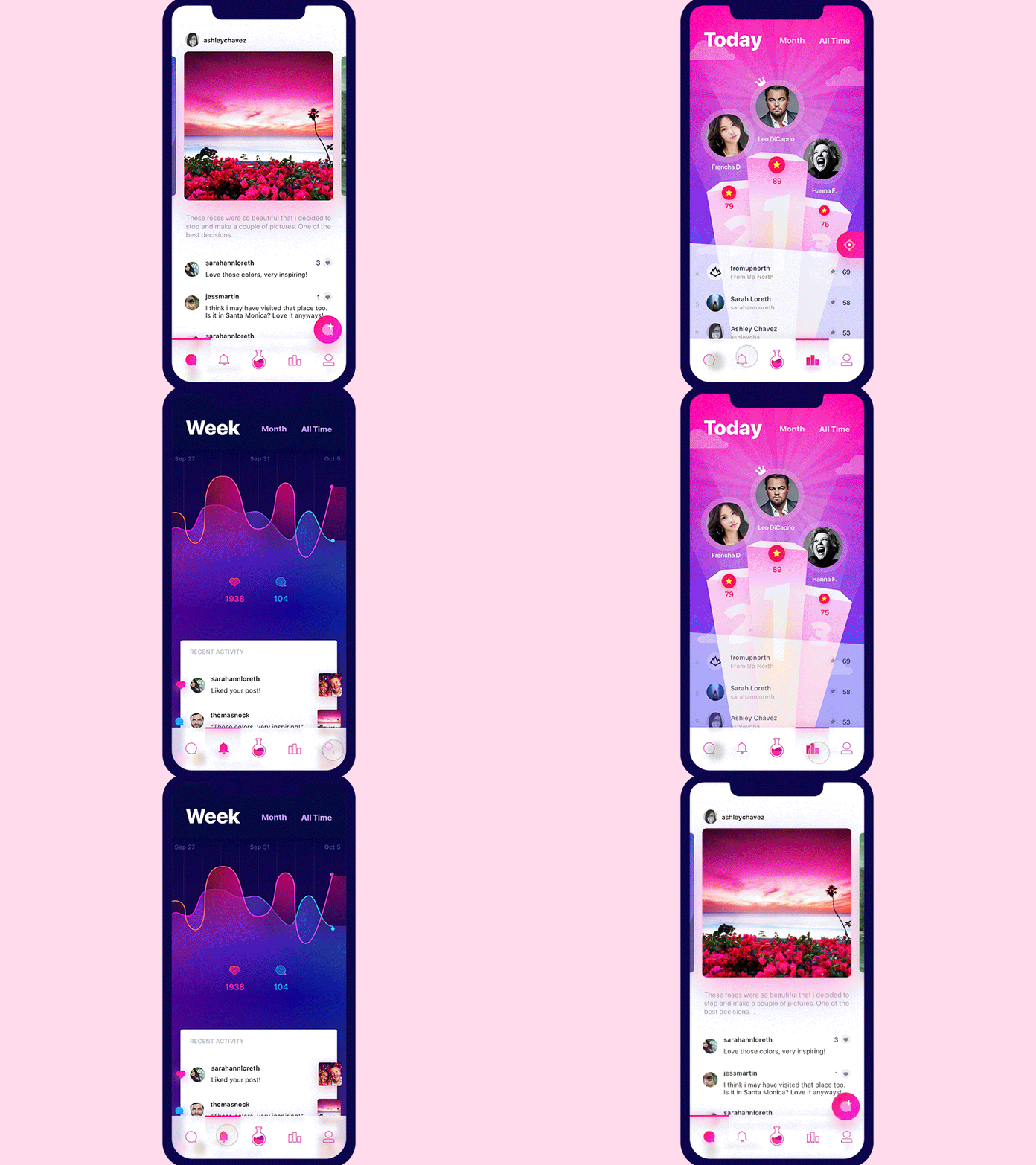
Bottom navigation makes it easy for users to switch between various and explore the app at its fullest capability. Often there are three to five top level navigations that allow users to get to common destinations While there has been other navigation options in mind, the bottom navigation concept has always been a sure winner. Many mobile phones have adopted this concept due to its simple yet user friendly design. When thinking of mobile app navigation, designers must think of designing with thumbs in mind. As a result, this concept covers a clear, visible, and consistent concept of navigation. In a research on mobile device usage, 49% of people rely heavily on one-thumb to accomplish their tasks on the phone and 75% of interactions are thumb-driven. In summary, since the bottom navigation was designed with links that are easy to reach and thumb friendly, this design is here to stay. Call to actions are easily navigated with user friendly design make bottom navigation of the most common option for mobile app navigation design. .
3) Horizontal Slider

Horizontal slider was created due to an increased demand for more screen real estate. The design was created to allow users to scroll through images or content horizontally even when they have a small screen. This concept is preferred by most designers because it is intuitive and can fit an unlimited amount of content whether it’s images, blogs, or videos. Consumers often spend an average of 28.8 minutes a day viewing mobile videos. Companies such as Airbnb, Uber, and Instagram are already taking advantage of this concept by showing users similar experiences and options by allowing them to scroll horizontally. For example, users on Instagram can endlessly scroll through several Instagram stories to view the latest content at the touch of their finger. The concept is clear, simple and organized allowing users with limited skills and knowledge in mobile app to use it.
In conclusion
In conclusion, while there are many mobile app navigation trends out there, these 3 concepts are here to stay due to their ease of navigation, design and simplicity. The concepts of using a side navigation, bottom navigation, and horizontal slider are classic and can only be improved with time. Many major companies are already using these concepts and they continuing to improve the design everyday. Mobile users are already familiar with these concepts; therefore, it would be easy to integrate within a mobile app design. It’s more crucial now then ever to design mobile app that are familiar and easy to use for users as mobile spending is projected to triple and reach 201 billion dollars by 2021. No matter what mobile app design you choose, make sure to keep user experience in mind.

