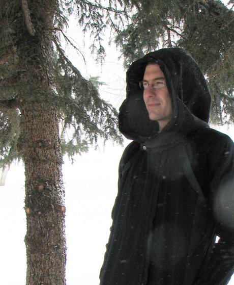
For the latest installment in our Industry Expert Interviews series we were lucky enough to speak with visionary artist/author Shaun Friesen, who has recently released The Riddle Solver, a visionary buddhapunk prayer that re-mixes technology, spirituality, and economy into a new quantum humanity. He also happens to be I.M.P’s chosen artist!
Shaun has presented his multimedia artwork at numerous tribal and community festivals around western Canada.
In 2008 Shaun displayed two culmative art prints, Sun and Moon, from his Digital Unionseries at a successful fundraising group show called ‘Soul to Soul,’ in visionary artist Alex Grey’s MicroCoSM (Chapel of Sacred Mirrors) gallery. Shaun studied with Alex and Allyson Grey in 2009, participating in their visionary arts intensive. The following year, for the release of the 6th edition of the Chapel of Sacred Mirrors Journal, Shaun designed a viral campaign for CoSM.
In 2009 Shaun supported New York based media theorist Douglas Rushkoff with the release of his book Life Inc: How The World Became A Corporation And How To Take It Back. Using his digital ninja dexterity and nanotech production skills, Shaun knit together the renaissance sequence featured in Rushkoff’s Life Inc: The Movie. In 2010 Shaun received Digital Alberta’s Best Animation Award for these contributions.
Since 2010 Shaun has been a designer with the visionary art global microgallery collective, the Galactik Trading Card Oracle Complex. He lead the production of a 92 page hardcover tome, a 10 year Oracle history and treatise on visionary design and visual remix, which was released globally in September of 2011.
You’re a professional creative with a particularly strong vision, please tell us a bit about your design practice. What is the philosophy behind what you do? What motivates you?
Nature motivates me, and acts of atrocity against it provoke me to light the world on fire – or at least the collective human soul understanding, of what the world is.
With my design practice I identify the very best invisible essence that a business, brand, artist or teacher (or all of the above) has to offer, and make it visible. I aim to distill the essence of a subject, project, or person down to a core visual message of unspoken impact; beauty, awe and grace.
I have always liked the title of Animator, as it makes me feel a bit like Dr. Frankenstein – I support you to come alive.
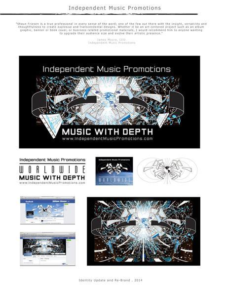
Our readers may be interested to know that you created all of the I.M.P artwork. Can you please share how you came up with this truly epic imagery? As well as your interpretation of it?
I was working in my sketch book at the time, and after the first consultation meeting I felt like the most recent sketch would be an ideal starting place. After a high res scan, I added the vector composition of the planet, the magnetic field, staff paper and musical notes, which would later be refined into the numerous logos.
Maintaining company colors was a primary importance. The re-brand had to be visually on-par (or beyond) the bands the company represented, or even looked up to… tool, nin, etc. The slogan of ‘Music With Depth’ was a big part of the integration as well, seen as the space photos and the photo I took of vancouver: the ocean; waves.
In the end I see the new branding represent an unprecedented, never-before-seen explosion of music and creativity. The black is the industry, being blown apart, as well as trying to trap the new, inside some kind of old paradigm. The most visible staff paper annotations, on the left and right, are the first 8 notes of Beethoven 5th Symphony. I feel like the art (as well as the company mission) is linked to that level of epic. Unstoppable. Cue music.
What music-related art have you been captivated by lately and why?
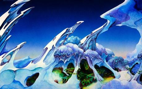
The artist, illustrator and architect Roger Dean. He’s the visual master who was commissioned to do most of the Yes albums. Definitely captivated, because of his imagination, and technical execution. More than any other music-related artist I think he truly approached a record cover as a fine art canvas. But of course this was back in the day when album sleeves were tangible, and required an in-depth investigation – an environment to be immersed in – while immersed in the music itself.
Beyond Roger Dean, LP’s themselves have been captivating me. Mind you, not looking at album art on google, from the 60’s, or even LP re-issues, but actually holding the album from the 60’s and 70’s and trying to time travel a bit, and feel what life was like when that album was released. Fuck, that’s the only signal there was back then… Not an interconnected, intercontextual spiderweb of hypermedia, but a self contained island in time.
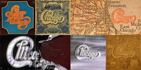
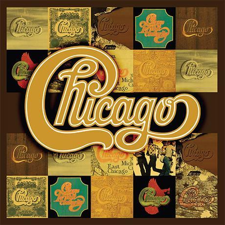
The Doors LA Woman, Born on The Bajou CCR, Paranoid Black Sabbath (mostly the inner photo) and I really like Chicago’s Best of. Chicago’s wordmark and album design are definitely under recognized; their visual voice a well knit conceptual cohesion spanning 4 ½ decades.
What makes a great album cover?
Art only – no text, such as Autechre’s Draft 7.30, King Crimson’s In The Court Of The Crimson King and of course… Pink Floyd’s Darkside of the Moon.
Visually quaint, cute, quirky, puns don’t work, though dark satire always does. Always mystery over ambiguity. Legitimacy over Parody. Striking, rather than Shocking. Rage Against The Machines self-title debut is striking, while NOFX’s Eating Lamb / Heavy Petting Zoo is shocking; it’s a cute quirky punk rock pun. Sexy Innocence works, far more than Adult Slutty, such as Deftones Around the Fur rather than The Strokes’ This is it.
My favorite album covers are those that are enticing, micro-piece’s of an entire world, and at the same time, work as an emblematic visual flagship of the whole. Any album cover by stars and artists likes Bjork, Tool, Nine In Nails, David Bowie, Tom Waits are exemplary, and so very hard to separate from the music itself.
So, what makes music-related merch memorable? We’ve all seen that band hoodie at a gig that we must buy!
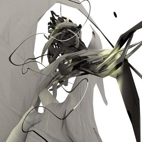
In terms of merch, it’s usually a core aspect of an albums visual signature – such as a background subtly brought to the foreground for full audience focus. This is the NIN visual formula.
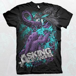
In terms of hoodies or garments: simplicity, mystery, puzzles, riddles. Op art. Sci-fi. A visual integration of the occult – like Dead Kennedys level occult. An indirect pattern of ambient flavor. Depends on your genre of course and what your audience is willing to wear. I’m not too sure who would wear a baboon puking up an octopus… or maybe it’s eating it… I’m not too sure (Asking Alexandria’s Baboon vs Octo Shirt).
Please don’t put your square album cover on your shirt…please. Push beyond and further into your album art brand. Like Roger Dean, treat the garment as a wearable canvas. The print-on-demand technology these days it quite astounding. 15 years ago I remember bands having to drop $600-800 minimum for a 2 color silk screened shirt – pretty insane compared to print-on-demand digital submersion and all-over-shirts.
Music/album artwork includes some of the most iconic and recognizable art ever released. What are some important considerations for independent musicians when planning the art that will represent their music?
It’ll be around forever so don’t rush it. Contribute something visually equal to your music. Make it something that, 10 years down the road, you’ll still be proud of.
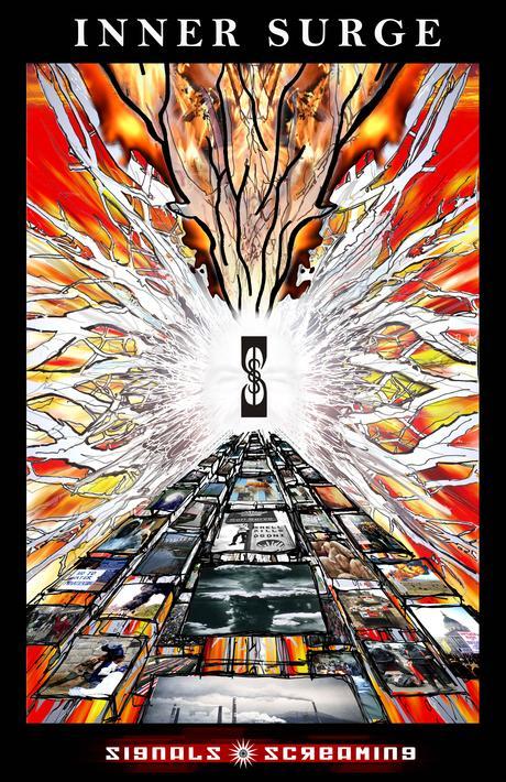
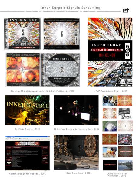
The first album art I did was for Inner Surge Signal Screaming. 10 years later and I am still proud of what I made, how it represents the music, and also how it artistically depicts the incoming upgrade of the information highway, way back in 2006.
Where should a musician start when looking for the right artist/graphic designer for their project?
You don’t necessarily need to find an artist with a lot of past album work, more-so a visual style you like.
Find someone who has the ability to technically jump mediums. If it’s not the artist themselves, then an art director or visual support person who can offer technical assistance in building a brand that can hit every platform you’re wanting. Whether integrated into motion for a music video, a sleek FB identity, stage banner, or a drum skin cover, it should all be united.
Ideally local – someone you can meet with in-person. Ideally someones who’s been to your gigs and knows your project outside of studio recordings. There’s almost always a visual artist or designer at every gig. If your focus is primarily studio work, there’s almost always a visual artist or designer in your FB network.
Remember this arrangement is the fun part, and is the big finish to all your hard work. Don’t settle still you feel like you’ve found your very own Alex Grey.
How much vision should the musician have to bring to the table, and how much should they defer to the visual artist?
It depends on the relationship to the artist, and what role you give the artist in the project: how well you know them and trust their art practice. It is very much a meeting in the middle of creatives.
Before you approach your Alex Grey, have ready 3 art pieces or album covers that most closely embody your vision (as well as band logos/word marks if your artist will be designing your bands logo also).
Make sure you have high quality recordings ready to pass along, 80-100% of the album, as well as a concrete track listing. The visual artist will need to sit with your sonic work, and probably obsessively listen to each intricate detail: each tone, melody, rhythm, and lyric.
- make sure you have a talented photographer as well (See’s James interview with Ryan Donnelly) Your photographer is as equally as important as your visual artist.
Any current projects you’re working on that you’d like to talk about?
Commercially, I’ve once again taken up the mantel of web designer for the Inshala Family Festival (www.Inshala.ca) a yearly 500+ person electronic music festival in Southern Alberta. In their 9thyear, their website was a project I helped steward until 2012. It’s always such a pleasure to craft this digital ecosphere, their online media archives, and help build momentum for the coming year. Their musical line-up is always astounding.
I’m also very blessed to be working with an organization called IndigenEYEZ (www.indigenEYEZ.com) An NFP working on the de-colonization of indigenous youth across western Canada. This team is very much stewarding an injection of land-based wisdom into the western mind.
I also recently – and finally — have a store up of my own art available for purchase. This includes many clothing pieces, such as hoodies and print-all-over shirts, as well as tech gear, such as laptop skins and phone cases. This is the first time I’ve had my own art on merch items. Buy your Free Zen gear at Society 6 (https://society6.com/freezen/collection/meta-tech) or Cafe Press (http://www.cafepress.com/freezen)
If you are wanting to download more of Shaun’s insights on art, culture, and being a creative entrepreneur, check out his manifesto on post-paradigm life and visionary culture THE RIDDLE SOLVER, now available on Amazon (http://www.amazon.ca/dp/0994984111)
Independent Music Promotions’ (www.independentmusicpromotions.com) revolutionary music PR campaigns are the most effective in the industry. Submit your music to us today.

