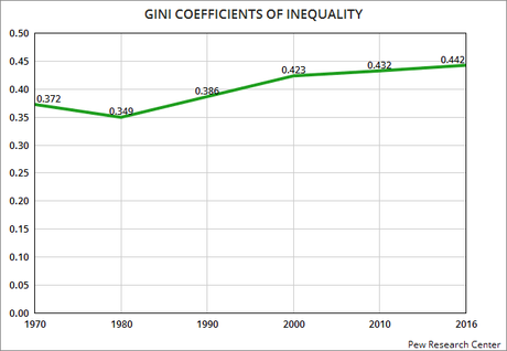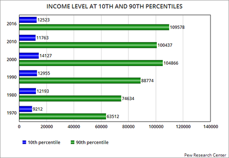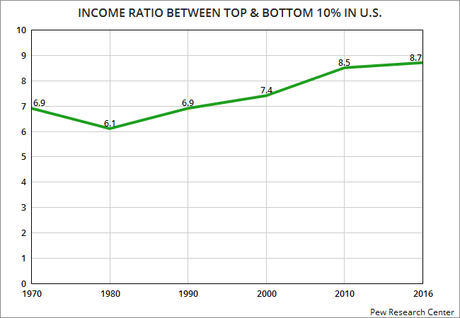


These charts use information compiled by the Pew Research Center. They show the growing income inequality in the United States. This inequality is normally judged by how much income is required to enter the top 10% compared to the level of income below which puts someone in the bottom 10%.
The top chart shows the GINI Coefficient. This is a number between 0 and 1 -- and the higher the number is, the more inequality exists. Note that before the GOP took over economic policy in 1980, we were actually making progress toward a more equal society. The GINI declined between 1970 and 1980. But after the Republicans established their "trickle-down" economic policy, it has been rising.
The second chart shows the ratio of income between the bottom and top 10% of earners. In 1970, the income requited to be in the top 10% was 6.9 times the income of the bottom 10%. That went down to 6.1 times in 1980. Then after the GOP economic policies were put into place, that ratio started to rise. In 2016, it was 8.7.
The third chart shows the actual incomes required to enter the top 10% or be relegated to the bottom 10%. Note that the gap has grown significantly. It continues to grow. And the recent GOP tax cut for the rich will cause the inequality to grow even faster.
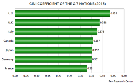
The chart below shows the GINI of all the G-7 nations in 2015. Note that the United States was the most unequal of those nations. In 2015, the GINI for the U.S. was .435. It has now grown to .442.
Republicans like to claim their fiscal policies are good for all Americans. It's a lie. Their policies have tilted the economic playing field to favor the rich -- at the expense of all other Americans. They must be voted out of power so a fairer economic policy can be instituted.


