Last month a local publicist asked me if I’d be interested in decorating a model apartment in one of the new big and shiny buildings that are popping up in Boston like mad. I was incredibly flattered, of course, especially since I’m not actually an interior designers. In fact, that’s why she asked. The budgets are smaller and the directive more creative. Rather than perfectly turned out, pristine showcases, these units, since they’re rentals rather than condos, are to be on the funkier side. In addition to my non-decorator self, there will be an art gallery owner, a visual merchandiser, and another writer. We will create color schemes for furniture and accessories, but not actually alter any finishes.
I think I will get down and dirty with some DIY projects, and will likely enlist my handy husband to help (especially given his urging that I take this on). Although we live in a condo in the city, he has a few well-equipped tool boxes stuffed with a vast range of hand tools, from hammers, screwdrivers, wrenches, and pliers, to power drills, soldering irons, and saws. Can we build a bed? Put up shelving? Create inventive wall decorations? We shall see.
We visited the building yesterday, which is still very much a construction site. We got a peek at a few finished units on lower floors and they have a great look, with light oak floors, white walls, floor-to-ceiling windows that actually open, and two kitchen styles—one with cerused oak lower cabinets and glossy grey uppers, and the other with textured white wood lower cabinets and glossy white uppers. They are both great looks and have me thinking about the best color palette for studio apartments.
I prefer to work with white on white color schemes, since I love all white rooms. I have in mind the whole pure white with pastel or bright color pops and a smattering of plywood. That seems easiest given my abilities and budget, and the fun style would match up with a portion of the target demographic. However, I may be assigned a unit with the grey/cerused oak kitchen. The finishes are beautiful, but I’ll definitely have to re-think my design/color scheme. It will need to present as a little bit more sophisticated. I perused many of my Pinterest boards last night in search of inspiration, starting with searching for a color palette for studio apartments.
If I am to decorate a unit in which the centerpiece is cerused oak cabinetry, I am leaning towards a color palette of pale wood, charcoals, and blush with touches of copper. Here are inspiration photos for the color, look, and feel I am thinking, with light wood, grey, pink tones, and copper accents.
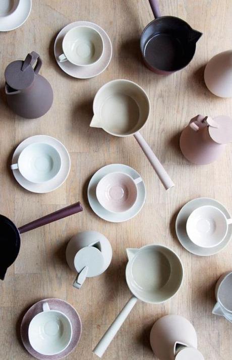
Ceramics by Kirstie Van Noort
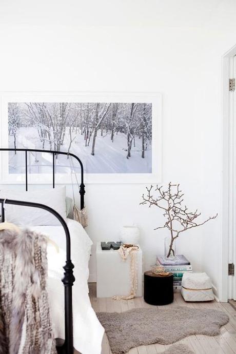
Penny Farthing Design House • Photo by Tim Pascoe
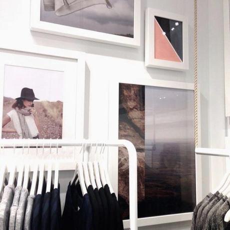
Lou & Grey • Photo by Marni Elyse Katz for StyleCarrot
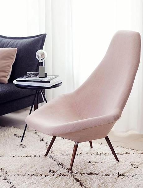
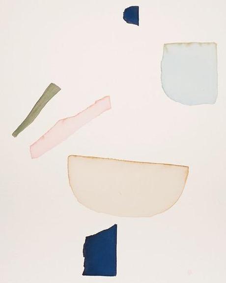
Landon Metz
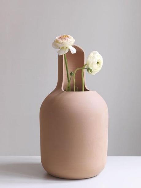
Gardenias Vases by Jaime Hayon for BD Barcelona Design

Geometric Copper Foil Print • Leif

unidentified
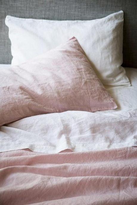
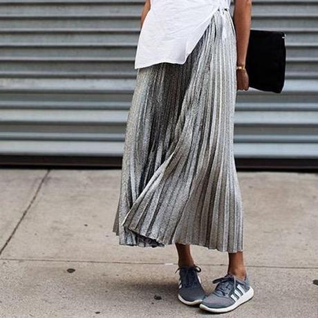
The Sartorialist
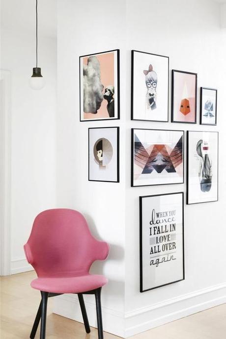
Photo by Frederikke Heiberg • Inside Out
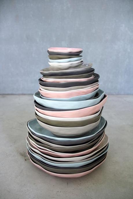
Ceramics by Amaï Saigon
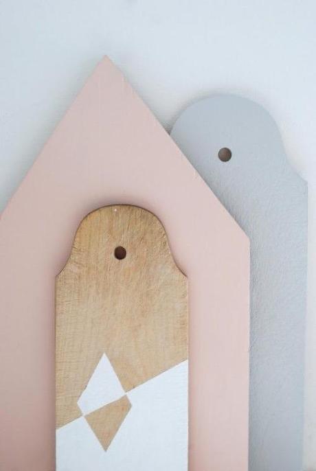
DIY painted bread boards • Maya’s Loft
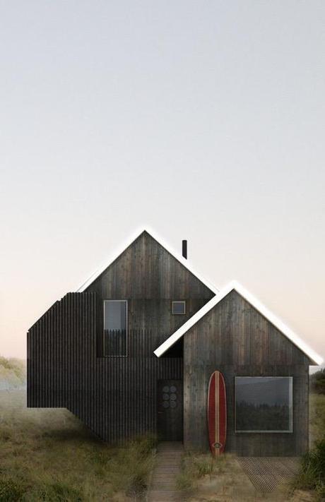
“Ditch Plains House” • T.W. Ryan Architecture
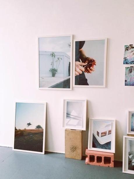
unidentified
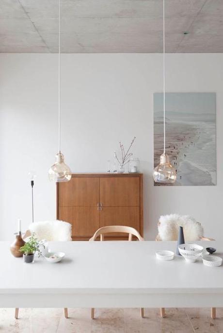
Mega Bulb pendant by Sofie Refer for &tradition
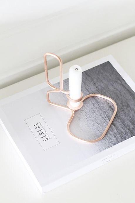
noeblog
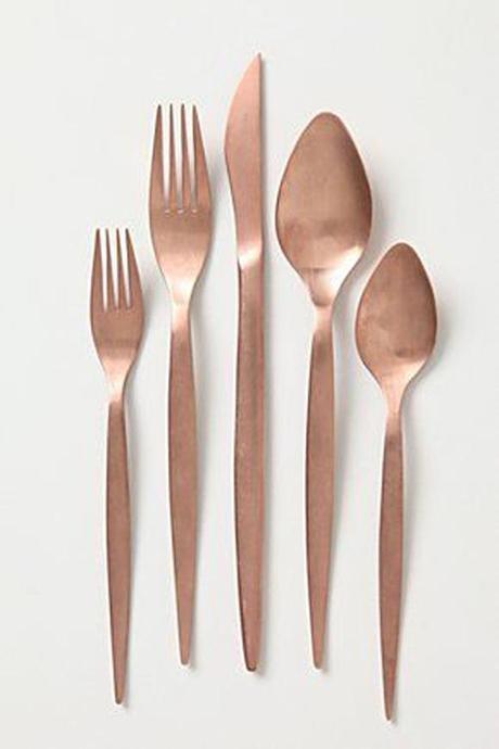
Coppper flatware • Anthropologie
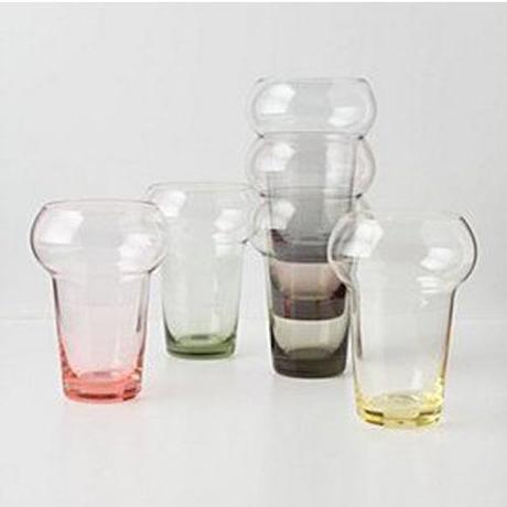
Colored Tumblers • Anthropologie
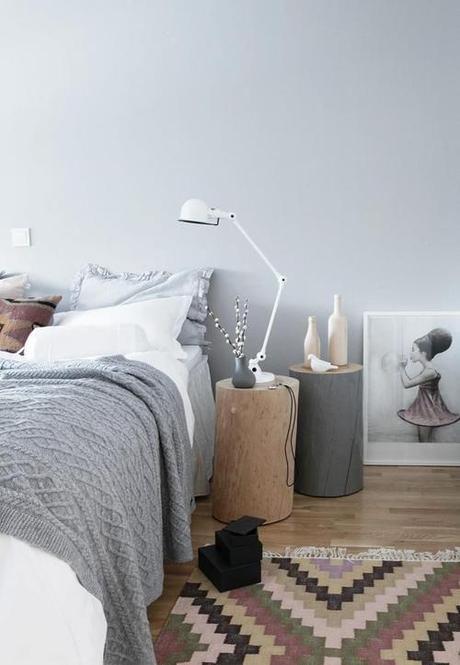
unidentified
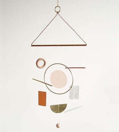
Wind Chime by Ladies & Gentlemen Studio • Sight Unseen

unidentified
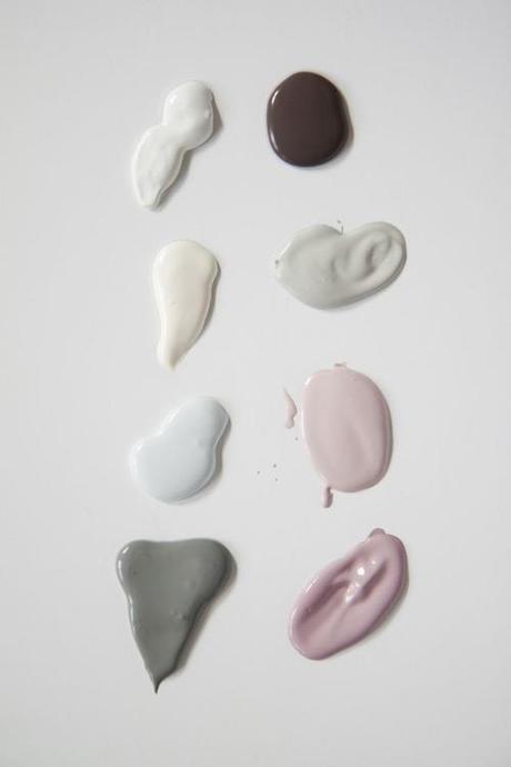
Pure & Original Paints
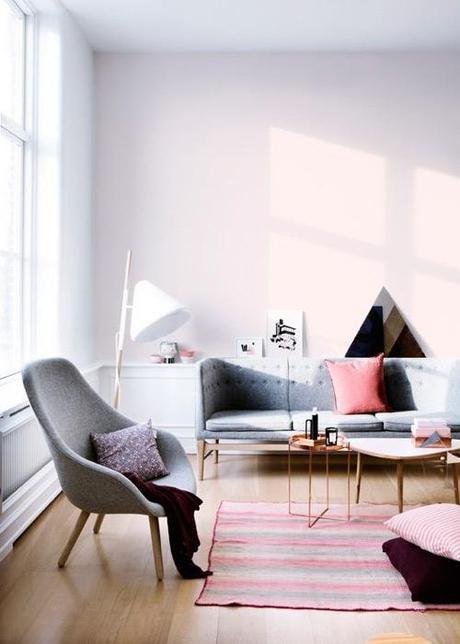
unidentified
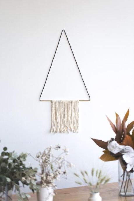
unidentified

unidentified
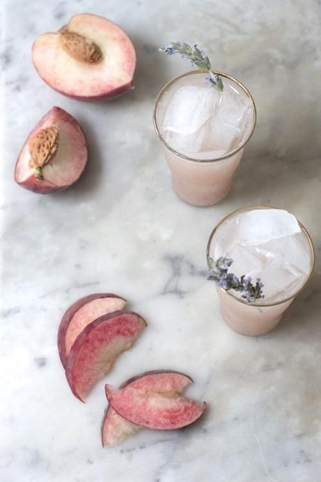
White Peach Maple Soda • Quitokeeto
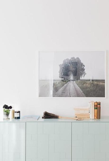
Styling by Hannah Wessman • Photo by Malin Cropper • Hanna’s Room
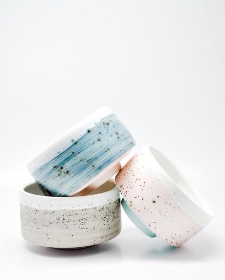
Fiess tea bowls • Leif
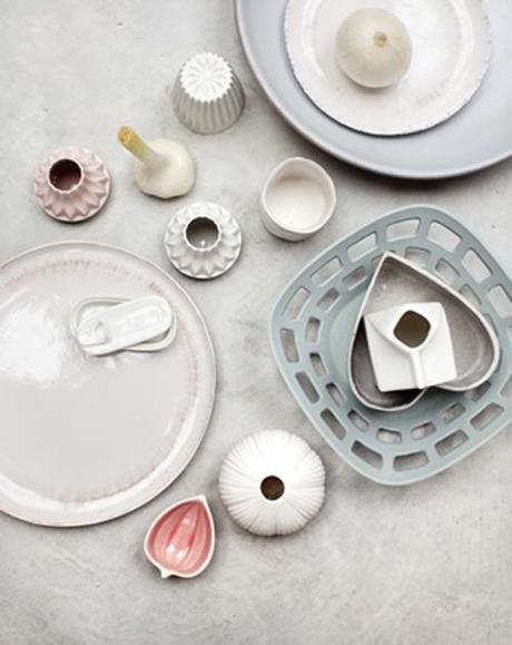
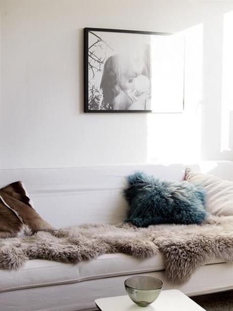
unidentified
