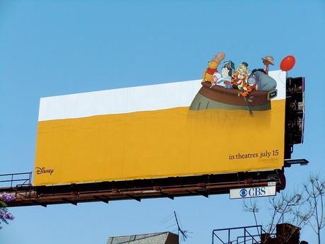
What? A movie billboard without the obligatory shot of the star looking tough holding a gun? Thank god. This board advertising the new Winnie the Pooh movie is so cute and simple, you can’t help but smile. Other than the cute factor, the thing that makes this ad so effective is the negative space. The sheer emptiness of the design beckons your eye contact.
Anyone creating a billboard can learn a lesson from this. You don’t have make 2/3 of your design negative space, but giving a little breathing room to your imagery and copy makes people want to look at it. You’re simply making it easier for viewers to see what’s really important.
