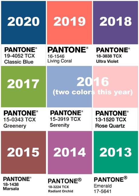
New year, new trends! While I am not one to jump on every trend's bandwagon, I like to be aware so I can add ones that appeal to me or play with my existing wardrobe to have it feel fresh and modern. Color is one of my favorite trends to follow as it will determine what is in stores (great to stock up when color trends match your color faves) and gives me ideas on how to mix colors in a a new and modern way. Every year, Pantone, selects a color that they feel defines the tone of the coming year. This may feel like a gimmick, but if you look at the colors chosen for the past few years (shown above), you realize they were strong trends that were embraced by high-end designers as well as mall brands. While I didn't buy any Living Coral last year, I did see how coral and softer shades of blush and a white with just a drop of coral were popular trends and I saw myself gravitating towards such shades when I really hadn't before. I also see how coral continues to be a popular color, though in 2020 it's a bit softer. When I shared Fall and Winter Color Trends a few months ago, I didn't own a lot of the colors and had difficulty finding the colors in stores to link in the post. However, now I not only find those colors everywhere, I have come to love and own many of them. Don't dismiss Pantone's Color of the Year, it often sets a trend not just for its year but years to follow.
What is Pantone's Color of the Year for 2020
This year, I think many of you will be pleased with the color Pantone chose for 2020: Classic Blue. Pantone says Classic Blue instills, "calm, confidence, and connection, this enduring blue hue highlights our desire for a dependable and stable foundation on which to build as we cross the threshold into a new era. A timeless and enduring blue hue, Classic Blue is elegant in its simplicity. Suggestive of the sky at dusk, the reassuring qualities of the thought-provoking Classic Blue highlight our desire for a dependable and stable foundation on which to build as we cross the threshold into a new era. Classic Blue brings a sense of peace and tranquility to the human spirit, offering refuge."
I regularly receive feedback from you wishing that there were more "traditional" or "cool" colors available in stores and I agree. Especially when you wear larger sizes, it seems that everything is black, gray, beige, or a muted shade of mauve, blue, and peach. I hope that by Classic Blue becoming the Pantone Color of the Year we will see an increase in versatile, wearable colors in a range of sizes. And unlike more statement-making colors that Pantone has showcased in prior years, Classic Blue is, well, a classic and pieces you buy in this shade won't look passé in a year, or two, or more.

How to Wear Pantone's Color of the Year, Classic Blue
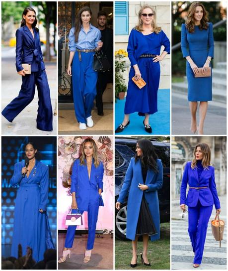
The hottest color trend that has continued from 2019 is wearing a column of color. Don't be afraid to rock a Classic Blue pantsuit with a Classic blue blouse underneath, a Classic Blue turtleneck sweater with a Classic blue pleated midi skirt, and you will see many solid-colored maxi dresses and jumpsuits for one-step column of color dressing. Look for fabrics that will showcase the richness of this color - think more along the lines of silk (and its budget-friendly poly and rayon alternatives) instead of chino and cotton so it glows like sapphires instead of looking like part of a uniform.
Classic Blue was seen on the runways with black, white, and navy. These three colors are often ones not associated with blue. Too similar, and too costumey/nautical. However, the pairings feel very fresh. Blue and white Breton stripes is a classic; consider pairing with black wide-leg pants so you incorporate the color trend and a current silhouette. Black and blue stripes also are a great way to style Classic Blue. Many watercolor and tie-dye inspired prints were on the runways, mixing Classic Blue with white, gray, black, and navy. I am betting we'll see more prints like this as spring gets closer. Don't be afraid to pair Classic Blue with denim. However, just with navy and black, you want to be sure there is enough of a contrast. Pair Classic Blue with deep indigo, faded blue, or a color like black or cream.
Classic Blue is a great shade to use for modern and unexpected color pairings. Try it with Kelly or emerald green, or add it to some of the desert shades like clay, brown, and camel that are on trend this season. Classic Blue looks chic with pops of orange, rust, mustard, orchid, and berry. Switch out a dress' blue self-belt with a belt in one of these colors or even a ribbon in a contrasting shade. Right now you will be most likely to find Classic Blue in sweaters, blouses and blazers. Try wearing a blue sweater or blouse with camel or brown pants, or a blue blazer with a cinnamon or wine-colored blouse. This is a great way to make blue feel seasonally appropriate, modern, and not so Crayola.
Classic Blue can also be the accent. It's a fabulous shade for glasses and sunglasses, handbags, belts, and shoes. If you love a pop of red or candy pink, try switching it out for Classic Blue this season. It's a great accent to neutrals like olive and khaki, and isn't as cartoony of a contrast with black and white. A blue suede loafer or pump could get a lot of stylish wear, looking great peeking out from work trousers, styled with denim in all colors of washes, and with dresses and skirts of most any color. Come spring, a blue shoe will look fresh with faded denim, chambray, and white.

What Other Colors are On Trend for 2020?
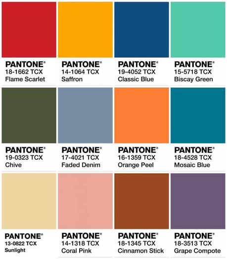
Each season, Pantone creates a palette of colors that they predict will be on trend. Looking at the colors they chose from Spring/Summer 2020, I again think Pantone is right on the money. It's a mix of colorful favorites in the vein of Classic Blue, paired with spring tones and shades you've likely seen already gain popularity in 2019. What I love about this combination is the juxtaposition of bright with muted. The faded shades that are reminiscent of the desert and a foggy forest make such a cool contrast with clear pops of almost primary colors. It's this modern mix that really will take your existing wardrobe to the next level. And while these colors are all different, they all provide something that Classic Blue offers and we see with movie remakes and the appeal of past decades - a feeling of nostalgia. Of safety, security, and serenity; things we may not be feeling in society and therefore are trying to achieve through fashion.
As always, when I share trends and fashion advice, it is to offer information and in no way am I stating it must be followed. There's little chance you'll be seeing Sunlight, Coral Pink, or Grape Compote in my wardrobe, and I continue to wear the colors, silhouettes, and trends that I like. I hope you will do the same. But with the death of fashion magazines and social media looking more and more homogenous, I hope pieces like this give you some ideas on how to update your personal style to best fit your life, your needs, and your tastes!

