It's very easy to get stuck in the same colour combination rut. You always put red with white and blue, wear your orange with your brown and then just stick with adding any colour to black as it's 'safe' and you're really not sure how to mix colours.
So sit tight as it's time to experiment with colour combinations from the colour wheel.
To understand all about how to choose colours that play well together you need to understand basic colour relationships and terminology.
Colour Relationships
-
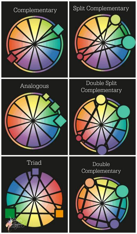 Complementary - colours opposite each other
 - Split-Complementary - colours one off the complementary
- Analogous - colours next to each other on the wheel
- Triadic - colours in an equilateral triangle on the wheel
- Tetrad - 4 colours - either a rectangle (double split complementary) or in a square (double complementary) on the wheel
When you are thinking about putting multiple colours together, you can spin each shape around the colour wheel and find a myriad of different combinations to try out.
Here's a great tool to help you find lots and lots of different colour combinations based on these colour relationships. You can move the centre dots so that the colours lighten or darken too.
You'll find many of these colour schemes in nature. Here is a beautiful rainbow lorikeet who has a Tetradic - double complementary - colour scheme of green, blue, yellow and red.
You can also mix a couple of schemes together or choose 2 of 3 or 3 of 4 in a scheme. You can easily mix red, blue and white - two colours from a triadic relationship along with a neutral (white).
Why not try choosing 2 colours from a relationship and adding them to your neutrals?
How Much of Each Colour?
So once you've decided on your scheme how much of each colour should you choose?
Like interior decorating, it's good to have a dominant colour, a subordinate colour and then an accent colour. Think the 60/30/10 kind of proportion when mixing colours.
Here I've mixed two colours schemes - the main colour scheme is analogous - with the blue and green/teal which sit next to each other on the colour wheel.
Then the scarf has small accents of a pink, which is is triadic to the blue and complementary to green.
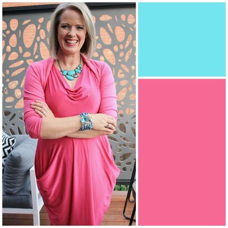
In this outfit I've mixed pink with turquoise, which works out to be basically triadic (pink being light red). Notice how the turquoise is used in small proportions as the accent colour, but repeated more than once to make it feel purposeful rather than random. Adding 2-3 pops of colour is a great way to add an alternate colour into a outfit. Just one small accent doesn't work as well often.
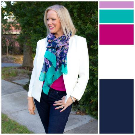
Again mixing blue and green with pink, using the white as a neutral.
This is a similar scheme to the first outfit, but in a brighter, stronger version of these colours.
Colour Mixing Tips
If you don't want your colours to clash:
More Tips on Choosing Colours
What are Clashing Colours?
How to Pick the Undertone of a Colour
How to Mix and Match Colours
 Complementary - colours opposite each other